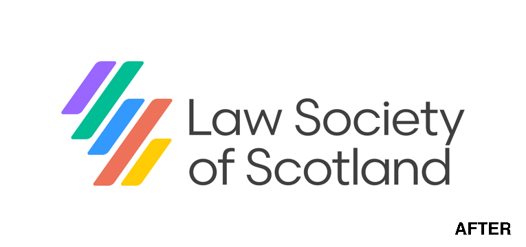
• The Law Society of Scotland, as part of its 75th anniversary celebration, has introduced a new identity that is meant to reflect its commitment to innovation in technology, regulation, inclusiveness, and sustainability. The arrangement of the forward-pointing color bars subtly suggests the shape of the country.
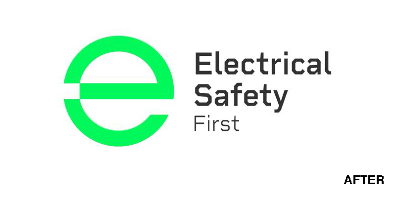
• Safety charity Electrical Safety First has eliminated red as its core identity color for several reasons. First, it wanted to move away from suggesting blood and danger. Second, research showed that red was by far the color used by many other charities.
The group’s new green and glowing logo better communicates its new strapline, “powering change + saving lives.” The emphasis is on positive outcomes, not disaster.