Consumers want quality. But they also want low prices. Following a model that Target has used for years, Walmart has created bettergoods, an economically priced line of food products that is clad in premium packaging.
Walmart’s inhouse design team used all lowercase letters and portmanteau-ed both words in the name to distinguish the new brand and make it seem more friendly. Photography on each packaging showcases the product inside; it also creates a ready visual cue that could aid in repeat purchases in a cluttered instore environment.
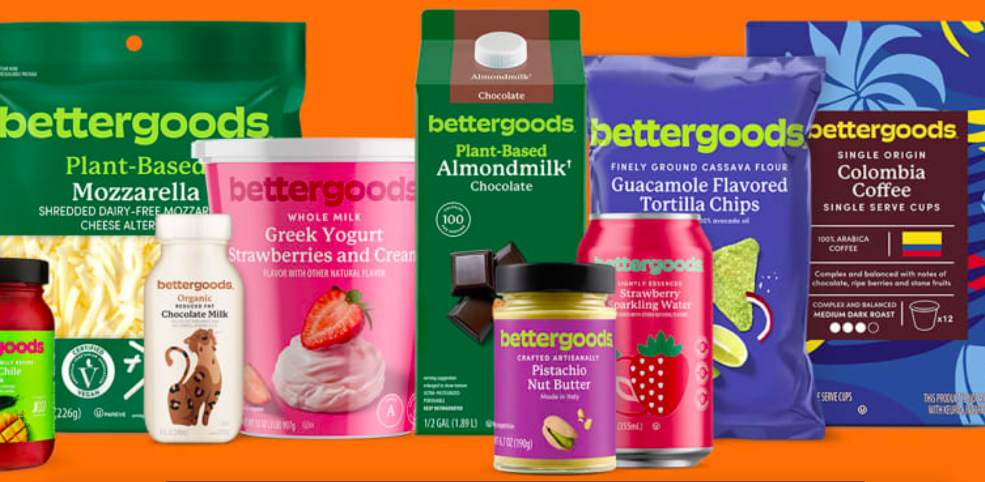
The new packaging is considerably more colorful than Walmart’s much plainer Great Value brand. The effect is an (apparently) more upscale product that is still economically priced.