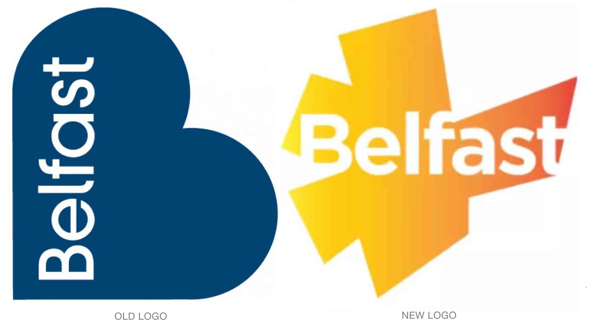
Belfast has a new identity plan, one that adopts the now-common convention of using the logo as a window or fillable container. It replaces a 10-year-old, heart- or B-shaped design.
The “starburst” shape of the new design roughly mimics the outline of the city, says Glenn Stewart, managing director of McCadden, the firm that created the design. While the new shape has received criticism for being a bit “union jacky” or even more unfortunately, like an explosion, Stewart says it is meant to convey energy and aspiration.

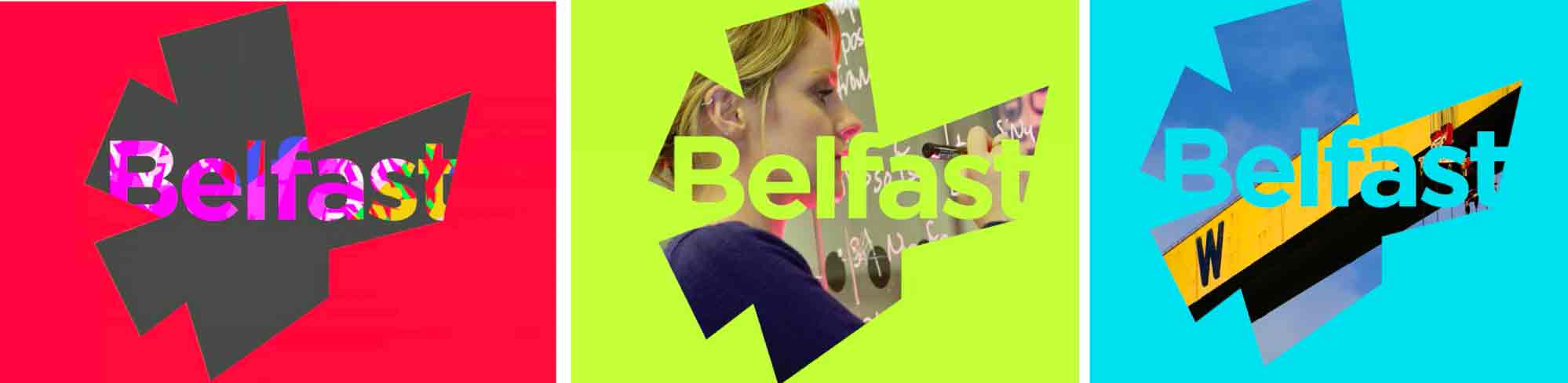
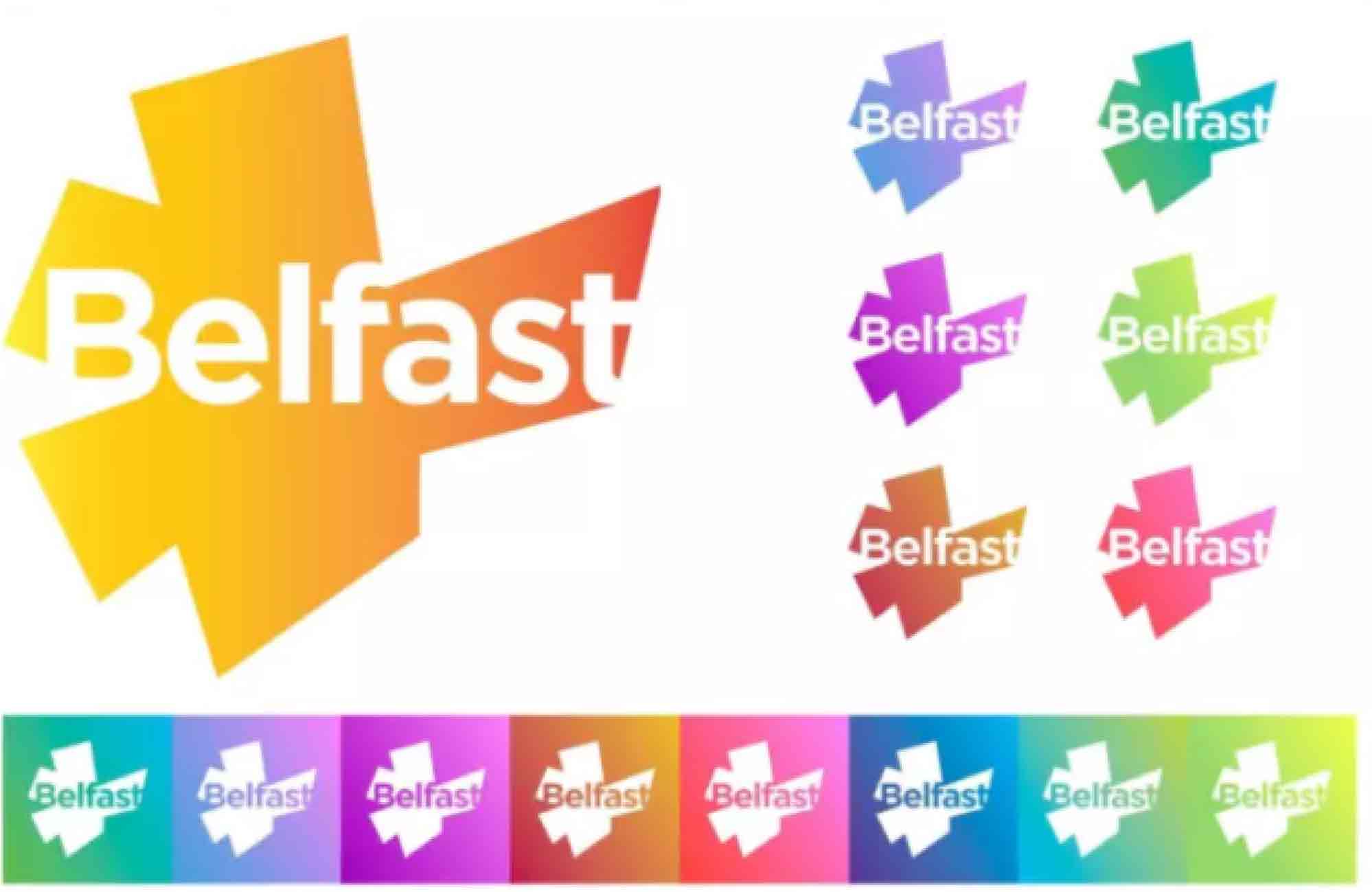
As of this writing, McCadden is encouraging citizens to use the logo as they see fit. Basic guidelines for use will be offered soon, but beyond that, he wants the design to grow organically and democratically.

Read more details behind the new logo here.