Bank of America Waves Updated Flag

Adaptive logos

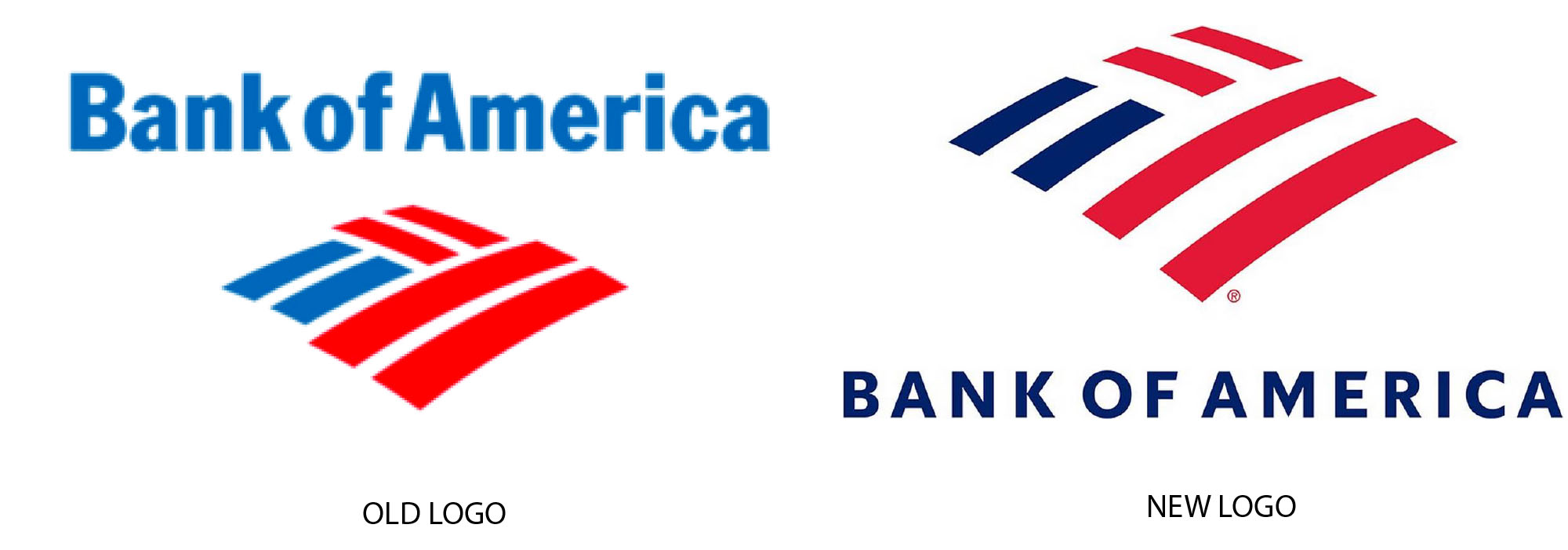
Bank of America has updated its logo for the first time since 1988 to reflect “a more modern brand that delivers both cutting-edge technology and high-touch solutions.” Toward that end, the company’s “flagscape” now has thinner stripes, and the words Bank of America are all caps.

Read more details here.

Like what you see? You, too, can join our tribe of quality designers and marketers who continue to make their mark by utilizing the invaluable resource that is LogoLounge.com.
Click to get more information and join the LogoLounge Community!

What do you think?