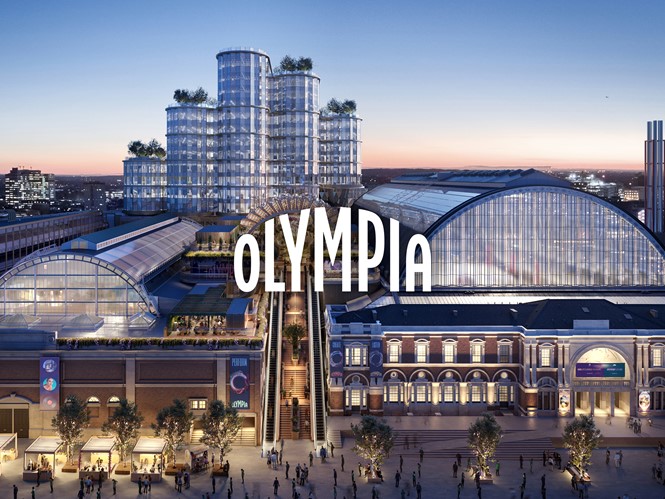
Design firm SomeOne borrowed from the architecture of Olympia London to create a new brand identity for the West London event and exhibition space. Designers were inspired by the arches that crown two large exhibit halls and gave that same shape to the new logo. The arching shape will also be repeated in other architectural elements at the location, which is still under development.
The “O” from Olympia also serves as an important asset in the new system. The circle shape is used as a photo frame, animated object, and art element for now. But that is likely to change as time goes on.
“The O system is designed to continually evolve and develop, just as the site and venue will too. In the short term it needs to showcase what is to come, whilst construction is underway,” says Laura Hussey, founder of SomeOne.
https://www.transformmagazine.net/articles/2021/someone-designs-new-destination-brand-for-olympia/