![]()
Publishing giant The Quarto Group, founded in 1976, is well known as a global publisher of illustrated books. Its numbers reflect its growth: today it sells books in 50 countries, in 40 languages, through 30 imprints (many of which were very successful independent publishers before they were absorbed into Quarto) that literally cover hundreds of different topics. The publisher recently moved into expansive new London offices and asked Pentagram to recreate its identity.
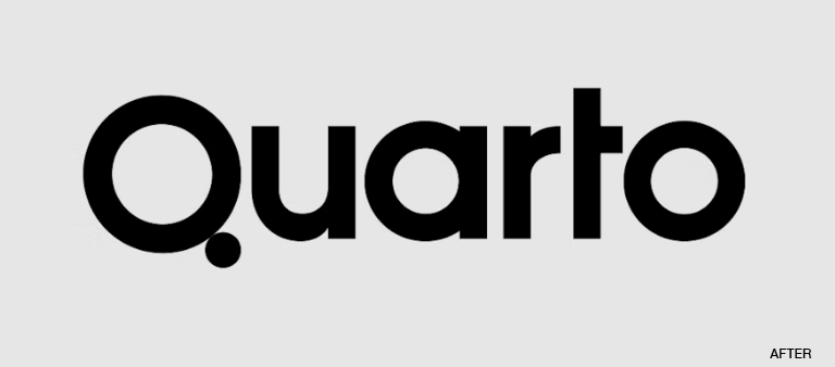
Consulting creative director Angus Hyland was charged with creating a “streamlined new brand name [that] is less corporate and formal and embodies Quarto’s core values of being nimble and dynamic.” To accommodate the many imprints and subject matters Quarto stables, Hyland’s team took a broad perspective and built on the publisher’s previous Q identity. The new identity also uses the Q, but by building it out of two circles, the designers turned a generic letter into an ownable and unique brand asset.
![]()
The meaning of the Quarto name played a big part in the new identity. From Pentagram’s website: “The literal translation of Quarto from Latin is ‘fourth’ or ‘quarter’, and these points of reference inform the design of the brand assets.... The use of geometric, circular forms in the logo alludes to the idea of ‘wholes’ and fractions. The main colour palette consists of four colours for each of the seasons and the graphic elements all derive from quarter divisions of a circle.”
https://www.pentagram.com/work/quarto/story