Interface design firm MetaLab has helped clients such as Google, Amazon, Slack, and Uber update their brands and interfaces, but it hadn’t overhauled its own identity since its founding in 2006. Now redubbed Metalab, the company’s wordmark has been reworked. Its use of its long-time brand purple is decidedly more restrained.
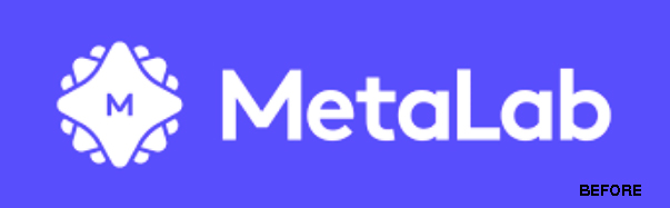
Metalab’s icon/logo shows the most change. An in-house team pulled the star shape from the original logo, but redesigned it to be very changeable form, as needed.

From the company’s website: “It was important for us to build a core brand identity that would stand the test of time while also making room for us to play and evolve with the times. Our wordmark, typeface, and palette all feel timeless [w]hile the star lends itself to infinite possibilities. It can morph and change, and because of that, there’s a built-in seasonality to the brand language.
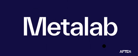
“We played with many different 3D renders—glass, balloons, metal, even fuzz—and many different angles, ultimately landing on a set that is right for the brand right now. Yet it can evolve and shift into any material of our choosing, [l]eaving room for what will feel right tomorrow.”