The goal of the charity Nesta is to increase “innovation capacity” in the UK. It partners with and supports various organizations across a range of sectors, investing in such diverse goals as how to deliver better, less expensive public services; understanding climate change; and technology in schools, just to name a few.

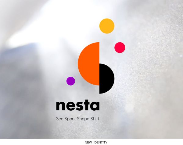
Pentagram created a new identity for Nesta that visually partners well with the organization’s collaborators. From a Pentagram blog detailing the project: “Nesta exists in relation to others, operating on a sliding scale of visibility, sometimes taking the lead in projects, and sometimes staying in the background. It ignites, partners, endorses, leads, facilitates and shapes, depending upon the context and perspective of a project.... The logo visual system, made from a combination of separate floating shapes, represent the organization’s way of working. There are deliberate gaps and splits in the shapes, creating the moments of friction, movement and invention that are essential to Nesta’s work. The overall effect is an effervescent energy that breeds constant action.

“The identity reflects Nesta’s flexible personality by presenting it as universe of planets, that shift and change according to your point of view. It is inspired by the avant-garde artwork of Kasimir Malevich and the mobiles of Alexander Calder. This visual style has been applied across all of Nesta’s sub-brands.”

Read more behind Nesta’s new identity here.