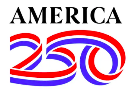
Uniting the US under a single 250th anniversary logo as well as possibly working in the word “semiquincentennial” feels like an unenviable challenge. But Sagi Havav, partner with Chermayeff & Geismar & Haviv, sidestepped the multi-syllabic word and instead created a flowing, ribbon-like logo that forms the number 250 in a single red, white, and blue stroke.

In an article with The Seattle Times, Haviv explains how his team undertook the challenging project. From the article: “It’s almost an impossible construction,” Haviv said of the design, which twists around itself like a Möbius strip. “I think that has an additional level of meaning, because bringing people together today is almost an impossible task, but the result is beautiful.”
(View many more samples of branding from this project at https://www.cghnyc.com/work/project/america250.)
https://www.seattletimes.com/nation-world/a-logo-to-unite-america-good-luck/