Carling Black Label
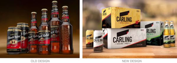
Carling Black Label has rebranded, with the direction of BrandOpus. The new designs are being rolled out this month. They are a definite departure from Carling’s previous designs, which were full of very traditional, male, beer cultural references. The new identity is much more sleek, its black label motif neatly tying the brand to its past and all products in the current line together. Read more behind the new identity here.
Coca-Cola
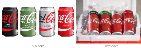
Coke red is coming back strong on Australian shelves with Coca-Cola’s “one brand” marketing push. Brand managers at the company said the product identity was becoming diluted in stores with Coke Zero’s black, Coke Life’s green, and Diet Coke’s silver designs. The goal is to create a billboard effect that raises overall brand awareness, especially on store shelves. Find more details here.