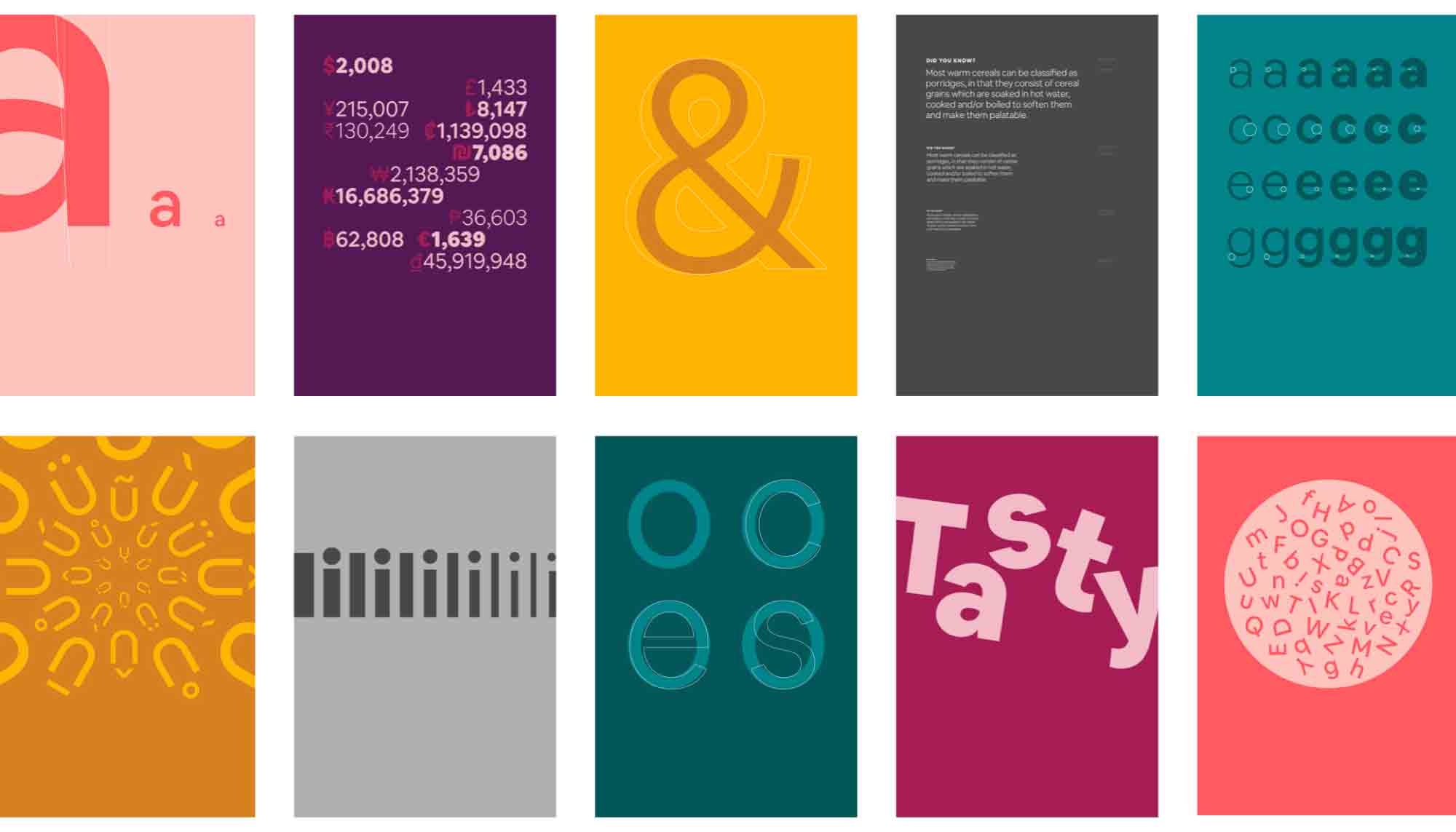
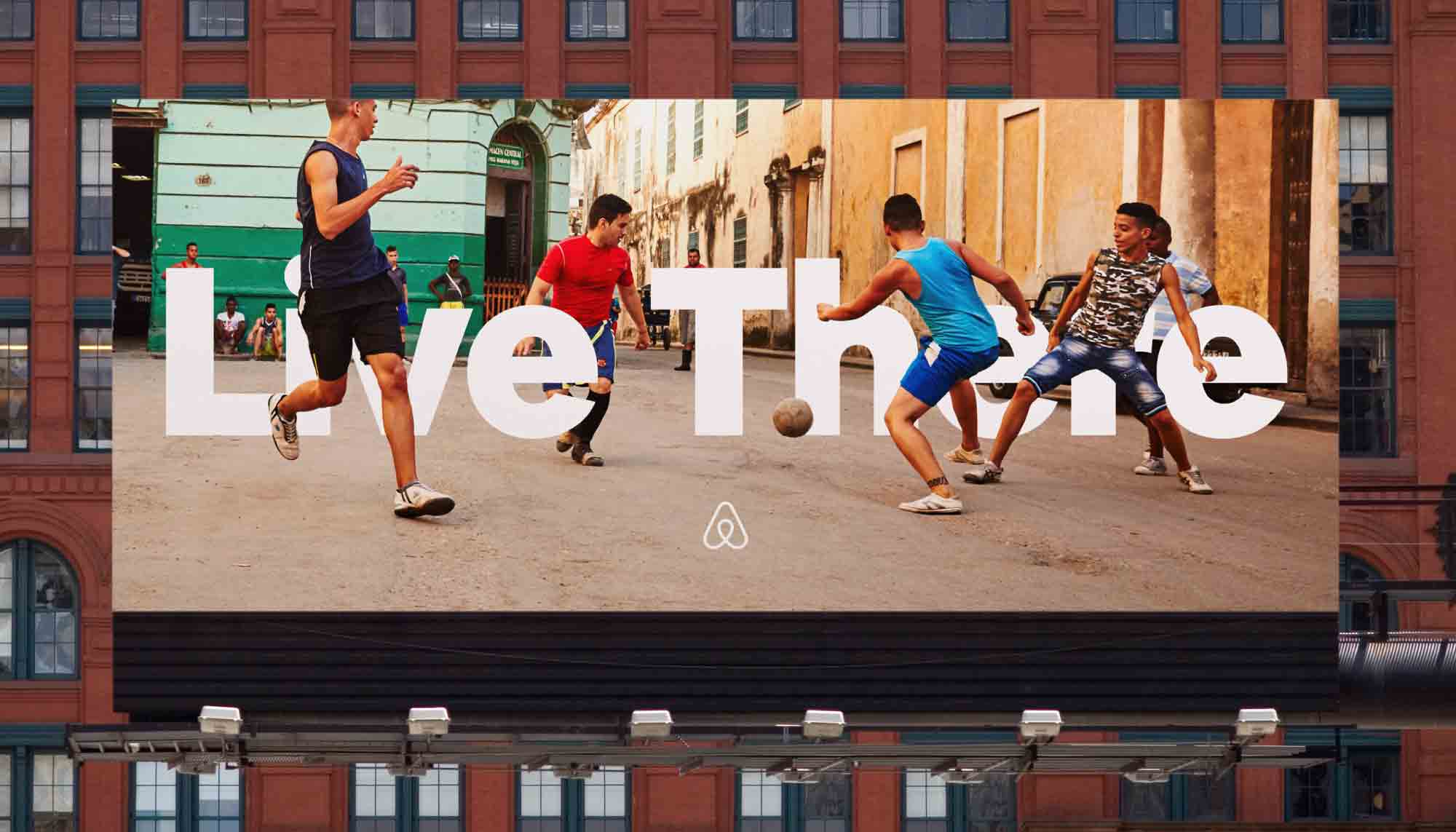
Airbnb has a new scalable typeface, Cereal, that was designed to accommodate all of the company’s needs, from “button to billboard.” The new bespoke brand attribute, created by the foundry Dalton Mag, was needed for a variety of reasons, according to Derek Chan, the company’s creative marketing lead.
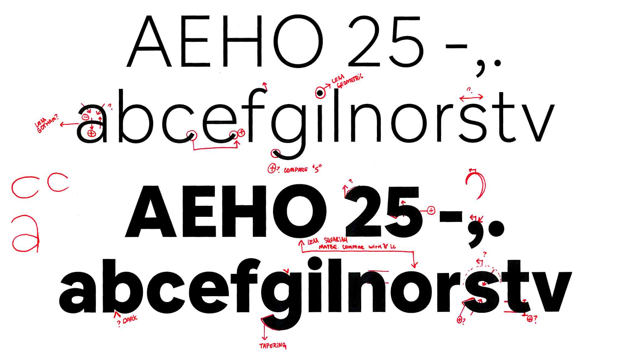
“Our work is extremely typographic, and people experience our brand across various mediums including the platform, Airbnbmag, and metro stop advertisements. We have specific business needs around brand distinction, legibility, and scalability that no available typefaces were addressing. We wanted a typeface that would function beautifully online and offline while reflecting our brand personality, so we decided to craft our own.”
See more here.