
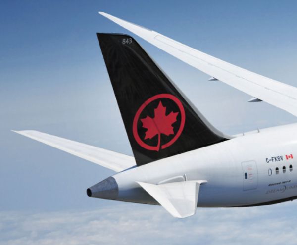
Just in time for its 80th birthday and Canada’s 150th anniversary, Air Canada has a new maple leaf in its livery and brand identity. The company’s new designs feature a bolder black and white palette, meant to highlight a bolder rondelle—the red leaf surrounded by a circle.
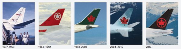
The rondelle is made the hero of the identity, which was created by Winkreative. Other updates include a black belly on fleet planes, which unifies the various craft in Air Canada’s fleet (especially when viewed from the ground) and which provides a strong backdrop for the rondelle; and a black mask surrounding the flight deck windows, inspired by the facial markings of Canada’s indigenous birds.
To read more behind Air Canada’s new livery, simply click here.