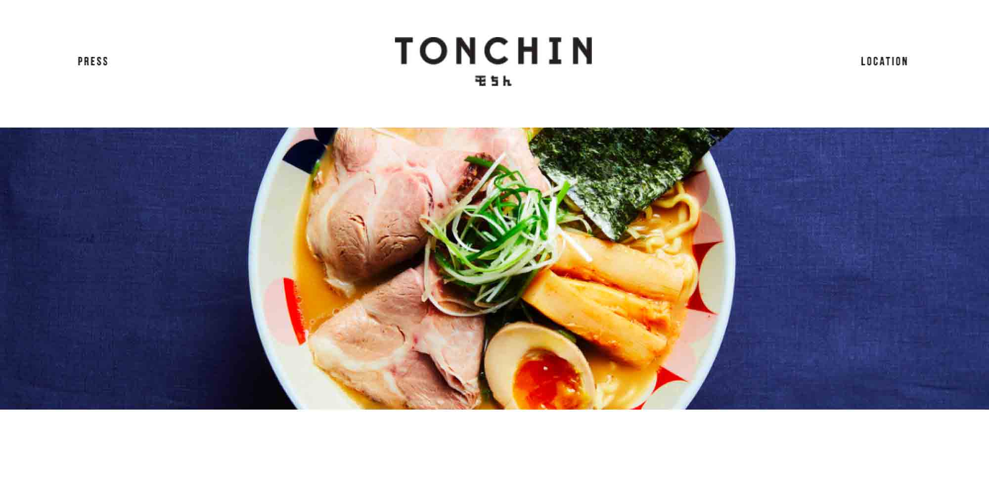
Tonchin is a ramen restaurant brand that is already well-known in Japan. For its first store in the United States, Tonchin management wanted to keep close ties to the home brand, but to present an upscale look that showcased its beautiful food.

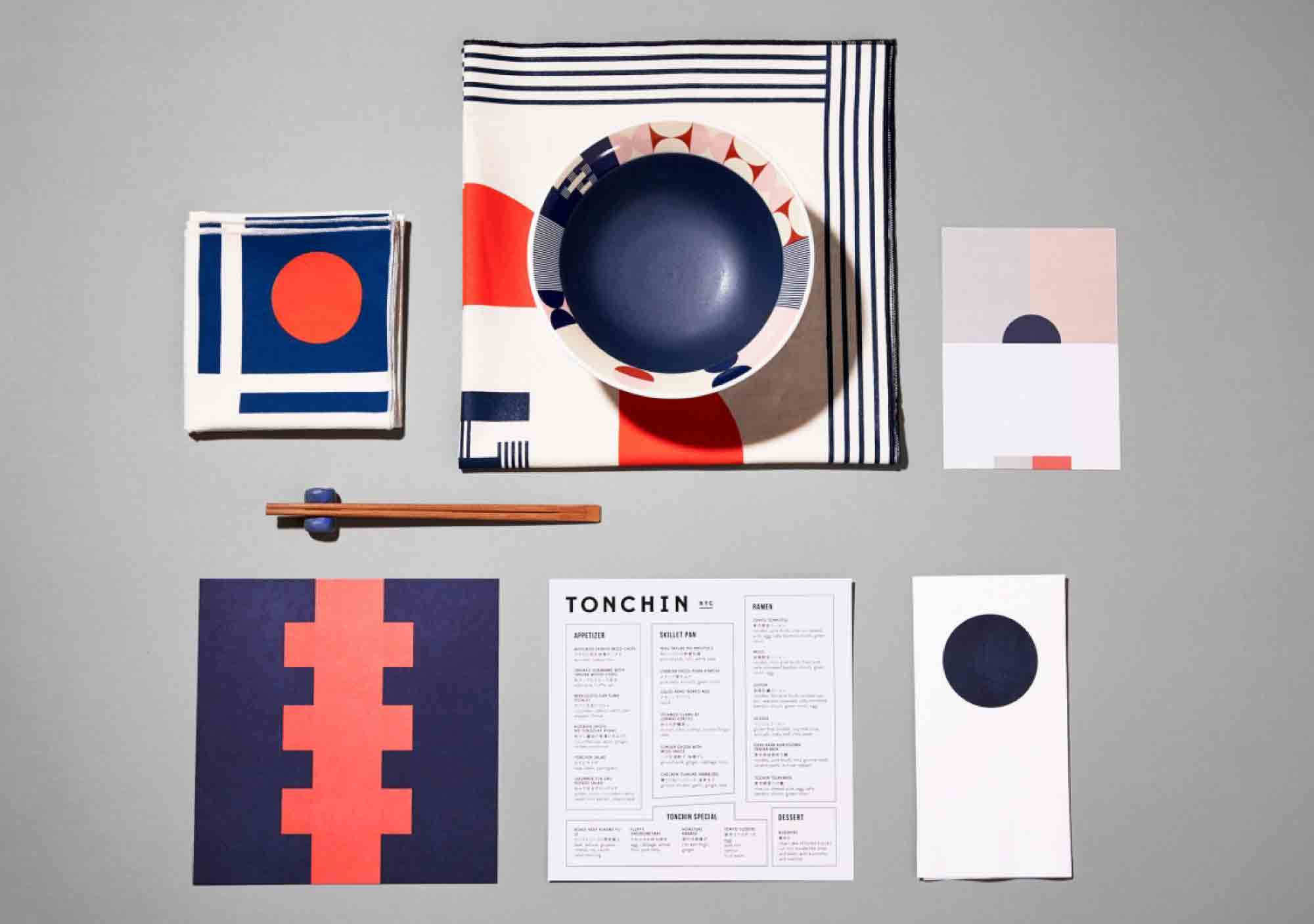
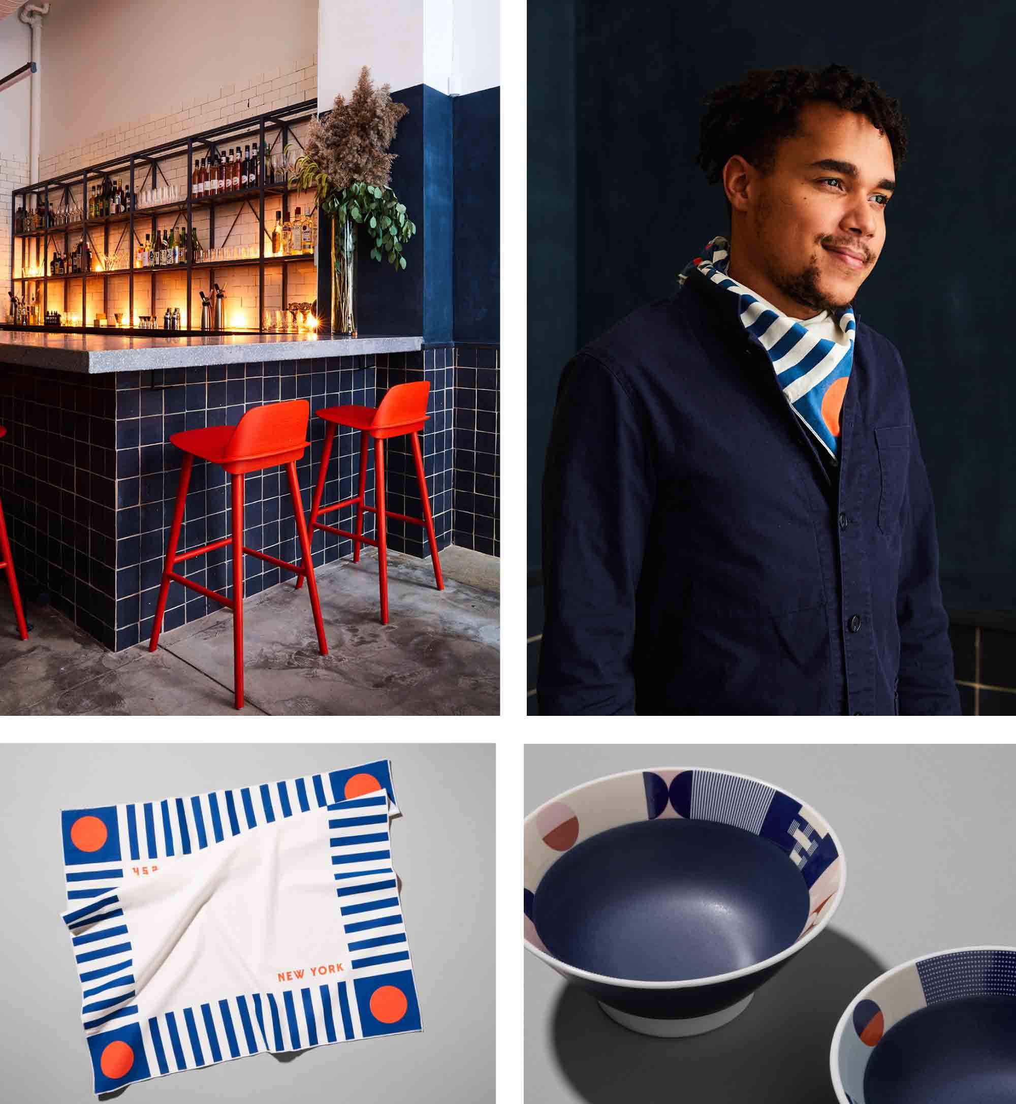
LMNOP Creative produced the new identity and, working with other artisans, applied it comprehensibly across the new store on everything from dinnerware and lampshades to curtains, uniforms, wallpaper, and print materials. Indigo and red present a clean, crisp, dark palette against which the restaurant’s beautiful food presentations can really shine.
See more here.