Thorn, an organization that works to protect children from online sexual abuse and trafficking, has a new identity based on its new vision statement: “Until every child can be a kid.” The new identity was created by Wolff Olins.
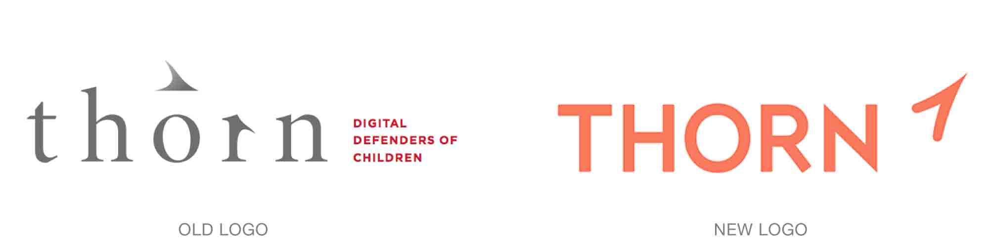
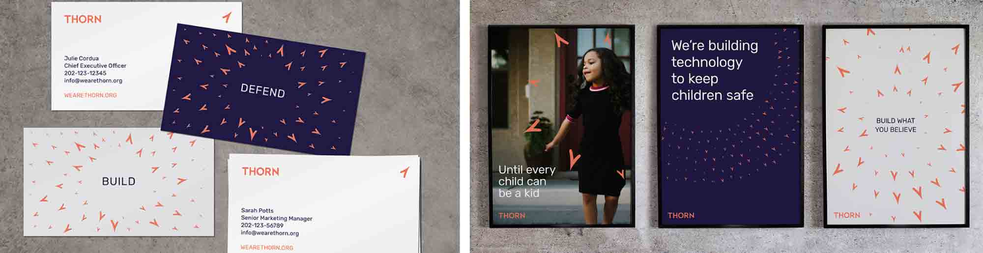
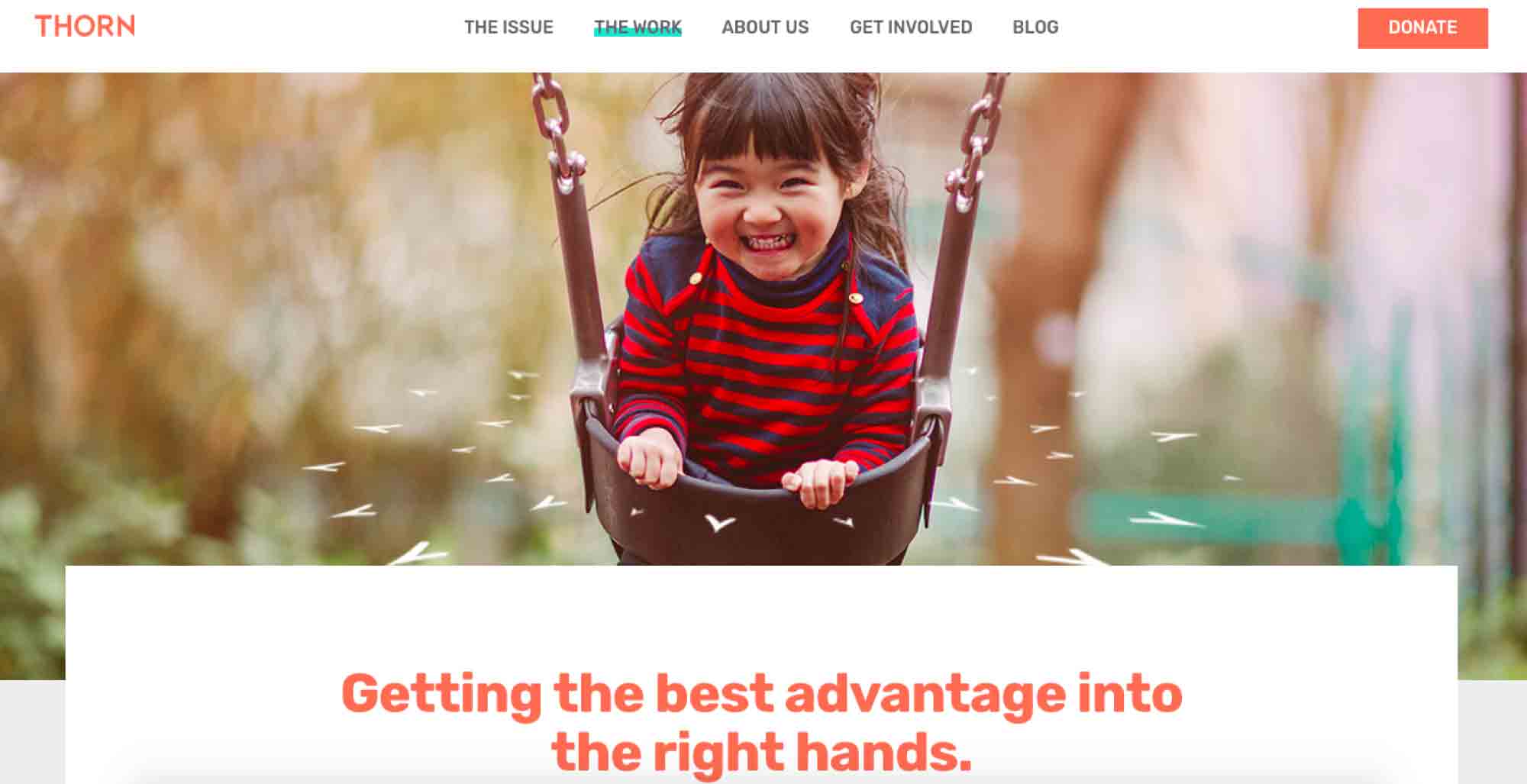
The new design builds on the thorn- or bird- or arrow-like shape used in its previous identity, but now the shape has new life. When used en masse, the thorn protects the rose, or child. When used in a single line, the thorns can form a frame that embraces an image or statement. They can also be used like rays in a sunburst, or a single shape can be used alone as a signal of positive, forward direction. In all applications, the sharp form is a reminder that people are on notice and are watching.

The typeface used in the new identity also feels clean and strong: the design used in the previous design felt quite ominous and dark. A bright but assertive palette of navy blue, orange, and white complements the strength of the new system.
Read and see more here.