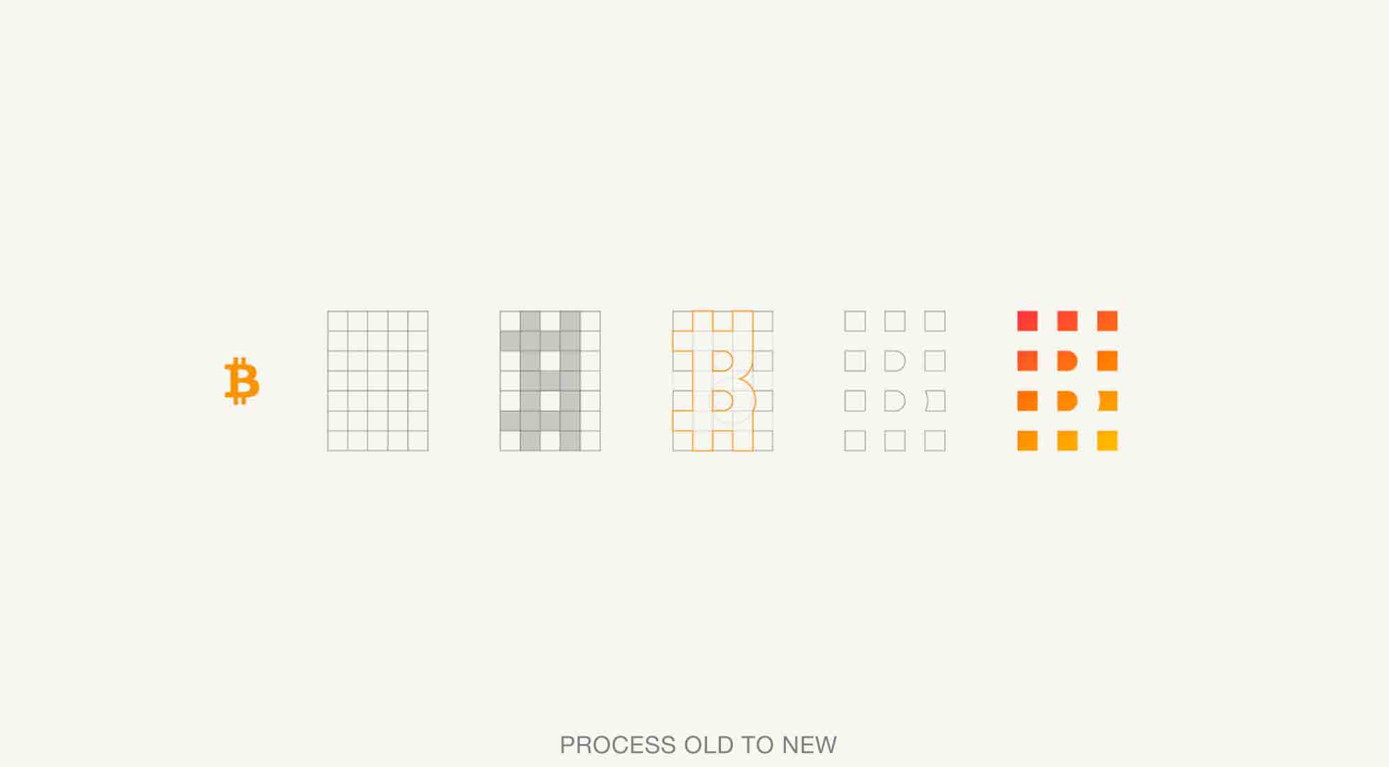
Buenos Aires designer Martin Bekerman has proposed a new identity for bitcoin, one that pulls the logo/icon away from its similarities to the U.S. dollar. Built out of separate pieces, the suggested design also symbolizes the decentralized nature of the currency.

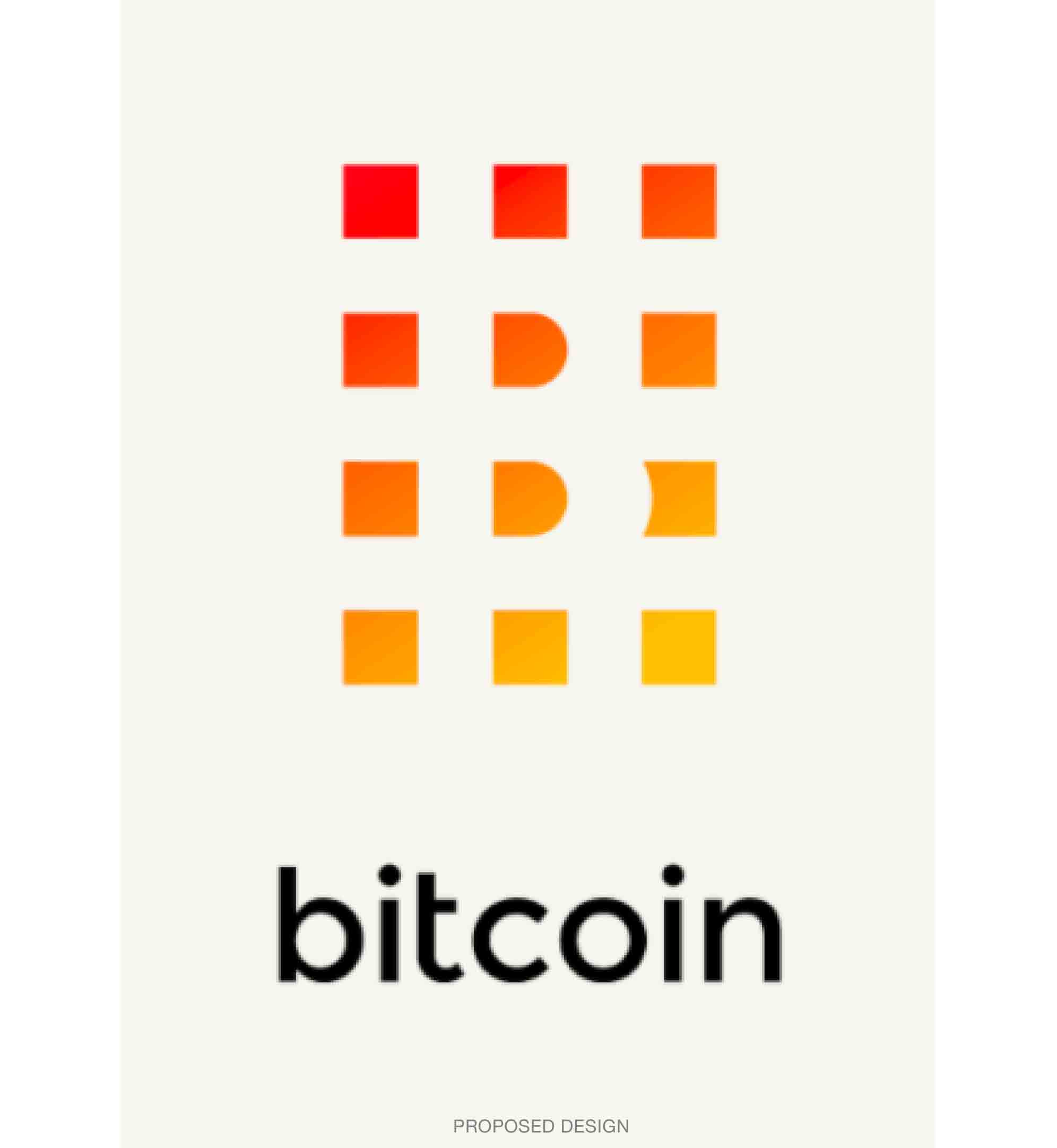
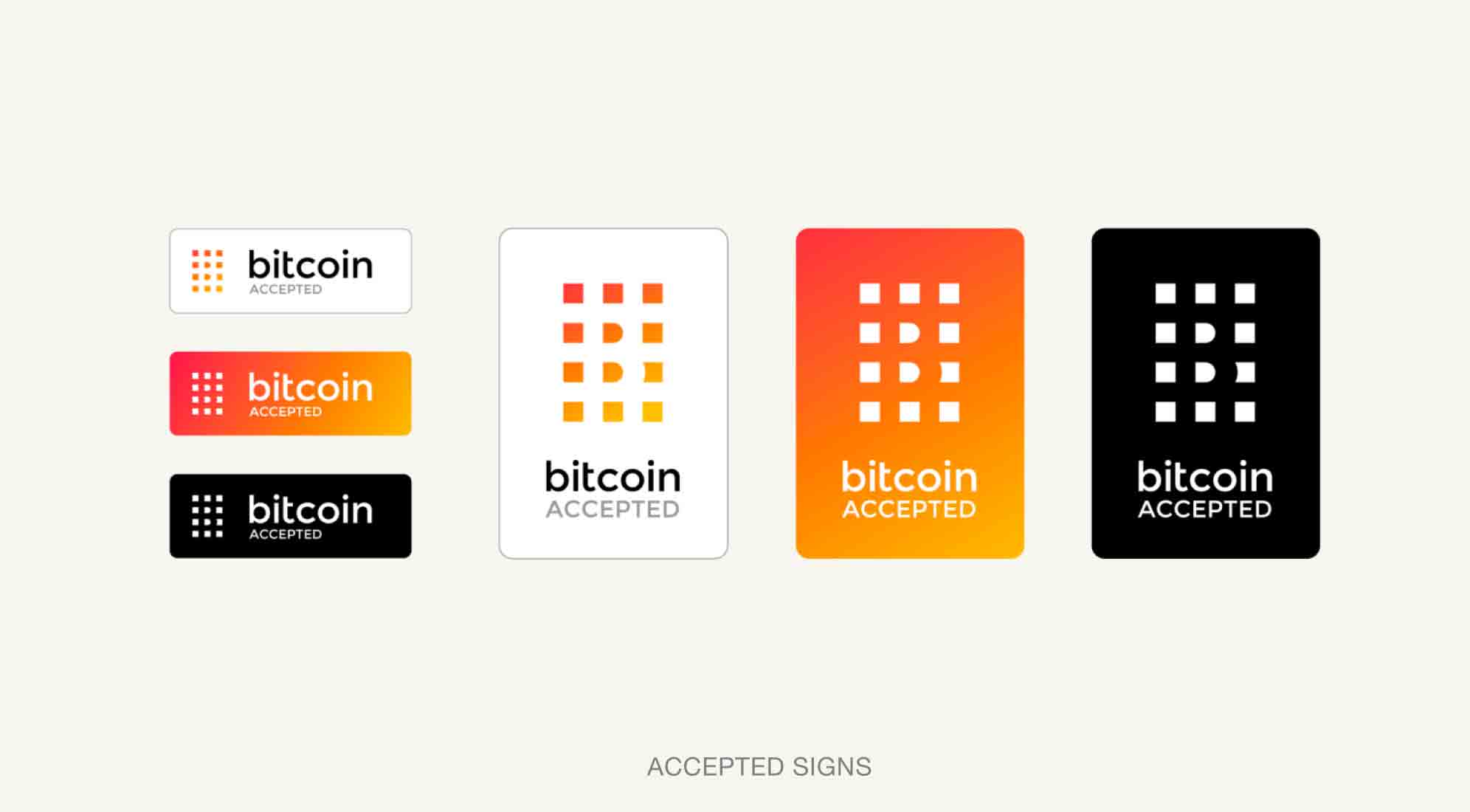
From Bekerman’s proposal page: “The fact that the logo itself is built out of separate units relates to the divisible and decentralized nature of bitcoin. This construction also opens the door for multiple interpretations of the basic recognizable shapes of the logo. As long as there is a minimum of 4 squares including the 2 corresponding to the “B,” we can consider the variation to be inside the system, allowing for different use [...] depending on size and location. This system detaches itself from a particular container, allowing it to work on top of different shapes as long as the “B” is recognizable.”
See more here.