Global risk assessment firm Moody’s, now 115-years-old, has a new identity created by Interbrand. An updated brand trajectory, “Decode risk. Unlock opportunity,” was selected to help guide Moody employees find new risk assessment solutions and create better benefits for their customers.
From the Interbrand website: “Based on the strategy, the refreshed brand experience is defined as a Bold, Clear, and Perceptive Brand, executed through a defined narrative, a distinctive tone of voice, and a new design system. Highlights include an updated logo inspired by the original Moody’s ratings manuals, an apostrophe used as an ownable graphic element, and a rich, digitally optimized Moody’s Blue.”
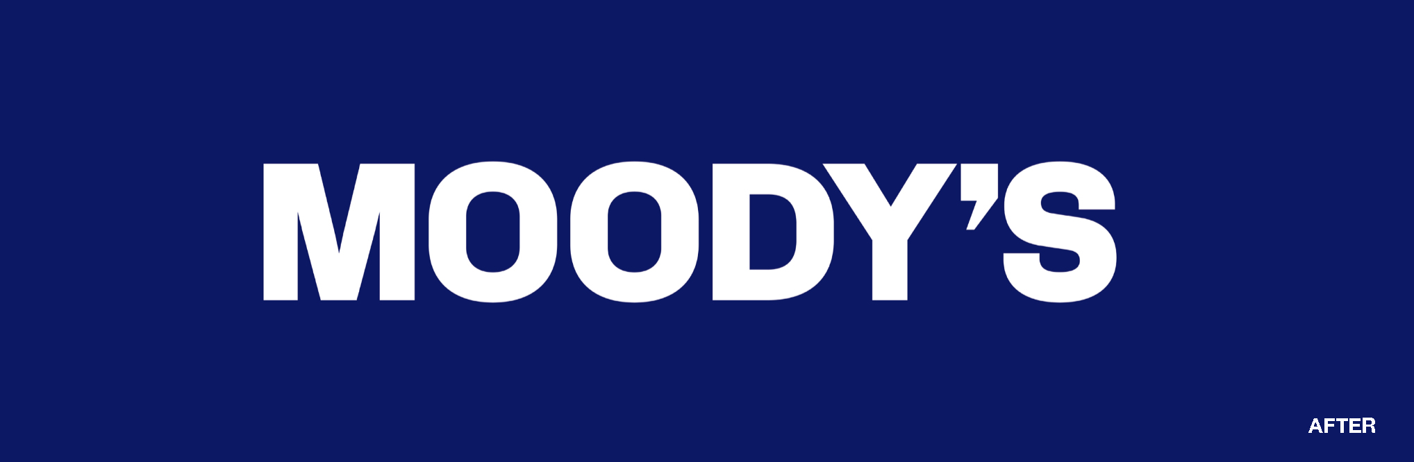
The apostrophe from the Moody’s name will be used by itself as well as in combination with the capital letter M as an icon and app logo. The client’s signature blue brand color has been made richer and has been optimized for better digital display.
https://interbrand.com/newsroom/moodys-partners-with-interbrand-to-develop-new-brand-identity/