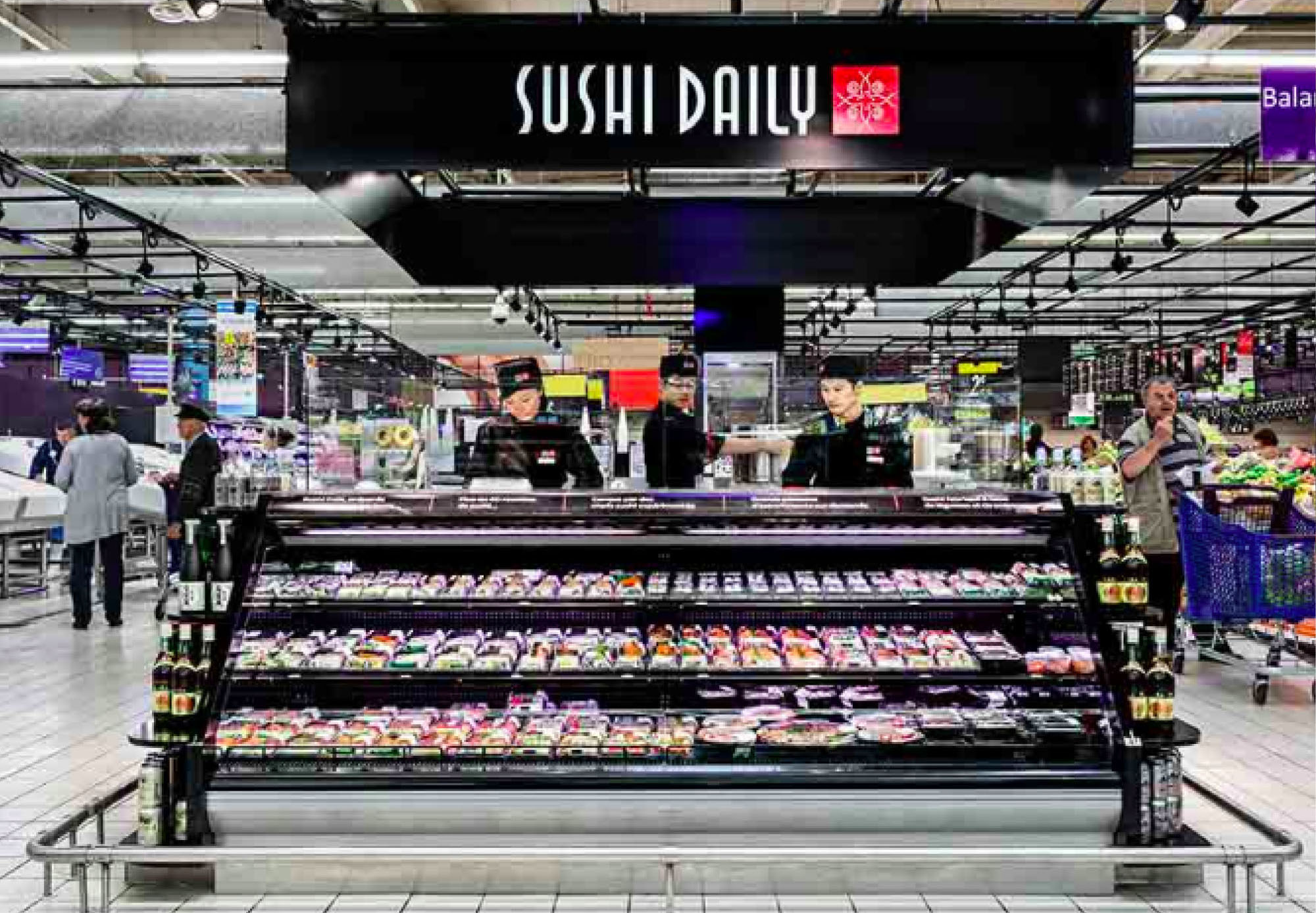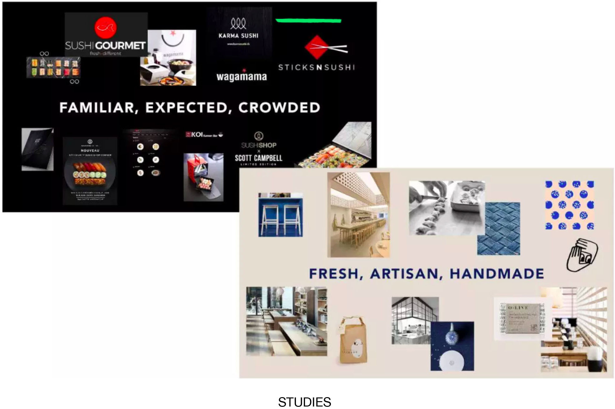
Sushi Daily’s kiosks are a familiar sight in more than 700 supermarkets across Europe. But when the company opened its first solo store, it needed to develop a more distinct identity that better communicated its expertise in a retail setting where sushi has almost become a commodity.

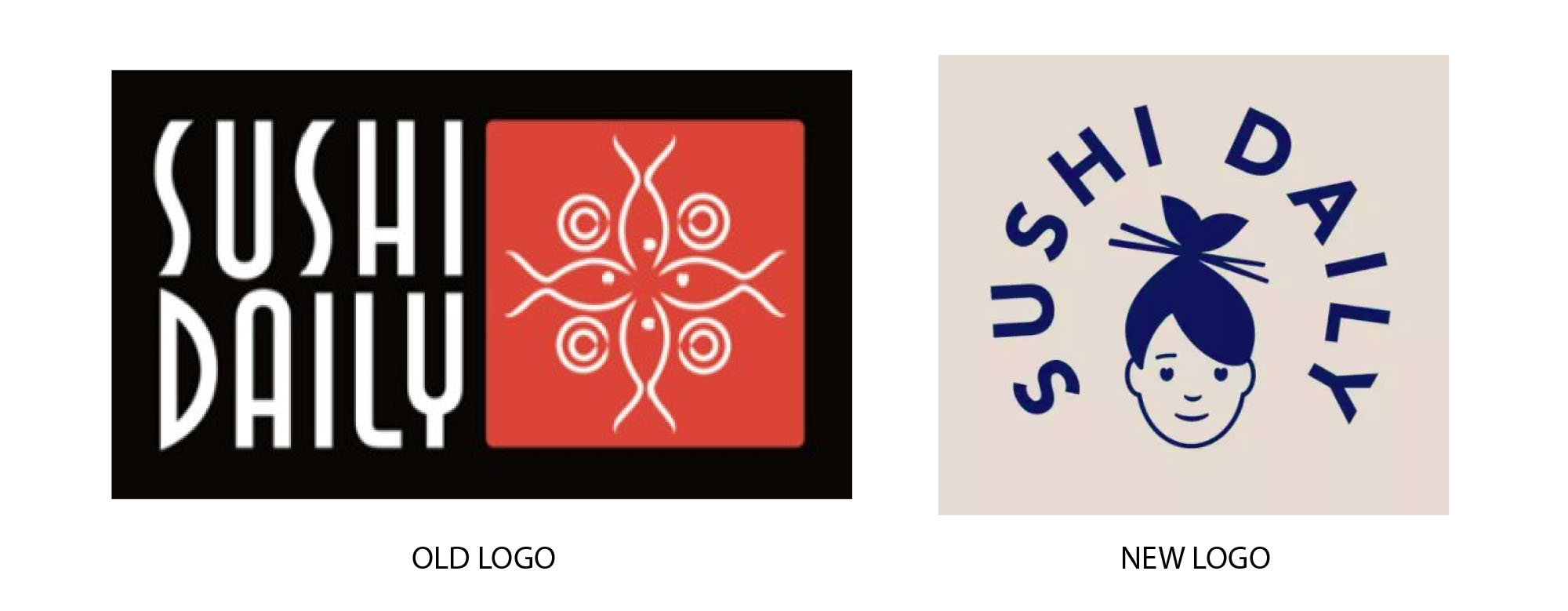
The design firm Without created a new identity for Sushi Daily, the centerpiece of which is a female character with a fish-tail-like top-knot. The character comes to life through charming animations and vignettes, explaining the history and culture behind the company’s products. The simple illustrations easily communicate to consumers without language barriers.

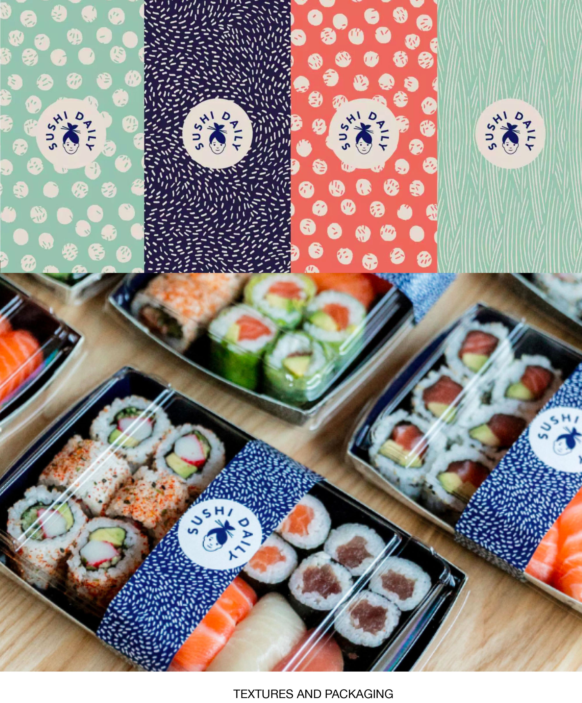
Another unique brand element is the use of indigo blue, rather than black, which is traditional in most sushi packaging. Blue communicates freshness and speaks of the sea, plus it is culturally appropriate to Japanese culture while showcasing the food well. Beige and salmon-pink are also part of the system, as is a textured pattern that resembles grains of rice.

Read and see more details here.