The word "trend" seems to raise the little hairs on the back of some designers' necks. Everybody wants to be a you-know-what-setter; no one wants to acknowledge the aftermath. But as we march toward LogoLounge.com's fifth anniversary, we've discovered that trends have become something impossible - and maybe unwise - to ignore.
With 20,000 logos now on the website, and with the ability to watch the switches and sways of creativity as it reveals itself through a real-time compendium of identities all over the world, we have learned that noting trends is not so much like reporting history as it is considering what might be next. Trends are not an accusation of some widespread lack of original thinking. Instead, they are a sign of design evolution in our ever-shrinking world.
Think of them as confirmation that designers are excellent thermometers/barometers of human thinking the world-round. That there are corollaries should be no surprise. So we note trends with these caveats:
- Are these trends on the way in or the way out? We do not presume to suggest one or the other.
- Do trends tell you where to go or, conversely, where not to go? Again, that is for you to decide.
Consider the following 15 trends. Visit LogoLounge.com where you can review trends from the past several years; in real-time, post logo design work; study the work of others; search the database by designer's name, client type and other attributes; learn from articles and news written expressly for and about logo designers; and much more. (Also, Books I and II are on bookstore shelves; possible submissions for Book III are being accepted now. Go to LogoLounge.com for more information.)
Discover new directions. But remember: With any trend, it is better to realize how you arrived than to know you have arrived.
01 | Logo Trend
Folly Stars
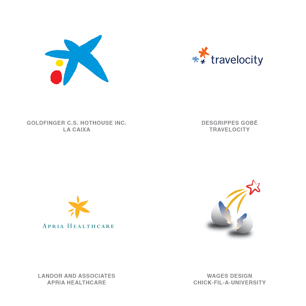
The star has always been a foundation stone of logo design, rife with symbology that varies from jingoistic federalism to quality and celestial guidance. No less important today, the star has literally taken on a life of its own as it starts to shed its strict geometry for arms and legs and wings. The shape has had a transfusion of personality and imperfection, so that it now rivals any human. This generation is much more approachable, while maintaining the same symbolic pedigree of its ancestors.
02 | Logo Trend
Amalgams
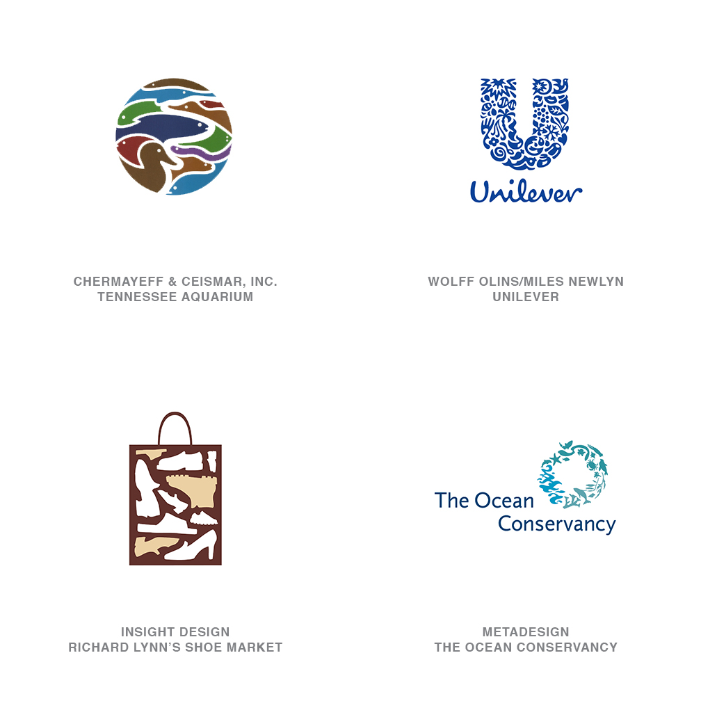
These assemblies of diverse elements may credit their throwback to Pierre Bernard's logo for the Parcs Nationaux de France (French National Parks), a seminal mark based on a Fibonacci spiral crafted from the silhouettes of every piece of flora and fauna in the parks. Miles Newlyn, working with Wolff Olins, has managed to build an equally enchanting logo for Unilever. This trend bucks the notion of assembling everything known about an organization and boiling it down to a single image. Instead, the designer displays those ingredients so that every element is preserved and displayed in an arrangement that takes on an additional layer of meaning more replete than any individual component alone. The detail of these logos can become as addictive as a good puzzle or flavorful pasta sauce.
03 | Logo Trend
Blow Out
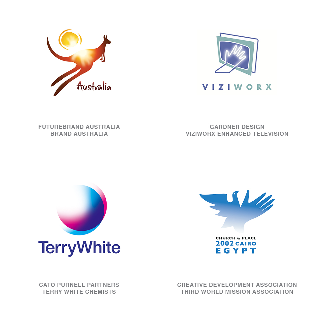
I still cheer every time I see a logo successfully chip away at the tenets of traditional logo design. This trend is one such rebel. It stands up and proclaims, "To hell with vectored edges!" This group is beautifully crafted. The shape is formed, but then a 5,000-watt krypton bulb blows out the mark's critical edges. The nerve to build an implied aura in a flat world is rewarded when the design calls for it. Melbourne's FutureBrand Australia could have captured a continent with a bounding kangaroo and sun, but they sealed the deal for adventurers and sun worshippers worldwide by welding a solar flare right into the viewers mind.
04 | Logo Trend
CMYK
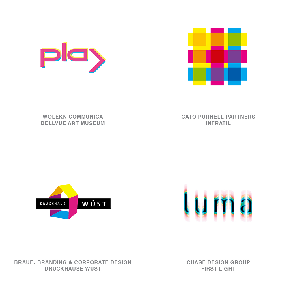
For years, cyan, magenta, yellow and black have been designer-speak in developing identities for printing and color houses. So when did these primary colors of the print world enter the vocabulary of the real world? When digital printers became cheaper than the inks you load in them. CMYK soon became the building blocks of a visually literate society. These base colors, spurned as long-time restrictions by designers, suddenly became the novel darlings of consumers. To explain a concept, knock it down to its basic elements: Suddenly, CMYK is a fresh tool that a savvy public understands.
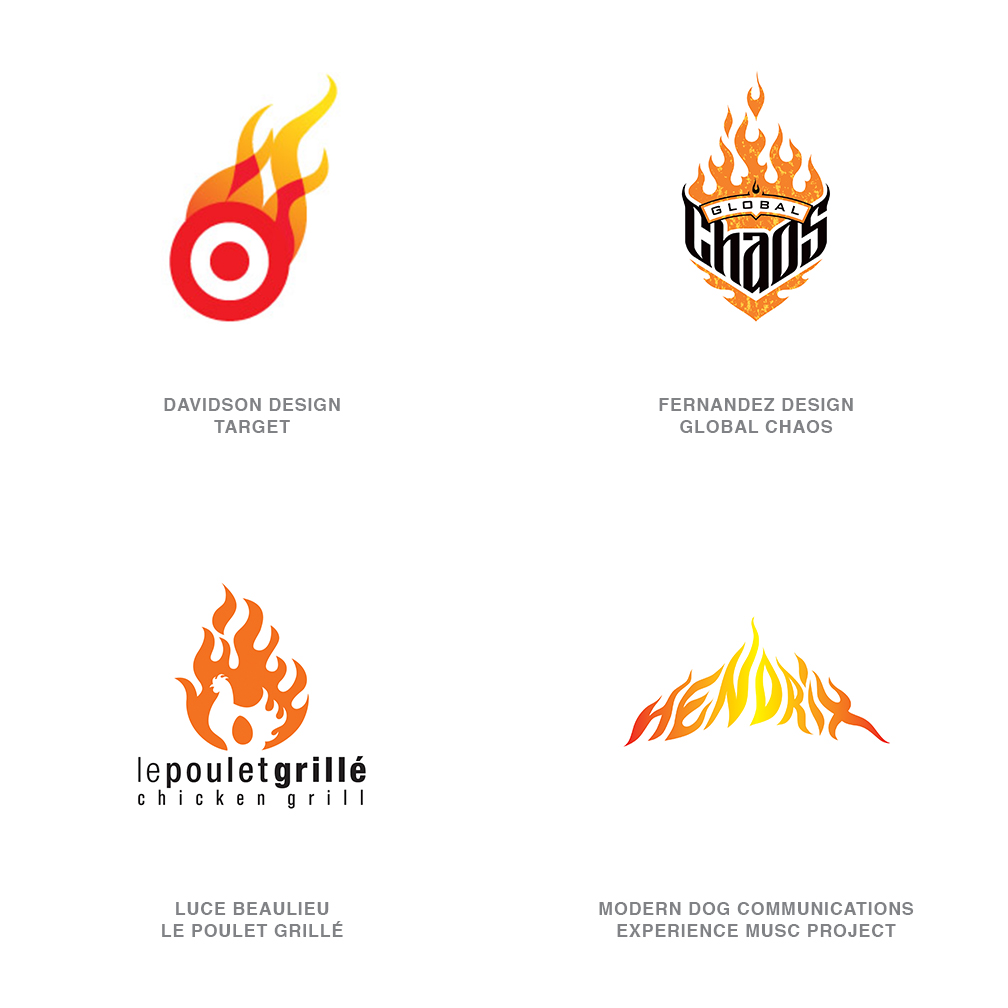
05 | Logo Trend
Flames
Though tiresome to many, fire is one of the elements of nature, and flames aren't going away soon. Want to confirm this? Turn on your TV and count the number of custom biker/motor/auto/monster/pimp-my-ride-shows spread across networks as diverse as Discovery, MTV and ESPN. Customization has become an industry, and good pin-strippers sign autographs. These guys can tell us there are traditional flames, fast flames, California flames, tribal flames and more. We still associate flames with heat, speed and vanilla rebellion, and as long as there are fast bad-boy clients, designers will be painting their licks.
06 | Logo Trend
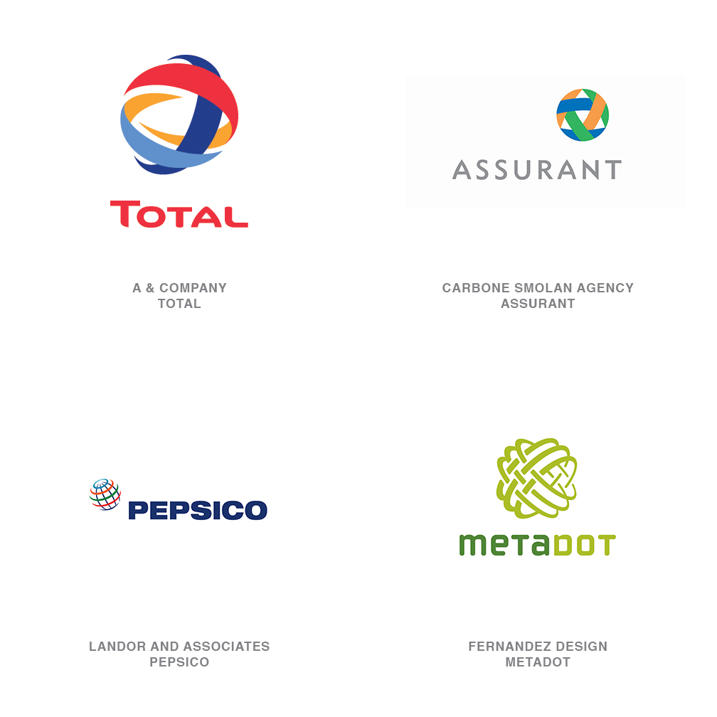
Wicker Balls
Globes continue to be a popular solution to represent the international affairs of a corporation, though I typically wince at a globe solution when it's the only tale a company has to tell. These solutions, on the other hand, can take on a degree of elegance and often represent the strength and complexity of the organization bonded by the woven layers. The French A & Company, for example, was masterful at combining the flagship colors of Total, Fina and Elf to help represent the merger of these three European petroleum giants.
07 | Logo Trend
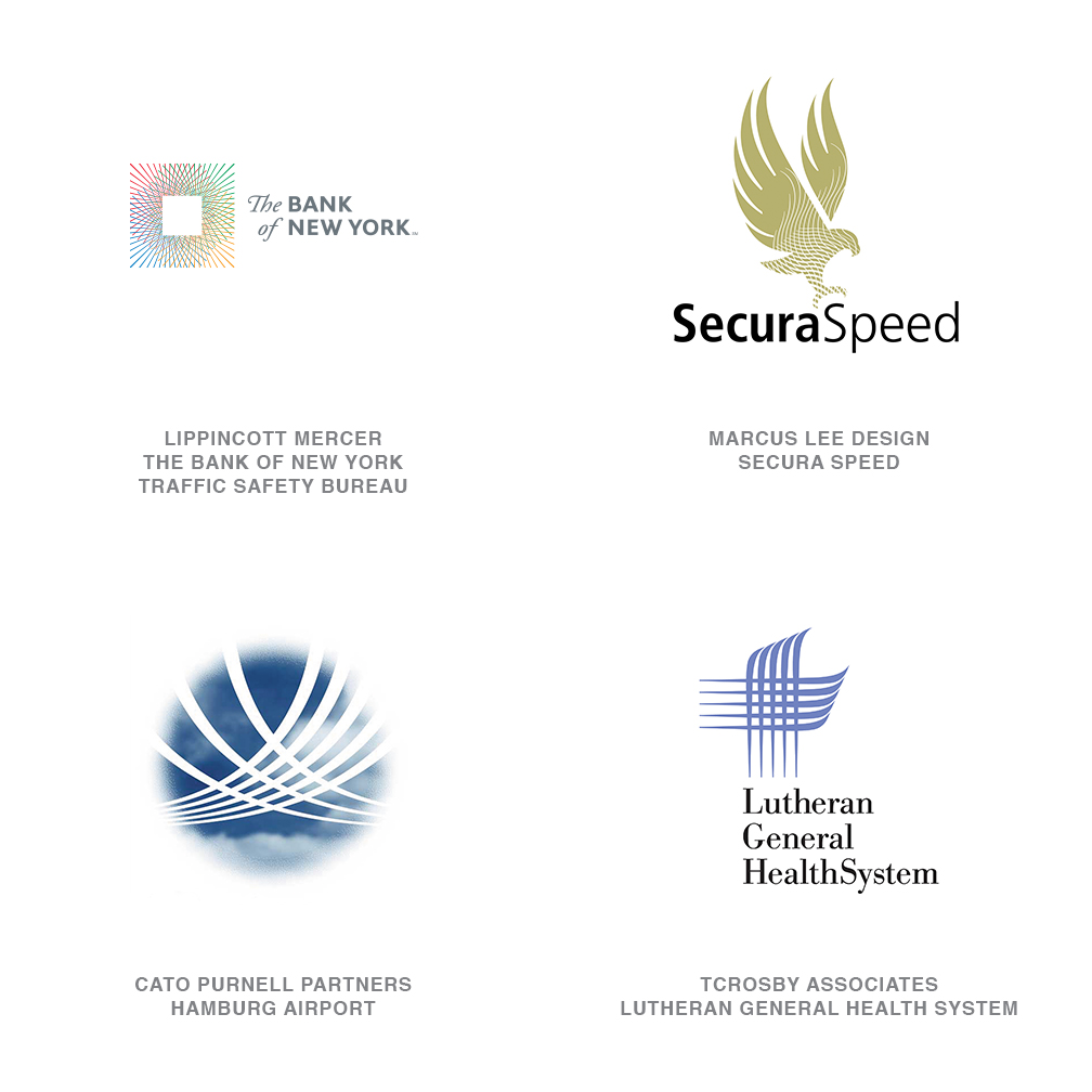
Weaves
A thread is just thread, but when woven together properly, the fibers become fabric. This is not too far from the premise of these logos. The deft weaving of linear elements brings intrinsic value and substance to the marks, and the interlocking lines add strength. This repetition creates rhythm which helps the eye complete the image. There is a certain refinement conveyed by the intricacy that goes unspoken. Lippincott Mercer takes this approach with its new identity for The Bank of New York, cleverly adopting the fine, engraved lines of international currency and financial documents to evoke the firm's global services.
08 | Logo Trend
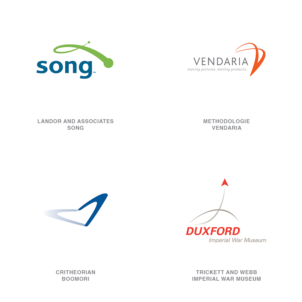
Whips
Gliding through the air from point A to point B, these logos may well be a genetic off-shoot of the dreaded "swoosh." Linear in form, whips arc through the air with a sense of destination in mind and seldom are they affected by gravity. Unlike the swoosh, which appears to be in infinite orbit, these logos show a definite start and stop. Landor's recent identity for Delta Airline's low-fare carrier Song portrays a bit of a playful nature as well. In an industry where the giant carriers must make a big statement, Song doesn't have to.
09 | Logo Trend
Puffies
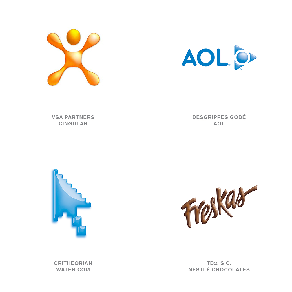
Different from their crystal-capped sisters (like the new UPS logo or John Deere), these logos have been pneumatically inflated to 33psi like pool float toys. Yes, they break the traditional logo rules with gradients, but, technically, we've overcome many of the production issues that used to give shading a bad name. Much like the complete suite of Microsoft Office logos that drift around our desktop, these logos draw your attention regardless of your personal persuasion. Three-dimensional logos will continue to thrive in a two-dimensional world. The good news is you won't hurt yourself if you accidentally fall on one.
10 | Logo Trend
Line Dots
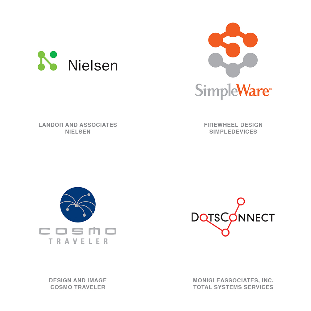
These seem to be everywhere, with many permutations. Often technical in application, they remind us of molecular structure, atomic particles, circuitry boards and dot-to-dot connectivity. It is a language that is packed with symbolism, highly malleable, and is as adaptable as a can of Tinker Toys. It is also quickly on the verge of saturation. The Nielson logo by Landor was early to this trend, and it is as succinct and economical a stroke as you can get.
11 | Logo Trend
Good Drops
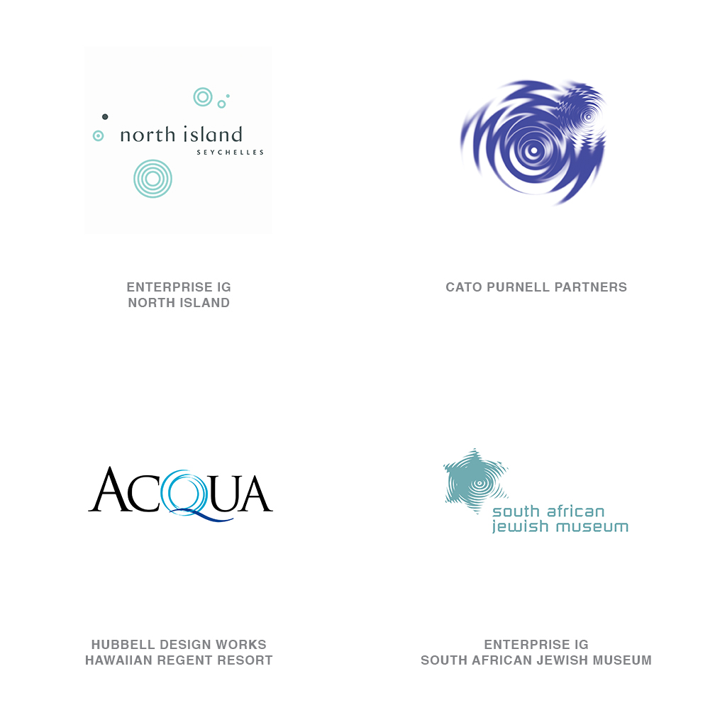
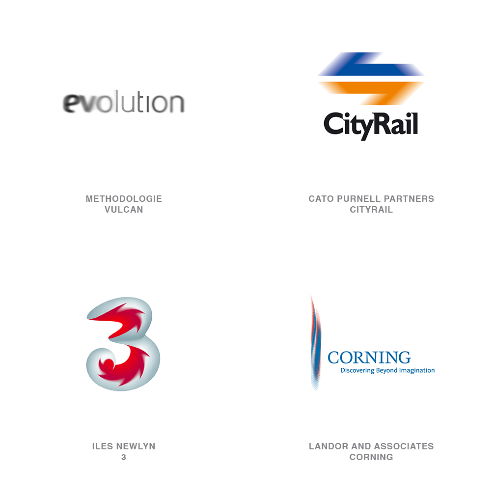
Let this serve as a notice that you can squeeze blood out of a turnip. Logos using water ripples continue to flow like there's no shutting off the tap. When it appears that every iteration of a concept has been laid to rest, a clever designer somewhere pulls out an unexpected twist on the game. Suddenly, you're found staring at a previously unvisited solution. Cato Purnell Partners' logo for the Australian Academy of Design @ Docklands makes an inventive use of the pool of ripples unlike any other. Look at Budweiser beer's drop crown. This well is deeper than it appears.
12 | Logo Trend
Leaf Life
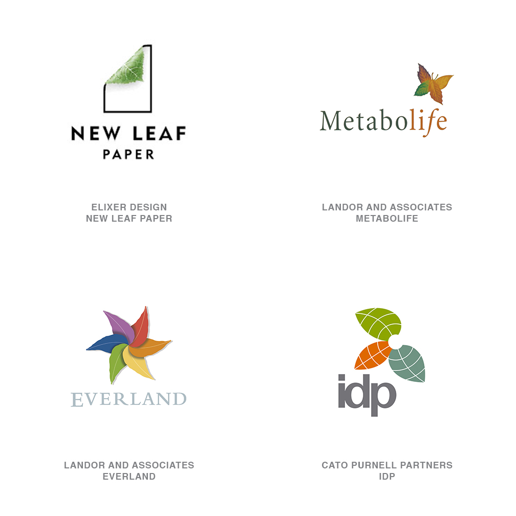
As ecological issues remain topical, the leaf will continue to be an iconic element in green design. Leaves are also being cast as bit players in more visual identities. They are certainly chameleon-like, with an incredibly broad range: A leaf can represent birth and death, a cycle of life, natural solutions, sun and shade, food and nutrition, beauty, growth and more. Because the physical appearance of leaves vary dramatically, designers are able to manipulate their form to suit their demands.
13 | Logo Trend
Blur
TAgain, the logos that stand out are often those that are willing to thumb their nose at convention. The idea of motion is certainly not new to logos. Robert Miles Runyon spawned a world of followers with his stars in motion logo for the Los Angeles Olympics in 1984. Technically, our capabilities no longer force us to show cartoon streaks to convey a concept. These logos reflect a more natural interpretation of the concept of motion. This is done in an engaging "made you look twice" format that demands a response. Others in this class play with your focus: Take, for instance, the Evolution logo, the new identities for Abbey International or the TATE in Britain.
14 | Logo Trend
Swirlys
Inspired by ornate pictorial calligraphy from the Victorian era, or perhaps more recently by the charming illustration of Elvis Swift, designers have become more enamored with the rhythmic flow of the pen. This style merges Spenserian script and the humanity of the hand-drawn line to ratchet up the elegance quotient. For the well-crafted marks of this genre, there is a lightness that comes from more white space than line work.
15 | Logo Trend
Hot Dogs
A disconnected group of round-tipped line segments sit, stand and roll over to form these logos. Though you might be tempted to call these "jimmies" or "sprinkles" - the decorations on a tricked-out cupcake - and despite Felix Sockwell's insistence we call this category "candied," "hot dogs" probably rings true with more designers. These short segments can convey self-contained individualism and, when acting together, can also show the unity of common action. If ever the sum of the whole were greater than the individual pieces, you are looking at it.
Minor Trends
In addition to noting these trends, it is also helpful to take a look back at trends noted by LogoLounge.com in the past several years to gain more perspective. All of the following are past trends that seem to still have plenty of forward momentum.
- Droplets are still everywhere. The new Bahamas' logo is an extended version of this notion of drops that merge or almost merge. There is a fluidity and motion to all of these marks. This year's Line Dots may be the next step in this exploration.
- Natural Spirals and Cave Rings, noted in 2002 and 2003, respectively, blend geometry and the natural world, much as a spiral seashell does.
- The Human Touch, noted several years running, is still very necessary in our scary world. A logo that looks handmade, such as this forecast's collection of Folly Stars, still has special appeal.
- It's still good to be Green. Even entities who are not especially ecologically-minded like to believe themselves to be.
- The forward motion of Slinky-like logos is still evident, too. A sister to this year's whip trend, logos with this notion seem to want to suggest progression.
- Photoshop continues to be an irresistible enchantress, especially with Glassine effects. Highlighting flat surfaces has been moved up a notch with candied and Puffy.
- Dialog Boxes are still incredibly strong, and some are very well done, indeed, such as OPEN's new Bravo logo.
- Particle Fields are coming together over and over, but in new and even more interesting ways. Witness the 2006 Torino Winter Games logo by Husmann Benincasa.
- Transparency and Prism: As production and printing processes become increasingly sophisticated and affordable, Transparency and Prism effects are being explored more.
- This year's CMYK trend is a natural outgrowth.
- This year's Blow-out and Blur are breaking the same rules as Transparency does.
Follow the trends.
Logo design in your inbox. Subscribe to our monthly newsletter for the latest from LogoLounge.