Each year, as I browse through thousands of logos in preparation for the annual Trend Report, I can’t help but consider the societal, technological and environmental influences and how they will affect the future of our industry. This year, three thoughts occurred to me.
One.
Now more than ever, perhaps because they make up a majority of the world’s early adapters and drivers of trends, we look to children and adolescents for insight into what will become the next big thing.
We’ve known for some time, and I addressed in last year’s Trend Report, that the size of our digital viewing ports I understand the layman calls them screens continues to get smaller and smaller. And a recent Pew Research Center report indicates that 91 percent of teenagers access information online through mobile devices. So if we are paying attention to this demographic, as history tells us we should, it’s no wonder that designs continue to bend to the parameters of small, mobile canvases. And need I mention the affect devices such as the Apple Watch will have this phenomenon?
And for those of you thinking, “On the contrary Bill, the iPhone 6+ and monstrous Galaxy W (seriously, that thing is bigger than my toaster) suggest that the pendulum is swinging back the other way toward larger screens,” I ask you to consider the latest TV models that, while the size of small cars, also incorporate these new symbols and icons into their user interfaces.
So as we toil to conform to these new parameters, designers are developing a new set of iconography, and the adolescents, children, even infants of today are experiencing a very different visual dynamic than generations before them.
For example, a cloud has a different meaning today than a decade ago. Depending on the setting and context, a teenager is likely to look at a cloud icon and think first of data storage rather than rain. Three curved lines stacked on top of or next to one another no longer conjure thoughts of rainbows, but of communication, or more specifically that WiFi is available. Even a hamburger icon has been simplified and given new meaning (hint: it has nothing to do with food).
Because the world continues to be reduced to symbols, our communication will become more icon-based resulting in more common iconography that can cross language barriers. Those ancient Egyptians may have been on to something.
So, back to design; what do these icons have in common? The mono-line. The mono-line is becoming reflective of how you simplify something iconologically, because it’s simply more legible and consistent in small areas. It’s adaptable and, frankly, it works.
But when I look over the enormous amount of mono-line logos and icons in circulation today, I’m reminded of past trends, such as the stripe logos in the 1980s. The two seminal logos that launched a thousand stripes the “stars in motion” 1984 Summer Olympics logo and Saul Bass’ AT&T logo were fantastic designs at the time, but the concept was so overused in the years following that they now have a dated appearance.
So, my prediction is that the airy, open, consistent mono-line solution will eventually be so ubiquitous and overused that it will begin to seem dated, possibly becoming the “mauve” of the 2010-2019 decade. In fact, we’re already seeing designers coloring in between the mono-lines to add surface back into the design, so we come full circle once again.
Consideration for the future: more symbols are being born every day, so what will the symbol be for 3-D printing? More on that to come.
Two.
Everyone has an opinion > everyone’s a critic > everyone’s an expert. This trajectory used to relate only to words and ideas, but with the abundance of visual corkboards (ahem, Pinterest) and how-to resources, the world is becoming more visually opinionated.
The good news is that people are embracing creativity and are interested in design, and this generation will be more visually astute and capable of forming their own pathways.
As well, the popularity of life hacks and sustainable practices that have grown out of reactions to some very stark realizations of the world we live in have contributed to this culture of doing it yourself. As a result, we are embracing imperfections and seeking proof of the human touch in design.
And I’m particularly encouraged by this possibility: the design field has historically been dominated by the male gender, but digital visual outlets like Pinterest and Instagram are dominated by the female gender. Let’s hope that interest will manifest itself into more women participating in design-oriented fields.
On the flip side (you knew it was coming), the people who are gaining enthusiasm for design and taking matters into their own hands often aren’t gaining the talent and learning the skills necessary to create successful designs or move the industry forward.
These “design tourists” may be able to find or buy the pre-designed parts and pieces, even design a few of their own, to create a logo. But they don’t know how they got to where they are or what it says about their brand, resulting in a lot of “Monet” designs that look good from a distance but are a bit messy up close. They can create a pretty picture, but it may have little function beyond looking pretty, and forget about applying it appropriately and consistently across multiple applications.
Skilled designers understand the objective nature of design, not just the subjective view. Objective gains are what make a brand successful.
Three.
Versatility or nothing.
I mentioned 3-D printing previously in this article, which can be added to the list of innovations that begin as novelties until more practical uses are identified and enough interest and funding emerge to help the technology evolve. Think Beta vs. VHS, then DVD vs. BluRay. And how many of us installed one of those massive satellites in our back yard, or fantasized about doing so, before the smaller roof-top models surfaced? Every day, innovators are imagining and developing practical uses for 3-D printing, and now that it’s becoming more mainstream, there will be an immediate need for 3-D design, as well as a consistent icon for 3-D printers. The challenge is that the 3-D icon contenders developed today have a good chance of appearing dated in very little time, because the device we are using today will likely look very different in the future.
With such a wide range of screen sizes on the market, we’re also seeing more responsive logos and design components. And as the need for versatility continues to drive design trends, we will see responsive design become an additive and subtractive process, rather than simply rescaling and rearranging the components.
Then, we’ll take those two ideas, throw them together in a blender and make a motion logo smoothie. A 3-D image, achieved by adding movement to a logo, allows viewers to see all sides and angles, and allows designers to build more robust messaging into their designs. And as device-agnostic coding becomes more customary, the motion logo might automatically take on a new set of gymnastics when viewed on devices of varying sizes.
Logo designers have historically taken cues from illustrators, looking for styles that can migrate into condensed visual solutions. I see that occurring even more frequently as we look for inspiration to develop these experimental and expansive designs.
Honorable Mention Trends
- Bar graphs these rectangles of varying heights and colors may indicate that your client places emphasis on measurement, movement or sound, which is a nice alternative to the communication rainbows.
- Tubes think of a hemroid donut. I agree. This attempt at multi-dimensional design can go away.
- Boomerangs your customers may go away, but they’ll come back! Not if your clients’ offerings are as lightweight as these logos. There’s just too little mass for these solutions to stand on their own.
- Twisted could be a rope, could be a DNA strand. These logos combine the strength of individual fibers to create a more solid form. Projected messages may include integration, activity, bonds and interconnectivity.
- Test bars I still can hear the accompanying sound ... beeeeeeeeep. Video production test bars are being worked into all sorts of shapes, from letters of the alphabet to 3-D boxes. These are becoming the universal sign for “video made here.”
- Bisect digital table tents and mobile sculptures. Two or more planes slice through one another to create a multidimensional shape. Architects love these and their quick transition to 3-D applications makes them a favorite of designers too.
- Slash and backslash marks is there more to follow as in a URL? Or are we simply bored with using the pipe character to create separation?
- Hops = beer. Need I say more?
- Also: anchors, rabbits, foxes, corkscrews and movie cameras.
A final thought: this report is intended to bring awareness to what is happening in the identity design field. Be educated by this, stand on the shoulders of others to advance our industry, but please do not consider this report a suggestion of what your next project should look like. So without further ado ...
01 | Logo Trend
Dot Tip
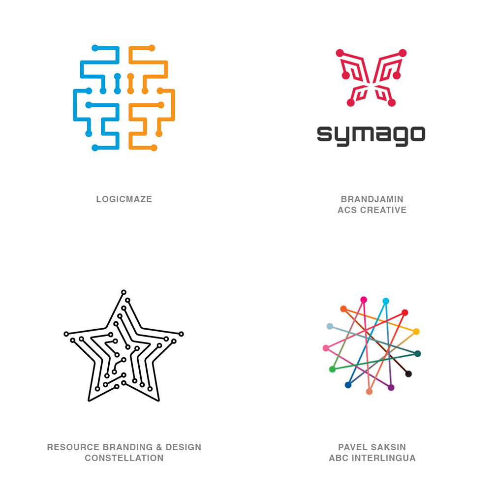
For anyone who has ever expressed a fear of injury from falling on a logo with sharp ends, this group has allayed the danger by safety tipping each pointy offender. Possibly as an attempt to move the mono-line trend forward yet another step, the additions of balls or circles bring closure and add additional weight to designs crafted wholly from lines. There is a nod to science by referencing digital terminals with these, though that is becoming a pretty dated symbol in a world that is reliant on more advanced technology.
Possibly a reference to connect the dot puzzles is more likely. Without the line work, the series of points represents a challenge and the connecting segments provide a solution. Line work on these can still become busy and needs to be minimal to keep the message from becoming too complicated, but it can allude to a pathway or process that helps link disparate points to achieve an effective end. Still, looking at these is reminiscent of a shoe store clerk’s inventive efforts at devising a solution for lacing up footwear with a few too many eyelets.
02 | Logo Trend
Contours
Designers set on finding a hybrid between simple one-color iconic symbols and a more complex descriptive illustrative mark have landed on a solution. Replete with gradation and contours, highlights and shadow, yet limited detail to keep the marks just on this side of simplistic. Generally, the mark’s iconic outline serves up enough information to complete the messaging when presented at a smaller scale. A closer evaluation or larger presentation reveals subtle volume delineation that creates a tactile temptation for the consumer.
This is just the amount of visual eye candy necessary to lift the logo from a page and create a point of optic differentiation. Some designers might view this technique as a bit to tricky for their liking but time will prove one group or the other right in the end. Although these solutions require halftone and gradation they still convey an economical one-color essence to the public eye. Let’s credit the design direction as moving the conversation forward with solutions that are to the point and not burdened with unnecessary detail.
03 | Logo Trend
Concentrak
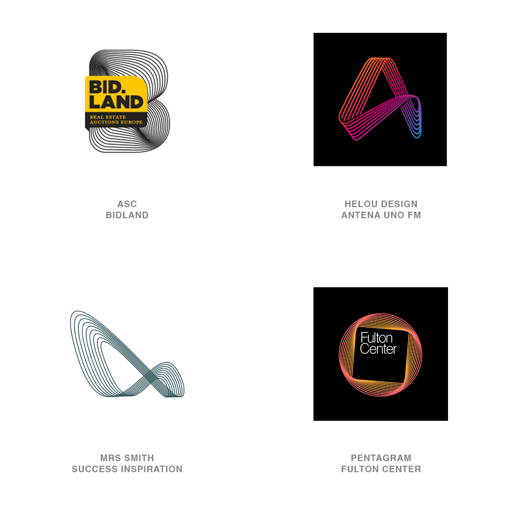
Pattern in any definition usually includes repetition of elements. That simple fact makes pattern an important component in logo design. It allows a viewer to mentally complete a picture with only partial information. Seeing just part of a checkerboard is enough for us to assume the balance of the missing board will also be covered with a continuing checked pattern. The concentric linear elements of these marks accomplish several fundamental tasks, including pattern recognition, but also allowing lines to volumize and fill space. They are at once massive and bold, yet delicate and fragile.
Bands of lines, often in a loop formation, twist in space to create a rhythmic story to best represent the client. There is elegance to these solutions that seems to flow effortlessly and typically reconnect back to their origin, although not imperative. Played out against a dark background these logos are often packed with high-chroma color and can radiate like neon. It’s also not uncommon to see a gradation in the color to convey an additional message of shift or change as it relates to the entity it represents. This dynamic string art design surged in popularity better than a decade ago but it is seeing a renewed interest with the acceptance of fine line work in identity design.
04 | Logo Trend
Sparkle
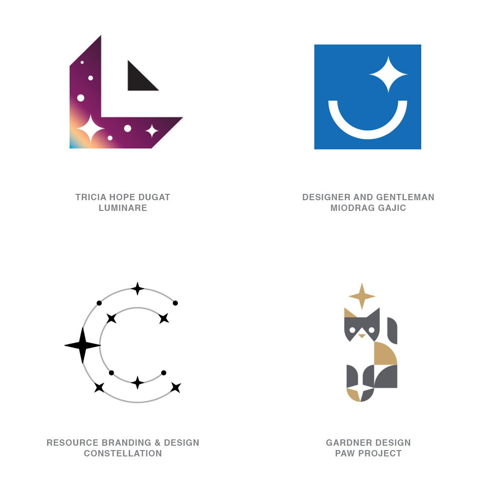
Shifting the perception of a ubiquitous device can be an arduous task and one from which designers tend to shy away. After all, we trade on the public’s preconceptions regarding symbolic devices. A five-pointed star may evoke nationalism to a major part of the world’s population. That same single star could mean a sub-superior movie or a superior grade on a class assignment. Religious connotations also abound for five- and six-pointed stars. The more polarizing and diverse the symbolism, the more gently designers tread on the celestial minefield. Scrape the meaning and hit re-start on an old friend the four-pointed star, or the proverbial icon for “bling.”
Certainly not a new icon, but one that is on a rocketing resurgence. The four-pointed star is being refitted and reintroduced with a less divisive host of symbolism. Let’s start by acknowledging it’s a happy star, as things that glitter, sparkle and twinkle go. Do note that this same star can be crafted from four semicircles or from eight flat line segments, and both are relatively interchangeable without a shift in meaning. The four-point lens flair effect probably is a more logical representation of a celestial star than a five-pointed star ever will be. It is something to be admired, is still symbolic of good, and frankly, it just brings some pleasant graphic relief.
05 | Logo Trend
Pick-Up Sticks
Randomness is an interesting concept that a definition will tell you lacks pattern or predictability. Though repeatedly dropping a fist full of pick-up-sticks will never create the same order twice, it nonetheless will create the same appearance each time. Or in other words a predictable pattern we will call random. What does chaos bring to the table for a designer? It provides a surface that is untamed and represents a consistency of idea that honors the unexpected. Lines are woven together like so many fiberglass strands and are equally as strong because of their unpredictability.
Because of the accidental arrangement, it might reflect the patterns in nature like a woven birds nest or so many pine needles on the floor of a forest. Maybe these remind us of a mud bank that is dried and cracked, or the arbitrary cobweb. All are patterns with a purpose but a dash of mystique as well. Man too weaves these patterns with roads and paths, and with air routes and sea-lanes. Possibly the most compelling reasons for utilizing this in a logo is its confrontational nature. Humans love order and serving up the antithesis guarantees a thoughtful encounter.
06 | Logo Trend
Coloring
It seems only right that as designers focused on mono-line identity solutions look to suck every last breath from the technique, they ultimately would circle back to injecting fields of color. After all, a field of color is the antithesis to the objective of mono-line solutions that rely only on lines to define their subject. This is a natural progression that will stunt the creative juices of designer’s children who’d previously been admonished for NOT coloring outside the lines. All that said, these are really beautiful solutions that maintain a contemporary aesthetic. They manage to hybrid a relevant technique with some nostalgic coloring book skills and a smart limited palette.
This is probably the opportunity to discuss trend evolution. In design, this process has jumped to hyper speed due to the ease of access to the work of other designers. Trends can pop up and vaporize in a week, or they can build traction, morph and linger for years. This report is about identifying trends, not to be copied, but to allow you to lift them forward. Mono-line logos of every iteration have made steady inroads for the last five years or so. This particular trend of coloring is one more variant and it may be the end of a line or it could be the nucleus of an entirely new trajectory. Regardless, designers in the future will look at mono-line logos of any ilk and quickly peg them as a child of this decade.
07 | Logo Trend
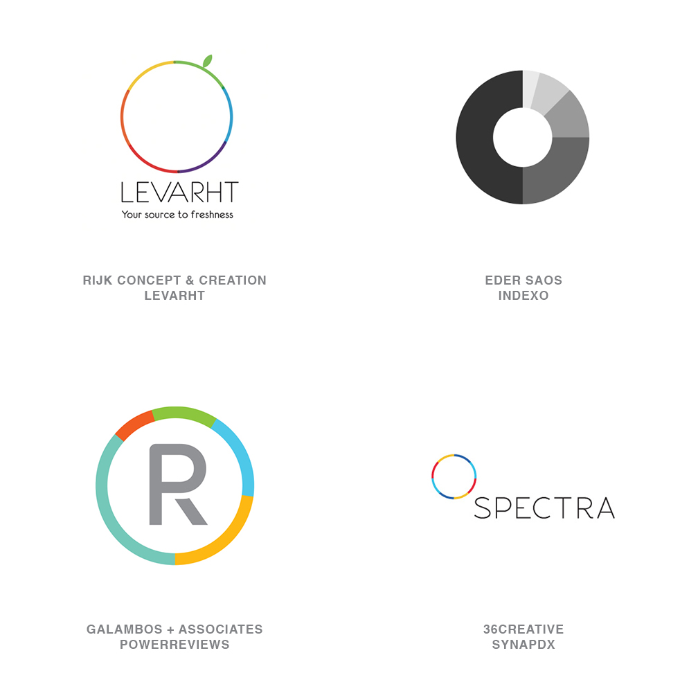
Circle Break
Imagine a pie chart so great that the middle has been eaten and all you’re left with is a really perfect ring of a crust with the same remnants of the colored wedges left on the perimeter. Occasionally there is a piece or two missing but the rim of a circle is always evident. The colored band areas may represent percentiles, or minutes on a clock, or some less orthodox representation, or they could just provide a decorative effect. An unbroken band like this has so many underlying meanings from continuity, to seamless process, to eternal perfection. The addition of a layer of significant color is just one more bonus message.
Though some of these marks resemble a rotating ring, such a ring has become one more iteration of the ubiquitous loading or as many read it, the “waiting” symbol. Yes, that is a process and we like to discuss process with a mark, but probably not one that leaves consumers adrift in a state of animated suspension. A more positive interpretation is a recognition of multiple parts assembling to work in unblemished unison. This is also a way to introduce some intense color in such moderation that it avoids becoming a garish chroma spectacle.
08 | Logo Trend
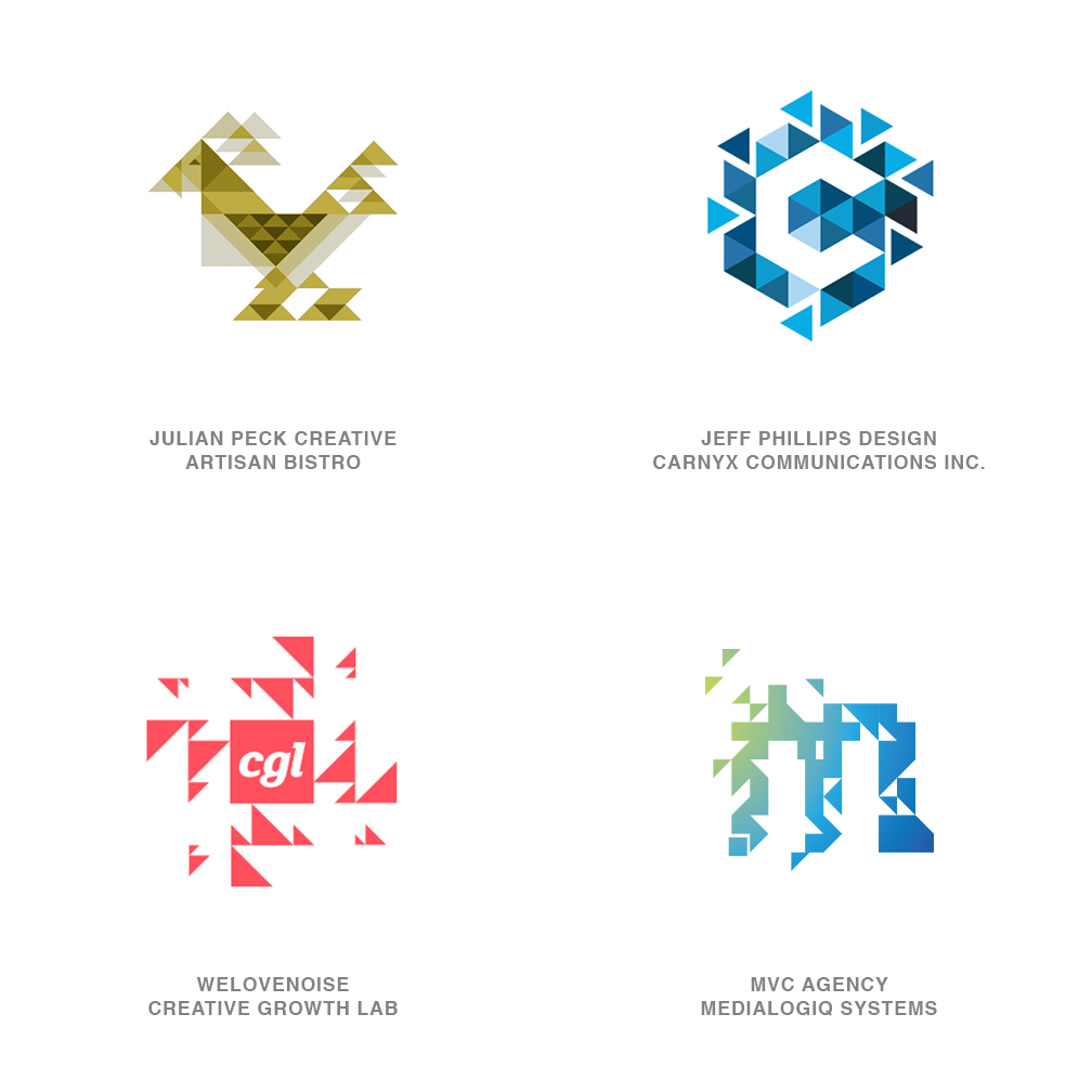
Trixelate
Obviously the offspring of what happens when a triangle and a pixel hook-up. But not just a solid field of homogeneously consistent triangles. Full of diverse scale and with floating pieces that portray motion and the story of process. These marks are either equilateral or right triangles, but not both in a single mark. They demonstrate a scientific quality and technology, much as a pixel would, but with a much more aggressive feel with sharp points jockeying for a place to land. Almost like peering another layer deep into a field of pixels and discovering their molecular make-up is actually the triangle.
These represent entities that understand the story of the whole being greater than the sum of the parts. Or a company that uses building blocks in a strategic plan of growth. Much as a tangram puzzle allows the player to create images from triangle parts, there is an almost game like quality to these marks. Note that some use transparency to allow for overlay while others allow for a general gradient to wash over the full logo. Others are a solid color, and in some, the color family is singular but of varied values. Despite the differences, all of these were born of the same DNA.
09 | Logo Trend
Photo
Those ascribing to traditional identity design tenets scrunch up their face and break into a cold sweat whenever a photographic image is interjected into a logo. You can literally see them squirm and then launch into a litany of challenges to this graphic taboo. Shake it off and embrace it. There is nothing new to using a photograph as we have reported in previous trend articles. In the past, these images have worked their way into a background, or an icon of a single image was used as a mark itself. This trend makes this report, as the last year has been a tipping point for the use of these images fully integrated into the identity vernacular.
A different generation of designers has unabashedly translated skill sets in Photoshop into part of their logo design toolkit. These marks are designed with the same symbolic language we might use in a traditional logo but using photo imagery instead of a graphic or a sketch. Images lift off the page and are often blended with other graphic components to complete the mark. Fusing of “real” and “graphic” elements can introduce wit and whimsy or they can be designed to show gritty reality and detail that is challenging to convey otherwise. Apprehensions be gone.
10 | Logo Trend
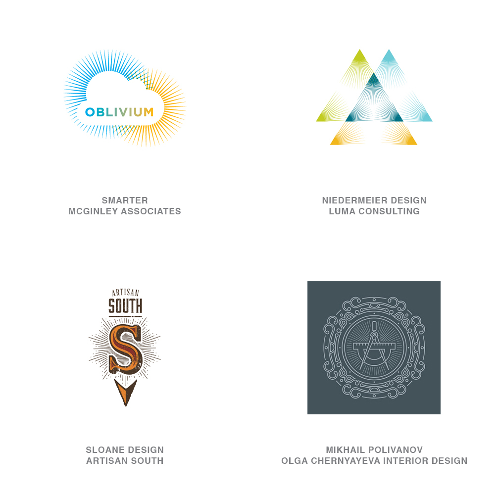
Rays
If it’s important, how do you make sure the world knows? If it’s an email, we go to all caps, or bold face it, or underline it, or maybe we even jump protocol and emphasize the drama by turning it RED with an exclamation point or three!!! Long before those options were available, the master painters and artisans created an ethereal radiance behind their subjects to indicate importance or a call for reverence. To demonstrate this in a graphic manner they used an array of vectors emanating from a central point. This created the effect of a glow that appeared to dissipate as it projected outward. A starburst if you will but generally crafted from mono-weight lines.
This year marked a dramatic bloom in the number of marks incorporating this technique. It may be an offshoot of a need to fill space with a single line weight decoration, but the diversity of application has been extraordinary. At a smaller scale the lines tend to soften down and provide a vector solution that starts to read as a subtle gradation. The merging of two of these nimbus elements can even be a unique way to establish a color blend as demonstrated in the Oblivium logo. Look for designers to investigate how various cultures have dealt with this effect as this technique is here for a spell.
11 | Logo Trend
Naive
Despite referring to these marks as naive they are about as simple as a fox. There is a renaissance of creating figural logos that have the spontaneity and whimsy of a child’s drawing with the insight and subtle design nuances of a mature rendering. The innocent nature of these solutions brings a smile to the mind. It assures us the product or the owners of the mark are not too full of themselves and likely have a sense of humor.
The handcrafted approaches on these bask in an attitude of anti-perfection that bridges to a large dollop of humanity. They demand a certain flaw to guarantee the human touch. Though these examples are black and white, the use of color is kept simple and as equally uncomplicated. Pattern and detail are important to this trend and help maintain that wide-eyed essence. So wide-eyed that a consumer might feel they too could pick up a pen and create a similar juvenile aesthetic. Practiced designers will recall Picasso once lamented it took him four years to paint like Raphael, but a lifetime to paint like a child.
12 | Logo Trend
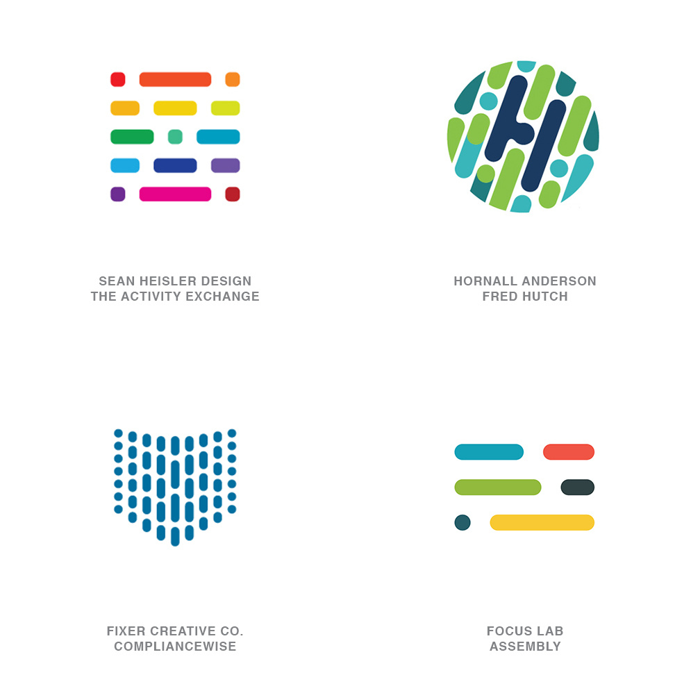
Coded
These marks are for the theorists that have forever believed identity designers are craftily inserting conspiratorial or hidden messages in their work. Assembled from Morse code like morsels, these logos will have pseudo cryptographers’ chomping at the bit to decipher. The truer story is that of many working together as one, demonstrated by a cadre of dots and dashes marching orderly in parallel lines to achieve a common objective. Generally these are seen on a single plain with various percentages of mortar to block combinations, interlocking with the same strength as a brick wall.
Most of these are comprised of elements with rounded or eased tips, though there are plenty with squared tips to be found as well. Color does not seem to be a deal breaker, since our sample logos range from monotone to full-on rainbow. The sequence of the elements conveys an air of a scientific nature, which can be a good fit for a client that trades in formulaic solutions. For the Fred Hutch Cancer Research Clinic, Hornall Anderson emphasized the researchers’ work with a microscope’s window to watch a series of active cells dividing, recombining, and doing their best impersonation of an initial H.
13 | Logo Trend
Chroma Coaster
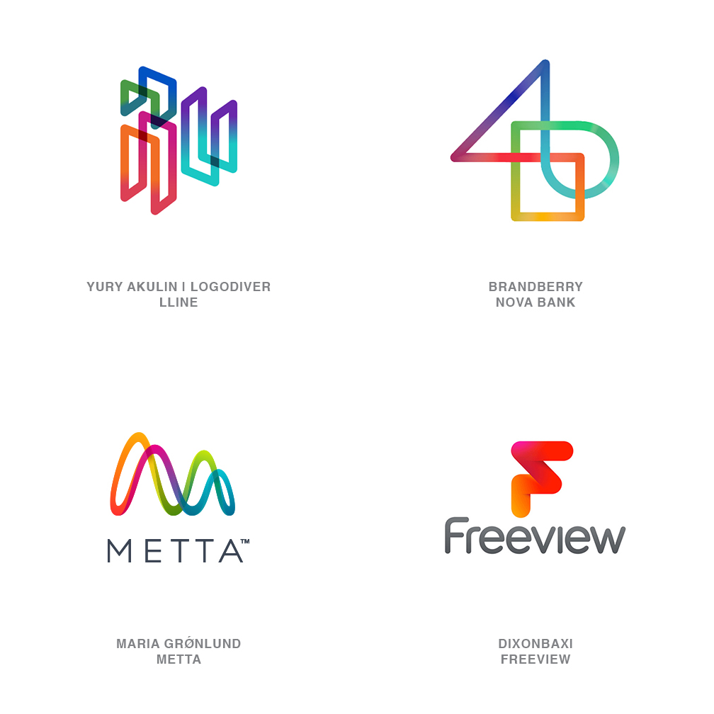
Using a single continuous line to swerve, tip and twist it’s way into a logo is a time-tested tool for designers. Quick and to the point these marks often rely on a line break or shadow at intersections to read well. Imagine any of these marks displayed in a solid color without transparencies and they would hardly capture your attention and could leave you perplexed. Enter the continuous gradation driven stream of hue changing color, coursing through their lineal vein, and a trend is born.
A bit like navigating a roller coaster spewing an ever-changing stream of high chroma plasma in its wake. Color can be transparent, opaque, or with shadows and highlights to convey a 3-D aspect to the mark. Whichever you chose, this demonstrates a trail or a pathway of discovery essential to a client process or consumer service. It moves the mark from a status of dormant to active. It coveys a level of vibrancy in activity and in thought. It might allude to shifts in culture, product or ethos. Either way, this vivid technique makes for a dramatic pop as designers search for ways to incorporate additional layers of information and brighten their solution.
14 | Logo Trend
Detail
A single thin line can be a beautiful thing to behold, unless it can’t hold it’s own when scaled down. As more monoline logos are crafted, designers are yearning for a way to add value and weight back into a mark. Without resorting to broad fields of tone, the solution is coming about with repetition and pattern hewn out of the same stroke weight and frankly multiplied to near excess.
Patterns may not be practical for viewing at smaller scales but still hold their own weight like the lines of an etching. Expand the scale of the mark and the line work blooms into a riot of decoration. Embellishment still possible without shifting line weight, but selected to enhance the mark by reflecting patterns of the culture, industry,or aesthetic. An homage to a Persian rug, a vintage label, indigenous textiles, or geometric motion each help define the skeleton of the marks shown here.
From the consumer’s perspective, the meticulous line work reflects an attention to detail they may hope to find in the entity it represents. Still composed of at least as much negative space as positive, these marks deliver an airy yet rich product that conveys a strong sense of awareness and craftsmanship.
15 | Logo Trend
Shaded
Shadows in real life come and go without a great deal of attention to them. They provide immense amounts of information to us that we absorb subconsciously to gauge distance, differentiate texture, identify light sources ,and generally keep someone from sneaking up on us from behind if the sun is at our back. Shadows and dimensional letterforms from a typographic perspective give us a chance to demonstrate substance, illicit drama or provide a bit of campy nostalgia to suggest just a few.
There’s absolutely nothing new about the use of the dimensional shadow, but designers are embracing the inclusion of this technique in record numbers and creating them using every conceivable iteration. Less the use of Long Shadows that the user interface designers have latched on to, and much more the graphic solutions that have no intention of fooling the public’s eye. Whether a single letter/monogram or a word or phrase, including a decorative return is akin to knighting a commoner and visually granting the graphic element a dominant role on a page full of bit players.
Follow the trends.
Logo design in your inbox. Subscribe to our monthly newsletter for the latest from LogoLounge.