Last year was brighter. This year is lighter.
Your humble servants at LogoLounge.com were called out by some after last year’s Trends Report on allegedly favoring brightly hued logos. In truth, though, like with all Trends Reports, we were objectively reporting what we saw. The color dial was certainly pegged.
For the 2011 report, our ninth, color is still prevalent, but tinted down. Where black has been used as the strong neutral, now brown or gray is in place. Blues and greens are softer, and pinks are starting to appear.
Other degrees of lightness: Shapes are airier, lifting off the page. Designs are rising out of their 2D resting places and suggesting that they would really like to go places. In some logos, line weights are slimmer. There’s plenty of transparency, too, as if light is now able to flow right through.
It feels like what people believe a logo to be is also becoming more transcendent. A logo is no longer a single piece of flat art. It can be a favicon, an icon, or an entire set of marks that work together to support the team. Its boundaries have become less strict as well. There was a time when most logos could be enclosed in a simple hand-drawn square, circle or similar geometric shape, but now many logos drag outside those outlines. They just don’t want to fit the old mold.
We also saw plenty of:
- Items related to wine—bottles, corks, glasses, corkscrews.
- Sticking with the light theme, lots of sunrises—or are they sunsets?
- For some curious reason, mortar and pestles, owls, and zebras (not in the same designs).
- Single-, double- or triple-line ribbons—almost like Chartpak tape of the 1970s—that run through letters and designs.
- What stood out most of all were trees (which incidentally is the most searched-for word on the LogoLounge site). There was also a hyper-resurgence of leaves, but leaves being used in really creative way: floating on water to represent stepping stones, celtic knots built out of leaves, a sculling team rowing a leaf-boat, the veins of which represent oars. Trees and leaves are not just used to represent sustainability/nature anymore, but the designs in which they are used do get the added perk of being basking in a pleasing ecological light.
The 2011 Trend Report
Every year, it’s worth noting that this is a report on trends, not a recipe book of styles. It is also not a finite list: There are other valid trends out there that are not mentioned here.
The report should serve you as an ongoing view of where logo design is headed. The word "trends" in itself can have a very negative cast, but in truth, trends aren’t bad. They reveal our growth. It’s our take on them that allows us to move even further forward.
01 | Logo Trend
Gradients
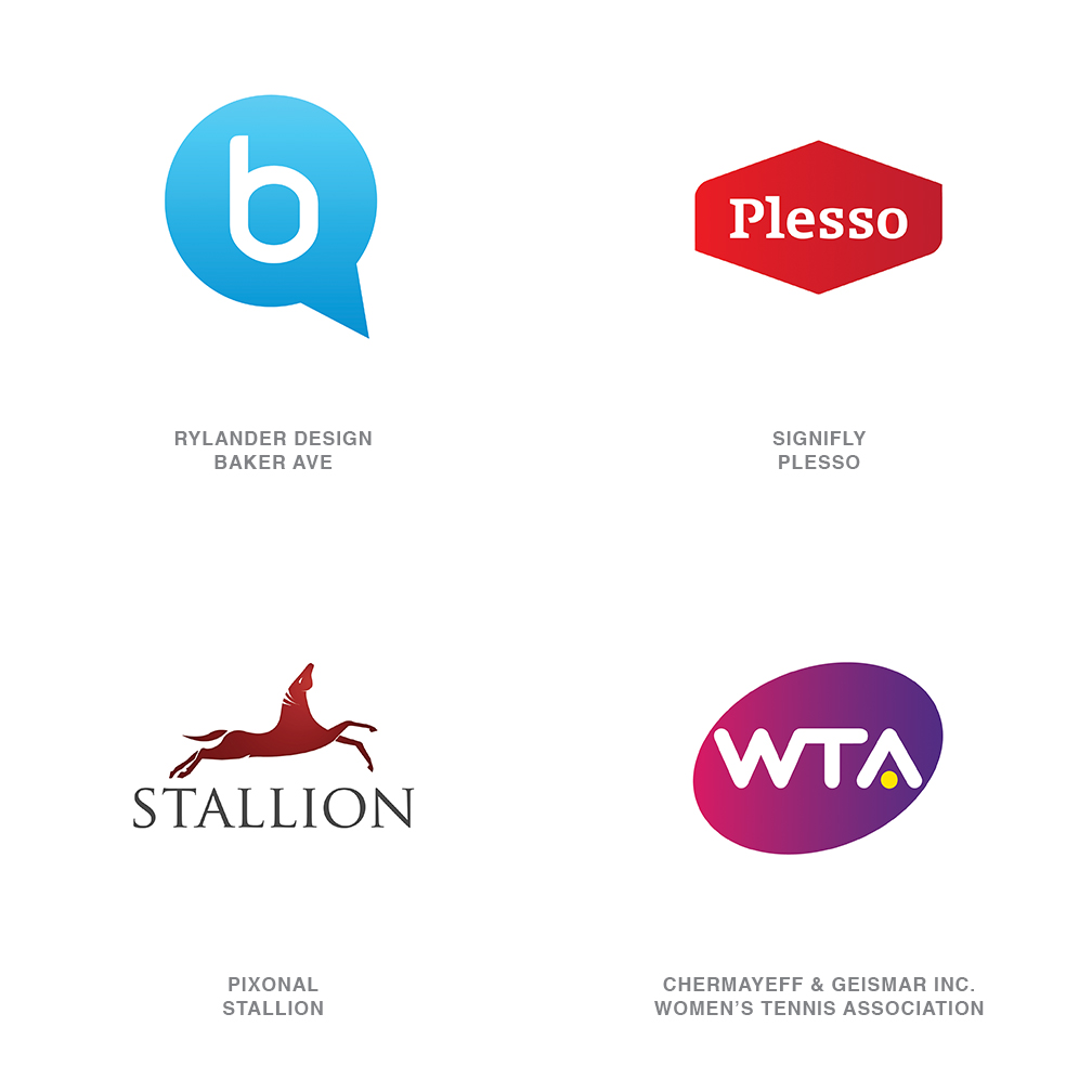
Not every trick in the designer’s palette has to be over the top: Subtlety can certainly play a role in the ongoing battle to capture the eye of the consumer. In a number of logo designs, a gentle linear gradation is taking hold—just a modest tweak to a flat, single color solution. The color gradation may be no more than a ten percent shift of color value, or it may be more dramatic, like Chermayeff & Geismar’s Women’s Tennis Association logo, which veers from a magenta to a deep violet
This direction allows designers to create a solution that visually coveys a message of motion or change in coloration but not through the vector shape or image. This is a continuation of trends identified over the last two years that have seen designers being more likely than ever to use the surface of a mark as an opportunity to introduce an additional statement.
From a technical perspective, this presents a formula and reproduction challenge that must be monitored. Simple linear gradations are notorious for shifting between platforms and file types. If monitored with vigilance, though, the rewards will exceed the grief.
02 | Logo Trend
Juvi
These are logos that look like Napster had his way with Hello Kitty: All are far too cute, with the smell of cigarettes on their breath. I believe we have seen this coming for some time, but this last year the trend reached a tipping point. Designers’ fascination with the social culture characters has lead to the adorable personification of the logo design industry’s output.
Society has become comfortable with the endorsement of anything bearing a smile. Gaming characters, Twitter birds, manga literature—all inundate a new generation. At every on screen pop-up, there is an opportunity to have your own mug shot translated into a two-dimensional avatar.
These aren’t just the cereal box advertising characters that coaxed a generation to the breakfast table. These logos are simple, often geometric and monoweight in line. Anticipate their audience to be tech savvy and relatively new to a paycheck.
03 | Logo Trend
Vibrate
What was a mark of poor printing craftsmanship for generations is now rearing it head to remind us of the medium. That slight misregister that caused visual vibration that could blind a reader halfway through a paragraph is now a confusing part of some logo specifications. Registration was once considered a CMYK printing issue only. Now the issue of focus is a part of the 3D movie experience when a patron removes his or her special glasses to wipe them clean of hot buttered fingerprints.
Either of these experiences reminds the consumer that there is a technical reason that great work looks great. These logos pull back the curtain to reveal the magic pre-primetime. There is no contesting their confrontational aspect. Much like an optical illusion demands, the consumer must give them a second look. But will the audience get the inside joke? The question may be, is the design mishap blatant enough to keep the consumer from simply believing that the designer was inept.
04 | Logo Trend
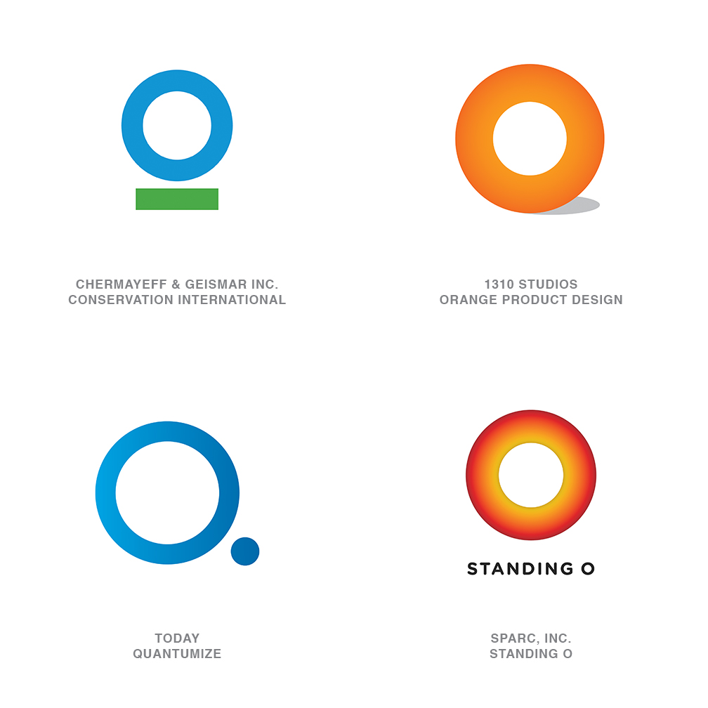
O
Yes, it’s an O! A veritable avalanche of full 360-degree, non-elliptical but very perfected, and thick as a cross-section of a suspect coronary artery logos are upon us. Kudos to each for finding some graphic differentiation through modification to its surface or supporting cast of shadows, bars, dot, stars, and stripes, and so on. As clean as these are, I am starting to miss a nice Bodoni O with a bit of line variance or maybe a forward-leaning italic O: With those, I know I’m looking at a letter and not just a vacuous circle. The difference between an O standing for something and a zero standing for nothing is slight indeed.
You would have to assume the Obama logo that was rightfully acclaimed for breaking ground and tradition in the realm of politics must share in the responsibility for this trend. As fresh as that mark was, its ubiquitous presence may end up accelerating the expiration date on followers. Consumers may well identify these similarities, leading you to ask: Will they believe there is an implied affinity between them, and will this influence their opinion of this entity?
05 | Logo Trend
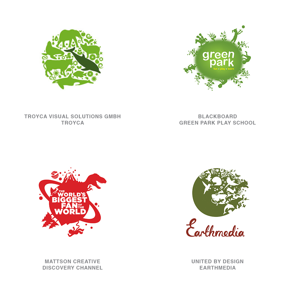
Earth
This is the solution for the client who wants to see his logo include everything on the Earth. Literally. Stylistically, this could certainly be broken into two categories: worlds with a perimeter populated by topical detail or worlds built out of topical detail. Since both variations have emerged simultaneously, we’ll treat them as the sustainability solution du jour. There is a certain whimsy about these logos, with their silhouette characters populating the orb like Gullivers in the land of the Lilliputians.
Part of the charm here is the dense amount of detail in a limited space. It starts to address the importance of our cohabitation and mutual respect as this big green cargo van is hurled round the sun. No attempt is made to define land mass or prime meridians, just a loosely round object with an exaggerated gravitational pull to keep its passengers on board. Minutia on a logo is generally avoided as it can vanish when scaled down, but this group seems to transcend this tenet by inviting the viewer to enter, magnifying glass in hand.
06 | Logo Trend
Monoline
An old rule of thumb to the socially adept was you can never be too rich or too thin. There is a certain elegance in an ultra-thin line, and this has never been lost on designers. Challenging as these may be on aging eyes, when designed well and not under-scaled, they will coax a pair of readers from the viewer’s pocket.
More than a few typographic marks have also picked up a spa membership in the last year. This is seen in script and in san serif display type. Note that in the type and illustration solutions, the line is not variable but rather a mono-weight.
07 | Logo Trend
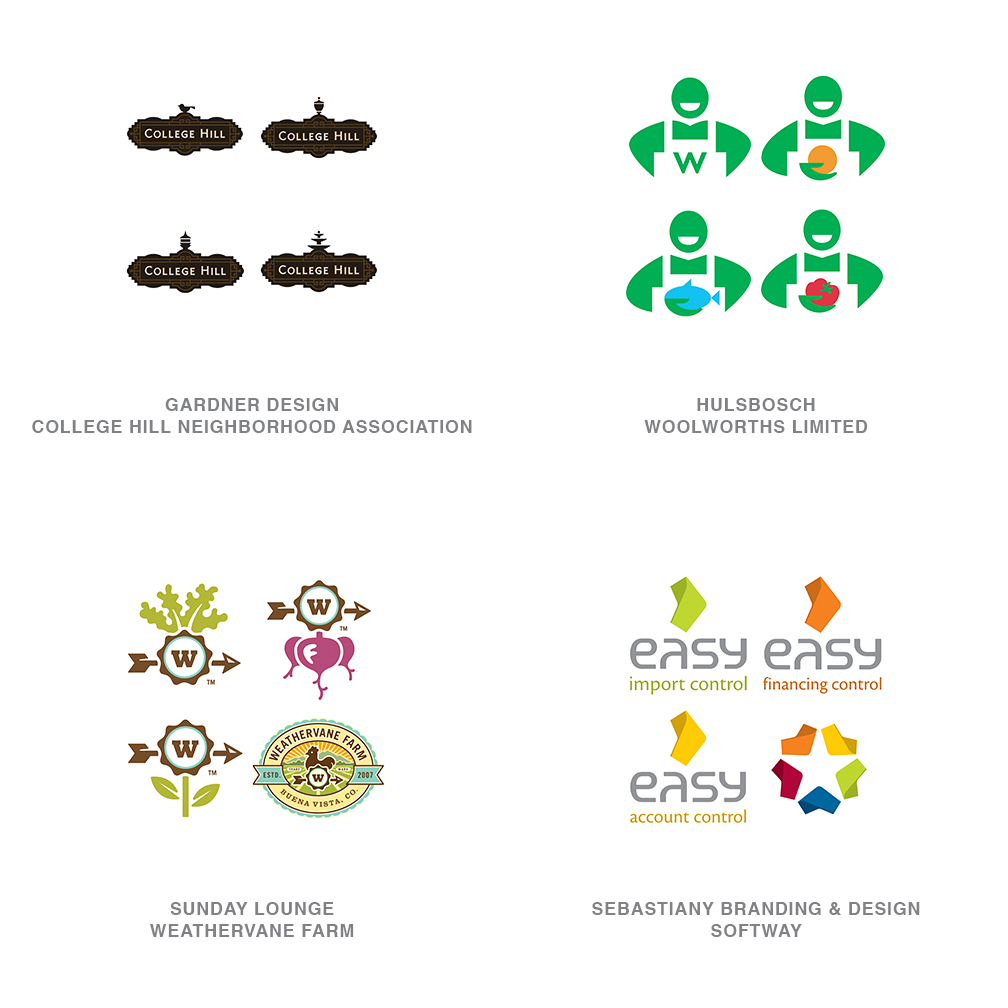
Series
A single client having a series of logos is absolutely nothing new. This is a time-tested solution to maintaining a core, consistent visual identity while focusing on specific divisions, products, or services. What is remarkable is the sudden ubiquitous deluge of these family marks.
In some cases, there is a parent mark that the family is constructed to relate to. Yet in others, every logo is of equal importance, and there is no single flagship logo. Nickelodeon exemplified this years ago with a common typographic solution knocked out of an orange field of fill-in-the-blank. But that solution relied more on the volume of solutions rather than the specificity of topic.
One consideration might be the expansive adoption of icon sets for mobile devices or Internet apps, which have built greater consumer familiarity with the concept of allowing a core icon to be redressed to take on multiple focuses. Color-coded series can be the least effective of these if the audience must memorize a system. Equally dangerous is the consumer not recognizing that a single mark is part of a greater system because of lack of context.
08 | Logo Trend
Brown
Every year we see color preferences ebb and flow, and if notable enough, we will mention this in the also-ran section at the end of the report. This year, with full apologies to UPS, designers discovered what brown could do for them. This was an abrupt and more universal movement, which warrants its appearance in the trend section.
It’s as if the volume knob had been pegged on black for maximum contrast for the last two decades, and we suddenly discovered it could be turned down and consumers could still hear us. This movement is about subtleties and is indicative of a new generation. Tone ranges from sepias, to chocolates, and even warmer.
Saturation levels of secondary colors have dropped back as well. Pinks always work well with brown, but other colors are being paired up here as well. Generally, these are clean colors that have had their chroma drained by half.
09 | Logo Trend
Dandruff
Proof that a little interference can truly break the tension. Any of these logos could survive without the dusting of white, but it is what helps set these marks in a hand-crafted genre and makes them more approachable. Crumpling, creasing, skewing, and distressing the art to create the prewashed look has been popular for years. This subtle effect has a few of its own differences that set it apart from the common methods of abuse.
This spritz of the logo surface is not always universal. More often it is applied only to specific areas of the mark. The open negative areas allow for the substrate to peek through, giving the logo a strong sense of place. If there is an attempt to emulate a look, it may be that of a block letterpress print that wasn’t liberally inked. Because only limited areas of the mark may use this effect, these logos are able to live with one foot in the future and another in the past.
10 | Logo Trend
Concentric
Yes, they are pushing the boundaries on acceptable levels of detail and reproduction challenges. But this crop of logos has an almost hypnotic optical mystique to charm the consumer. Repetition of fine lines concentrically crafted to play out an image may symbolically achieve the same effect as the cross-section of a tree telling the story of a life. It can be the tale of a journey or the timeline of a process. Scientific in nature, the creation of these marks is closely tied to the technology that helped spring them to life.
These designs are almost a cross-pollination of Spirograms (mentioned as a sidebar last year) and Jawbreakers (discussed in the trend report from three years ago). Many of these may conjure up a Timothy Leary moment. Whether used as the foundation of the mark or just as a portion, these solutions have dizzying impact on the viewer. This challenges, and like it or not, forces the consumer to confront the mark. They demand a reaction.
11 | Logo Trend
Loopys
Spoiler alert: The following trend deals with the surface treatment of logos. Jump to the next trend if hand-wringing of more than two hours is likely to result.
Seriously, while we all love discovering a logo that combines solid draftsmanship with clever concept and a memorable shape, we also have to acknowledge that exploration of diverse surface technique is a thriving business. Designers are hell-bent on discovering and laying claim to the next genre of surface decoration.
Marks in this latest group have a special looseness and casual appeal. A clearly handcrafted loopy, loopy line is applied to the surface of an otherwise unremarkable but recognizable shape. In fact, this scribbling is the punch line to the logo. No pretentious calligraphic thick and thin strokes here. The whole affair is once again crafted using a monoline technique, which has become a common thread in several of this year’s trends. Other noted logos this year were silhouettes, similarly filled with a more erratic scrawl, but they lacked the modest panache exhibited here.
12 | Logo Trend
Banded
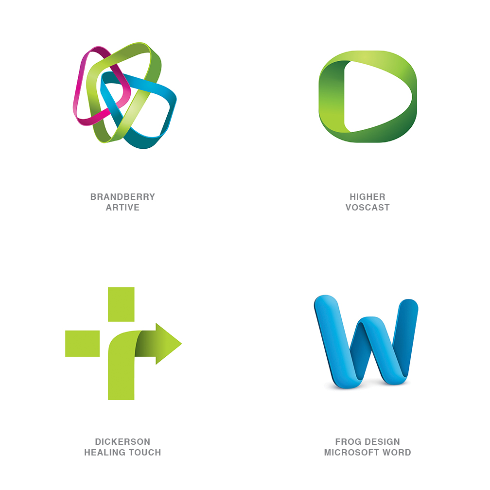
Exhibiting symptoms of an identity disorder, these marks demonstrate signs of being perfectly happy in flatland when suddenly they want to roll up off the page for a stroll in the 3D world. These marks are often constructed of a band that could be colored plastic or some other extruded substance. The notable identifier is the need to create a shadow on one’s self when turning a corner, but not casting a shadow on the page as they are not really of our world. Some examples of this trend have pretty grandiose dimensional tendencies, while others merely hint at an attempt to take flight.
Embracing the pleasures of working with gradients, designers are discovering that dimension plus shape equals unexplored territories. Flat, lifeless concepts take on pleasurable dimension that is attractive to the consumer’s eye. Though not the only one, this technique presents a graphic compromise for the purist between flat vector shapes and the crystal-capped dimensional hysteria of the last decade. The Microsoft Office for Mac suite icons formally cast long shadows and had a full-on dimensional appearance with bulbous shapes covered with light pings. Frog Design has dramatically reigned in the dimensionality and the shadow, as seen here.
13 | Logo Trend
Comma
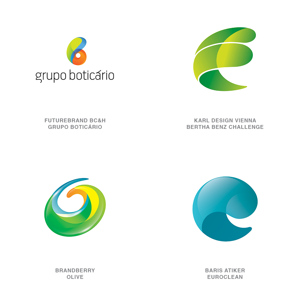
What is it about this shape? It continues to reoccur in broadly differing incarnations. It’s an unexplained obsession, like when Richard Dreyfuss tries to craft the alien landing site out of mashed potatoes in "Close Encounters of the Third Kind." We’re calling them "comma" because they look like a large, dimensional comma or maybe a bit of a nautilus shell playing out the concept of mathematical perfection. There’s a swirl in play that tells us motion is a part of the story as well. Or maybe it is a seed unfurling as it prepares to spring into life in a new form.
The rendering of these obviously varies but the primary commonality in these examples is the transparency, with dimensionality dialed way up and a color palette that vividly attaches us to nature in an unearthly way. Like the Orb trend seen years ago, these marks seem to be imbued with a visual magic that tells the viewer not to look for reasoning but just believe.
14 | Logo Trend
Buckys
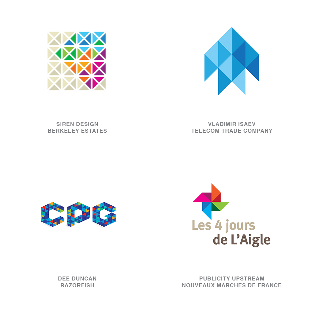
Tangrams be damned. As Buckminster Fuller (father of the geodesic dome) suggested, the triangle is the only flex-cornered polygon that holds its shape. Ergo, it alone accounts for all structural shaping in the universe. Like those building blocks of the universe, designers are embracing the use of a field of these modules to carve out space, dimension, and shape. The clustering of many triangles to form a greater whole tells the story of strength in numbers, and it can also create a mosaic of diversity.
Bass Ale took ownership of the single red triangle as one of the oldest recognized trademarks on record. Though that single perfect geometric shape is certainly iconic, it is also an unpleasant bear with which to design. Single triangular logos are certainly stable, but they nestle poorly with type and can create awkward negative areas. Pair them, triple them, or batch them up, and they become a wonderful, malleable skin that can be arranged to take on nearly any shape or dimension—and with Bucky’s approval as the strongest shape in the universe.
15 | Logo Trend
Fruit
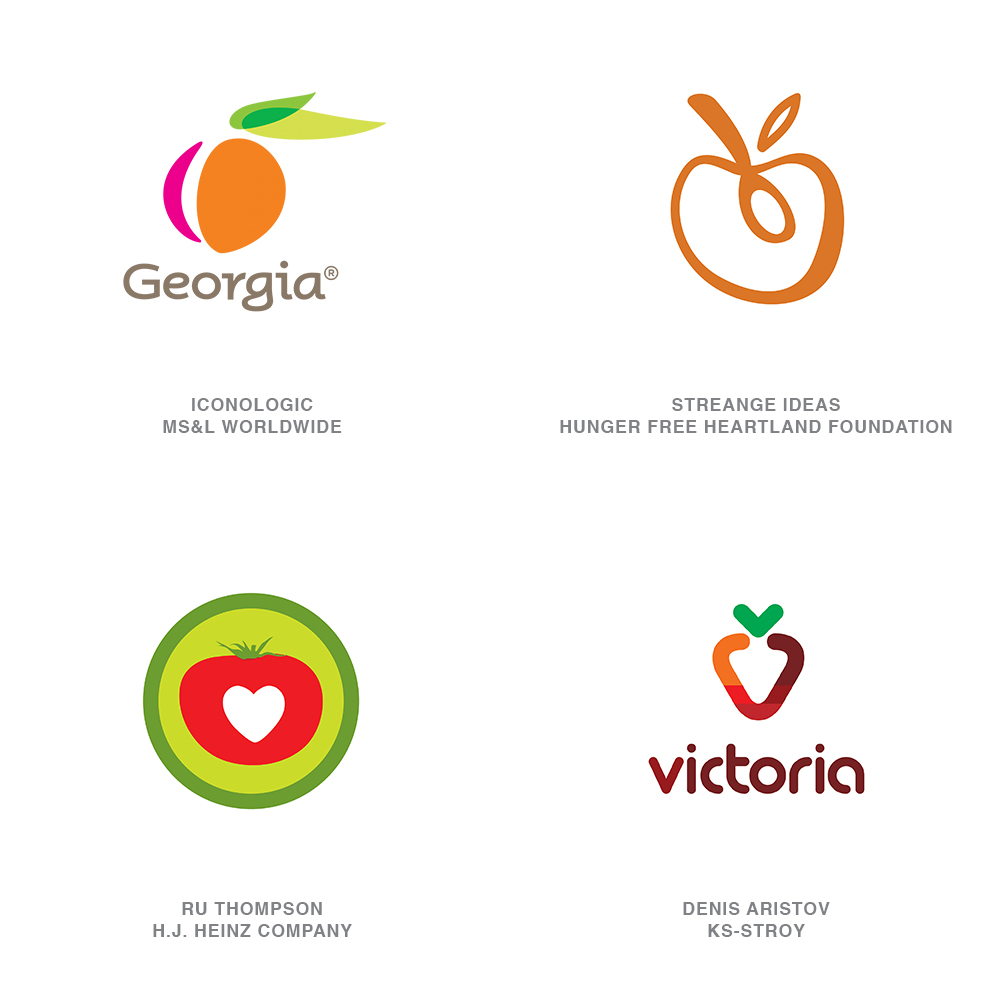
When is an Apple not an apple? When is a Blackberry not a blackberry? When they are symbolic of the world’s leading brands in technology, innovation, and communication. So the leap to viewing a piece of fruit as an iconic representative for something other than an orchard or a jelly manufacturer is not unfathomable. Over the last year, this sweet nugget of nature’s perfection has been everywhere in the field of identity.
Every type of fruit is a vestige of stories and memories consumers can relate to. It is a tactile, familiar, and generally sweet spokesperson for nature and sustainability. They represent the result of our labors and proof of work performed, and are a symbol of purity and procreation all in one.
These self-contained reproduction vehicles are packed with the symbolism we love to evoke for so many clients. Ask anyone to draw a specific piece of fruit, and they will resort to a visual shorthand of shapes, leaves, and stems which are recognized universally. The trend may reach saturation, but as a rule, you won’t hear too many folks suggesting too much fruit is bad for you.
Other Noteworthy Trends
 |
Back Again: How do you tell folks we’re in a time of flux? While some companies have been turning their identities into dimensional, transparent, highlighted spectacles, a good number—like Miller High Life—are now leaving that side of the ship and running back to flat vector solutions. Change is forever our friend. Landor Associates, Miller High Life |
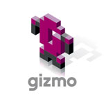 |
Isometric: eBoy cornered the market early on by manufacturing the world out of isometric, dimensional pixels. These new logos give homage to this look and could easily drop into an eBoy landscape and never be seen again.
Denis Aristov, Gizmo |
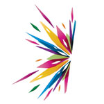 |
BlackHole: It’s as if someone was at the ready with his or her camera when a piece of art stepped to close too an Oreck vacuum. We see flying parts and pieces usually asymmetrically being sucked into a tiny speck of a hole.
BrandBerry, Idealogy |
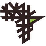 |
PickUpSticks: Silhouettes or image fields covered with a pile of straight sticks randomly dropped onto the surface. All of the lines are monoweight, and there is usually an even dispersion of positive and negative areas.
Interbrand Sampson Group, Commercial Bank of Africa |
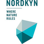 |
Reactive: The Visit Nordkyn identity is a tremendous example of this look and can be explored in motion at www.neue.no. Really brilliant. These logos lead the groundbreaking concept of shifting to convey information to the consumer. Imagine looking at a company’s logo and being able to tell how the market is doing or what kind of fish are biting.
Neue Design Studio, Visit Nordkyn |
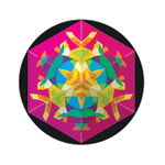 |
Medallions: These logos look more like an Aztec calendar wheel than a logo, with far too much information worked into a circular area. These attract viewer investigation because the information detail is too tiny to make out any other way.
Sol Consultores, Metrix Networks |
Follow the trends.
Logo design in your inbox. Subscribe to our monthly newsletter for the latest from LogoLounge.