You simply can't organize 42,000 logos-the approximate number of designs now on the LogoLounge.com web site-and not notice commonalities. Categories. Directions. Insights.
And this year is no exception: There are trends, for better or for worse. We'd prefer for you to be the judge. But what this year's report also delivers is perspective. With the benefit of past year's reports already laid out, it is not necessary to view trends as isolated moments in time. Instead, they can be viewed as organic, growing, morphing and transforming. One trend links to another, and then another. From year to year, there is branching from existing starts as well as shoots that emerge fresh from the ground up. It's all very informative to observe.
Through the LogoLounge reports, you can look forward and backward, too.
Through the LogoLounge.com web site, you can search an enormous database by keyword, designer's name, client name, industry, client category, type of logo, and dates to find a few trends of your own, as viewed from your own personal perspective. And through the LogoLounge books (Books I and II are out now, and Book 3 will be released in Fall of 2006 by Rockport Publishers), you can gain even more insights from a collection of 2,000 of the smartest logo designs from the past year, submitted to LogoLounge from all over the world and hand-selected by a team of extremely well-respected identity experts.
The goal of LogoLounge is not simply to amass the world's biggest pile of logos (although it is likely that already). It's goal is offer context with the content so that you can make sense of it all and perhaps have a better idea of where you would like to go next.
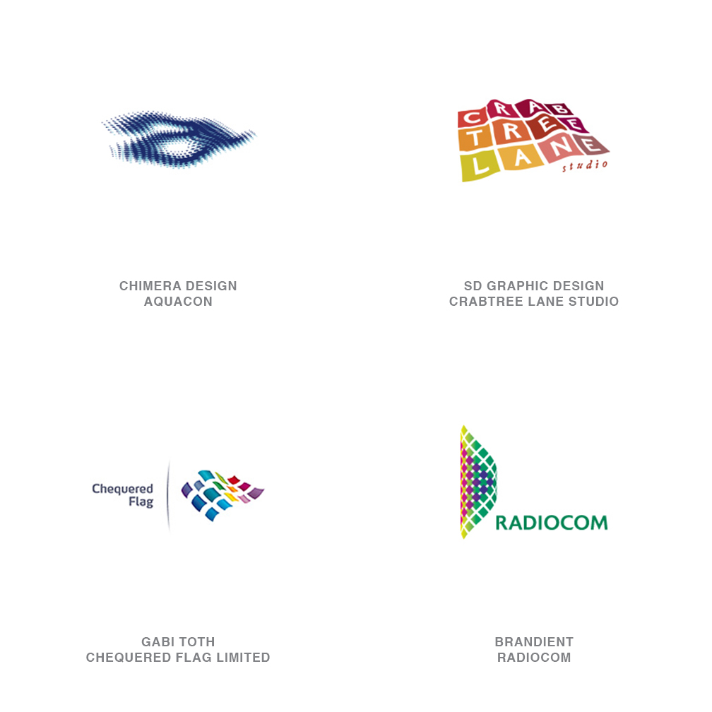
01 | Logo Trend
Blankets
The Aquacon logo gives every sense of the water's surface without relying on waves, ripples or other trite visuals. These feel like an evolutionary step forward from Microsoft Windows' logo waving in the breeze or Bank of America's geometric landscape fashioned out by a symbolic flag.
02 | Logo Trend
Blenders
Intense with motion and light, these logos give the appearance of a form being swallowed by a black hole. Shapes seem to bend and warp as if trying to defy the physics of light. The dervish nature of these marks embody an energy quickly recognized and associated with the product or the organization.
These could be an outgrowth of a trend spotted three years ago-Natural Spirals-but those forms had a much more leisurely appearance. These logos seem to be powered up with a nearly alien type of drive. It is a trend associated with any number of consumables, from over-the-counter medications and vitamins to highly caffeinated energy drinks. Who knew the Tide logo would come back to us with such vengeance?
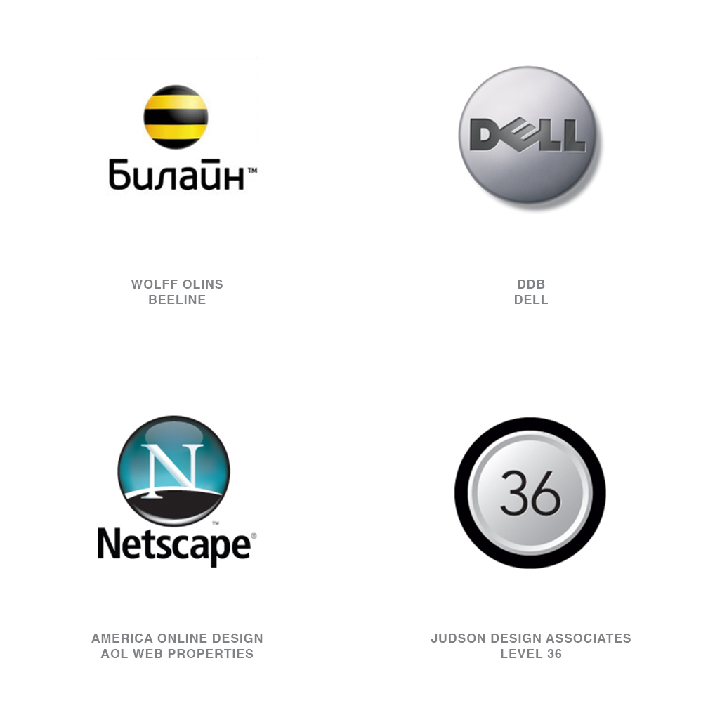
03 | Logo Trend
Buttons
Fully dimensional buttons with radius tops, highlights, shadows, embossing, and the occasional polymer dome seem to be everywhere. I can only imagine consumers with obsessive-compulsive disorders straining to avoid pressing each and every one of these. There's something about a nicely crafted button that feels right to a consumer.
It could be that the message is one of empowerment: Typically a button is pressed to bring about a useful consequence. Press the Dell button and a computer comes to life. Press the Beeline Cellular button and instantly connect to others. No surprise that these logos are generally associated with electronics and communications.
04 | Logo Trend
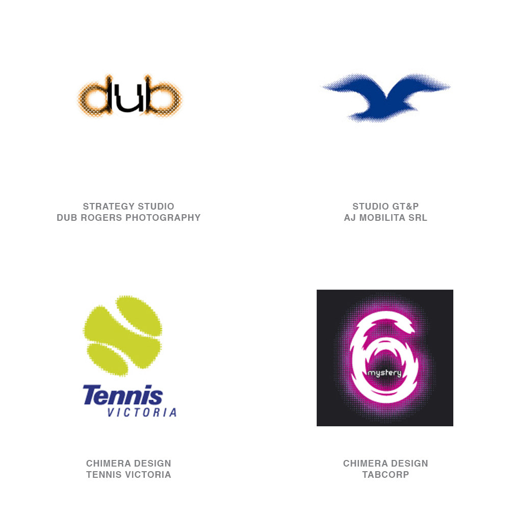
Dot Fuzz
Interpreting the idea of motion with this technique has a different set of variables than the continuous tone Blur trend from last year's report. Dot Fuzz logos have a better chance of accurate reproduction, and their gritty nature may capture a double-take or two from the consumer. Studio GT&P of Italy used the effect in an inspired application for AJ Mobilitá Srl, a transport company. Even at close range, their seagull logo gives the viewer a sense of looking at a bird
05 | Logo Trend
Orbs
Stare into the orb, and you'll see shrouded layers, orbiting stars, swirling liquids and other worlds packaged in a size we could drop in our pocket. These logos convey a message to consumers that there is a complex universe behind the product, but it is neatly captured and contained in a simple sphere they can easily interface with. Every effort at photographic realism is critical to maintaining the illusion.
06 | Logo Trend
Dry Brush
Our attempts to avoid slick and stay on a human scale are played out with a combination of simple brush strokes and occasionally an economic cut-out of a geometric shape. It's a combination of a little chaos and a little control that suggests balance. It's a challenge to be both graphic and mortal at the same time, but this method seems to do just that.
07 | Logo Trend
Embellish
A marriage of grit and finesse is responsible for the visual success of these marks. These are typically a dichotomy of fine details and dingbats knocked out of and assembled with a degenerated background element. Rich with rhythm and emotion, these logos are often though not exclusively associated with the arts.
The human process of collecting and meticulously crafting the various components is not lost on the consumer. This genre speaks well to a younger generation and the skateboard culture. Most important, though, is the influence of the artist Ryan McGinness, who has created a hybrid of graphic design and fine art with his installations.
08 | Logo Trend
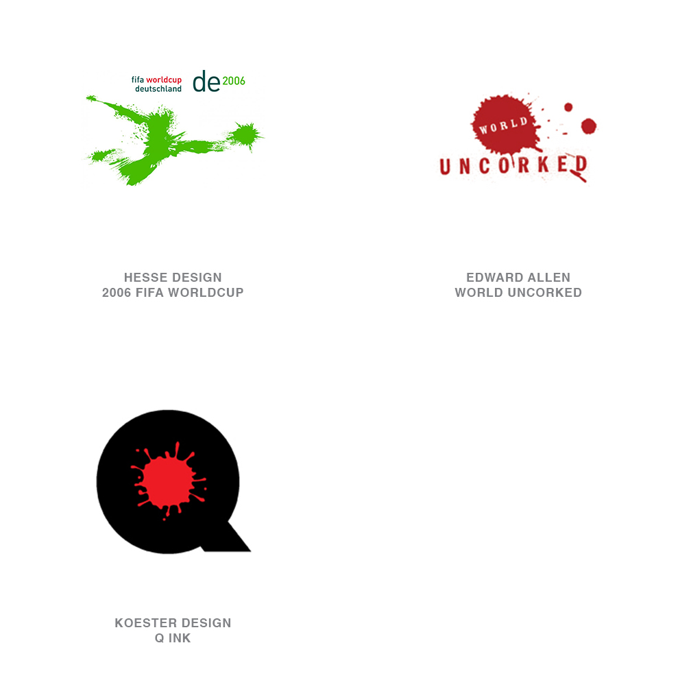
Splat
One of the most amazing sets of logos I've seen in years are the splotch pictograms of soccer players created by Hesse Design of Germany for consideration for the 2006 FIFA World Cup. What at first appears as little more than a bug on a windshield suddenly comes to life as a player frantically driving for a goal with a ball exploding forward with equal force. What amazes me about this series are the subtleties you see in each when you squint your eyes.
09 | Logo Trend
Glow
Technically, the subtle gradation of color for a background field bucks traditional production rules for a logo. But these are rules that have been cast to the side with advanced technology and production methods. The vignette also might lock the application into a white-only background, but considering the effect, it's well worth it.
10 | Logo Trend
Transparent 3D
These logos are fabricated from transparent layers that also take on form or gradation and highlights. Their luminous quality of light is engaging. Soon we could anticipate seeing transparent, yet tactile and textured surfaces.
Transparency has become a buzzword within the corporate world as more industries see the need to open their books and their practices to the public. Using actual visual transparency in a logo is a common metaphor.
11 | Logo Trend
Overlays
One of the driving factors behind the transparency trend is pure technology. Adobe Illustrator has made the additive color process a click away through layers with or without gradation. That means the effects can be controlled in a vector environment which is more conducive to experimentation than Photoshop.
The designers at Iconologic may have been responsible for creating the greatest audience for this look with their groundbreaking graphic solutions for the sport icons and venue graphics at the 2006 Winter Olympics in Torino. Their system relied on flat transparency, and the beautifully drawn sport pictograms were just as stunning in one color as four.
12 | Logo Trend
Filigree
hether in a close-up detail or a complete wreath, this technique creates an authoritative, impervious force field around the logo. It doesn't rely on mass: Instead, it uses an airy finesse that allows it to lock to a surface and gives the mark a sense of place. Last year's report discussed The Bank of New York logo, developed by Lippincott Mercer, which conveys a similar sense of beauty and security.<
13 | Logo Trend
Post Apocalyptic
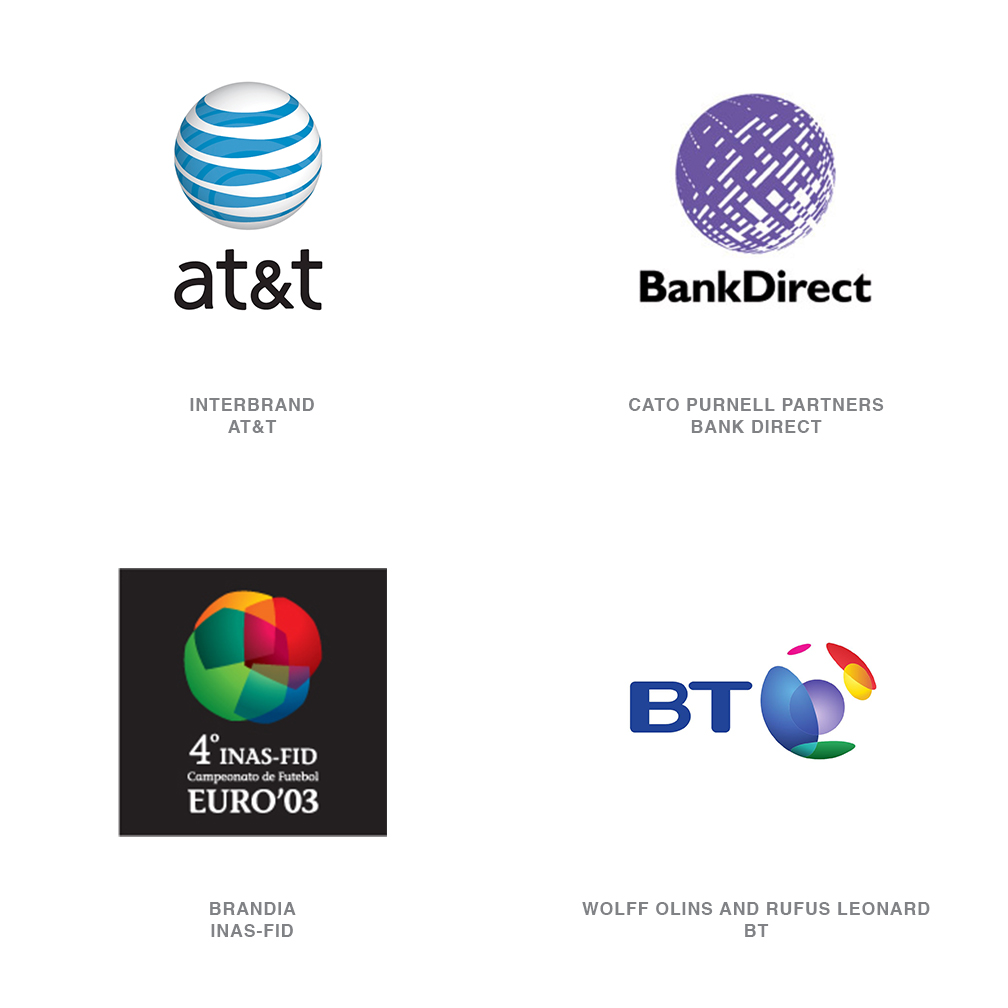
"It's the invisible sphere. The traditional globe has been vaporized and all that is left behind is the atmosphere." I wish I had said these words or named this trend, but all credit goes to the incomparable designer Miles Newlyn.
If you are global, the globe is not the message: It's what you bring to the globe. AT&T doesn't bring us a sphere. It brings us the connectivity to transcend geographic constraints. The same can be said of Wolff Olins' solution for BT. Watching the animation of this logo you get a sense of the world's continents and the symbolic coverage of communication. Both of these solutions take advantage of transparency to intensify the effect.
14 | Logo Trend
Vivid
After a glance at this year's trends, a secondary trend stands out: color. This is not just color, but unabashed color. Not in all sectors but in many, the desaturated or one- and two-color palettes of the past have been pitched to the heap. Hues are more vivid, and many logos are represented by the full spectrum.
Events, destinations, and celebration lead this group, but bold application of color is showing up in more traditional fields like communications and banking, for example. Technological barriers that used to limit logo color for pure economic reasons have become less of a concern. Companies have a greater presence on the internet and TV, both of which have light-driven, luminous RGB environments at their disposal. We've simply become more accustomed to saturated color.
15 | Logo Trend
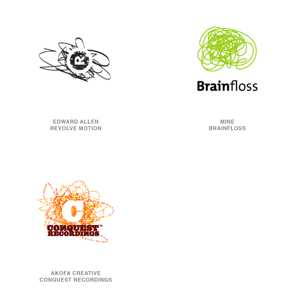
Scribbles
This is a throw-back to our childhood when we didn't have to stay inside the lines. We could create bedlam with any color crayon we damn well pleased. These marks have a frantic nature about them that appeals to a younger generation, but note that the logos are generally brought back under our thumb with the addition of a formal element often typographic.
Here again we come back to the theme of controlled chaos. It's an opportunity for companies to show they have the ability to create an orderly freedom, a chance to escape the constraints of an organizational planet but not leave the gravitational field.
Follow the trends.
Logo design in your inbox. Subscribe to our monthly newsletter for the latest from LogoLounge.