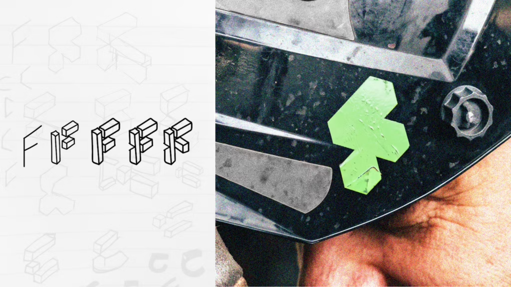
Dragon Rouge has created the name, brand strategy, visual identity and the brand architecture for the Foodera Technologies, which unites Kiremko B.V, Idaho Steel, REYCO Systems, Tummers Group, and Van der Giessen Industrie in one organization. Foodera is now one of the world’s largest providers of food processing machinery, systems, and technology.
From a LinkedIn release from Dragon Rouge: “At its heart is a new brand mark built from two fundamental elements of the company’s offer: a right-angle production line, representing the integrated systems that power food manufacturing facilities around the world, and a single cube, symbolizing the individual components and expertise that support, maintain and improve existing operations.”
In isometric projection, cubes combine to form an abstract “F” monogram. The plan uses a dark industrial green paired with lime green, a color that is common in safety clothing. (Illustration from Design Week.)