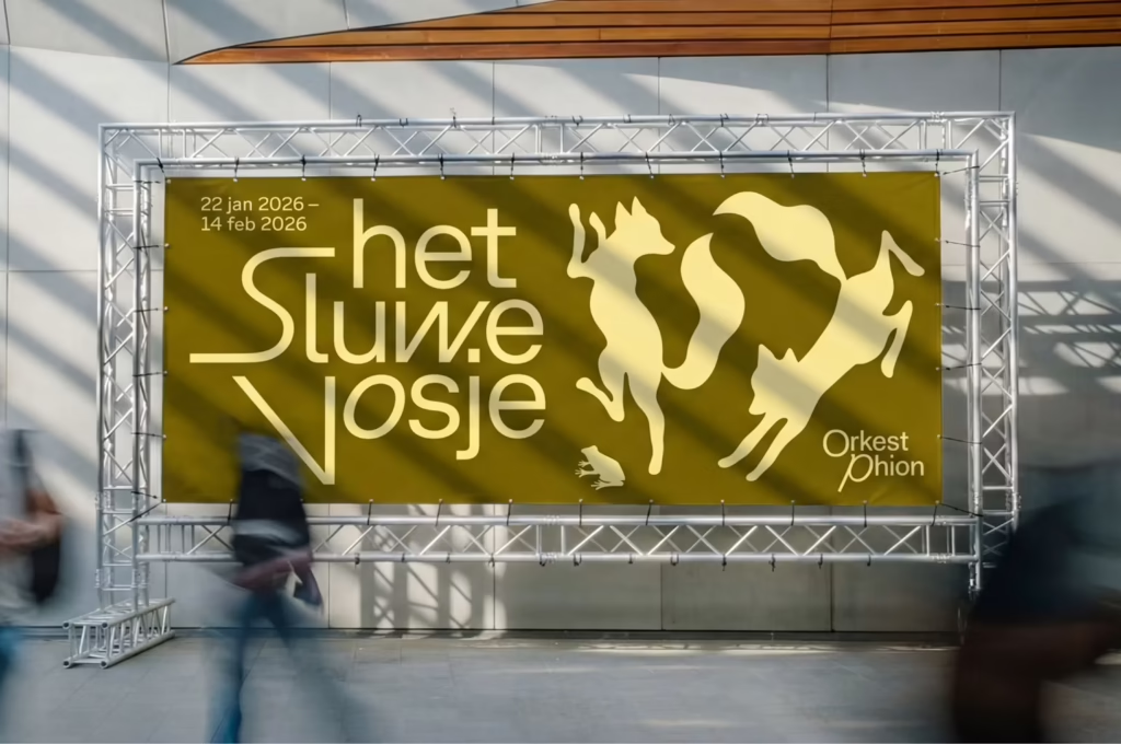
The new plan makes the group recognizable in each new location the ensemble visits, and it reflects the energy of the music that will be performed there.
The designers selected the typeface GT Planar for its inherently dynamic nature, but then further bent it other directions it to mimic the movement of music and of a conductor’s baton.
“GT Planar has details that only appear when you slant it,” notes Thonik design director Falco van Burg. “The moment the type tilts, extra forms come out that emphasize its character, and you can feel the typographer knew exactly how it should move.”
https://www.creativereview.co.uk/phion-symphony-orchestra-rebrand-thonik