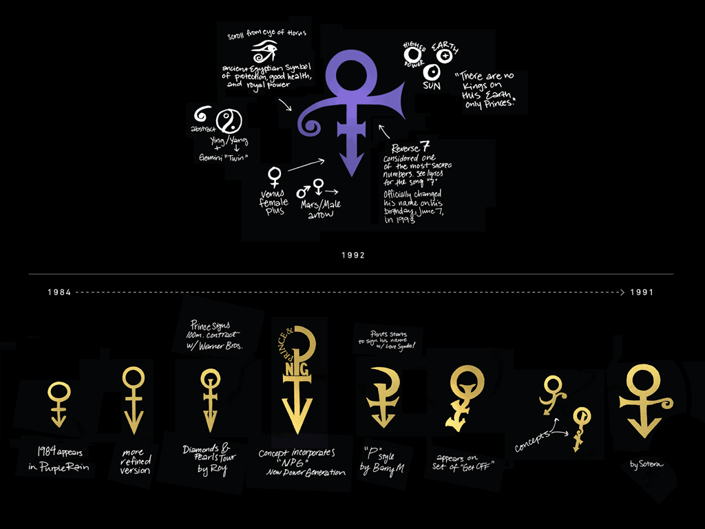
Almost 25 years ago, LogoLounge member Mitch Monson found himself in an enviable place: working with Prince, his creative director/producer Sotera Tschetter, and his art director Lizz Luce on music videos, album covers, tour graphics, and more. In this case, more included what has become one of the most unique and iconic graphic symbols of a generation: Prince's Love Symbol.
The creation of the Love Symbol occurred after a long, conceptual brewing process that started as early as 1984 with the release of the hugely successful album and film Purple Rain. Prince and his creative team introduced many combinations of the male and female symbols prior to creating the final Love Symbol. In 1992, Prince and his creative team engaged Monson, who was then creative director and one of four partners of the Minneapolis firm HDMG, to complete the design. Prince and Sotera put together a complete visual brief for the Love Symbol, and Mitch and Lizz spent a couple late design nights before landing on the final symbol design that was selected by Prince.
The original symbol artwork that was created was hand-drawn, but the technical process that took that design through development and final execution was unique. Macs did not have the graphic horsepower that the proprietary Video Paintbox Systems had at the time, so the team used a DF/X Composium Paintbox System (then $200,000 to $300,000) to work quickly and efficiently on symbol exploration. Also, since the primary use of these paintbox systems was for animation and not print, they were not ideal for large, high-resolution print output. So the designers had to default to traditional transparency output technology to create final print artwork for the symbol, album cover art, and so on.
It got even more archaic than that for presenting "approvals" to Prince and Sotera. For those reviews, all print artwork was output to VHS tape. Those tapes would then be reviewed by Prince along with the tapes that were routinely presented for music video approvals.
We talked to Monson about the development process and about the significance of the design.
When you look at a lot of [Prince's] previous designs, they started more clean and refined and slowly evolved into more curved and organic shapes. The final Love Symbol design included a lot of these more organic, hand-crafted and human forms. Over time, people commonly asked why these imperfect shapes were not more refined and transformed into perfect vector art. The answer: they were never intended to be that way.
We were really fortunate that Sotera and her creative team engaged us in so many different Prince projects both related and unrelated to the symbol. As you would expect, it was a fast and furious design pace, but we always tried to do things for the right reasons and to remain thoughtful about everything we were creating. We believe all the hard work was worth it because the final Love Symbol design really fit Prince. It's masculine, but romantic and sensual. It reflects his music and who and what he was, even as the king of reinvention. It's normally difficult to express all the attributes of a client in one mark, but somehow the evolution of the Love Symbol really did lead to a mark that reflects so many of Prince's attributes and passions."
What lessons on developing symbols with longevity has this experience taught you?
It is so amazing to see all the current tributes, memorials and the conversations about Prince. It is such a difficult loss for Minneapolis, the music industry, and the world. The symbol has a real connection with Prince fans, and now it has connected across generations. It's possible that it could become an ongoing generational symbol.
As I mentioned earlier, I think the care and thoughtfulness and meaning that Prince and the creative team brought to the development of the Love Symbol has also given it authenticity and longevity. Prince had been living the meaning for a long time, and now there was finally a way to fully represent who he was, what he stood for and what he wanted to further promote in the world: love, diversity and acceptance."
Is it possible that in the future, more people will choose to be known by a symbol rather than their name?
When you go to Paisley Park and see all of the memorials, you see the symbol everywhere. How can an artist not be inspired by that? We might possibly see a current or future artist that is inspired and adopts this sort of representation. If you can find that one symbol that represents who and what you are and what you believe in, it can translate in any country and in any language. Plus I believe people are more inspired by a symbol than by a word."
With the benefit of time and the opportunity to see how far this design has gone, what do you take away from the experience?
You always have to be creating.' That is important as a creative person. Then, somewhere along the way you will create work that stands the test of time. You don't know exactly what those designs are, so you always have to be thoughtful and engaged in everything you do. Whether it's a logo for your local coop or a logo for Prince, you have to use the same energy and attitude and excitement, because you don't know what the end game will be.
Work hard and make sure you enjoy every moment. Don't cut corners or say you don't have the time. That will pay off later.
We have been reviewing a lot of visual elements from the Prince archives over the past two weeks, and we are now starting to understand the significance and impact this symbol design has had. We can't predict what the longevity of our work will be when it is created, but it could be very important later. Just that thought can keep you energized.