America’s oldest brewery is updating its packaging, unfortunately, at the cost of its identity. The new look will first be seen in Indiana as it becomes the 20th state into which the brand will expand.
True, the original labels were chock-a-block with typefaces ranging from scripts to Gothic styles, and yes, the use of art could be inconsistent. That being said, perhaps it is acceptable for a nearly 190-year-old brand to embrace its loveable quirkiness and not try to dress like an 18-year-old (especially in light of today’s massive craft brew movement, with its incredible wardrobe of creative labeling).
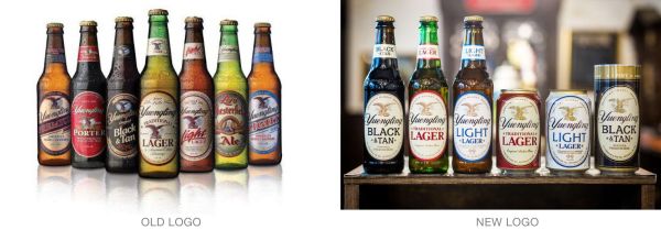
The new labels have all the charm of a 1980s generic box of mac-and-cheese. The brand name and much-loved but now ghosted-back eagle and keg logo play second fiddle to non-proprietary variety names like “Light” and “Lager.” The whole approach feels sterile and no longer communicates the brand’s lineage and history.
Read more details here.