![]()
Yelp has introduced a new team of app icons plus a refreshed logo. The new suite was inspired by the original mark, but the new plan introduces consistency to a system that previously lacked uniformity.
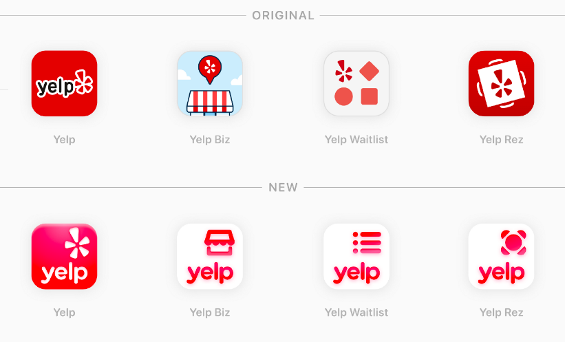
The wordmark, due to its more open counters, wider curves, and newly balanced weight, feels refreshed and definitely the leader in the brand’s hierarchy. The logo and the app icons each have enough gradient and shine to give them some dimensionality, a move against the current grain in identity design to keep everything flat.
Also streamlined was the color system. The old system used an amazing 16 different colors; now, all of the redesigned marks use only two colors.
https://medium.com/yelp-design/an-inside-look-at-how-we-refreshed-yelps-logo-app-icons-1b1c7f590ee1