Conduent, Inc. will separate from Xerox in early 2017 and continue providing business process services such as customer care, digital payments, education, compliance solutions, human resource management, and more.

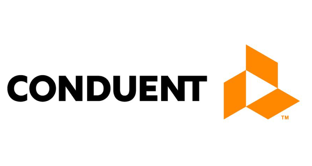
Despite the strong brand recognition of its parent company, Conduent is starting over to create a new identity story. Its new logo is built from three parallelograms that represent three of the organization’s pillars: clients, employees, and investors. Together, the three shapes are meant to represent “movement and agility.” The arrow formed by the negative space at the center of the design is meant to suggest the concept of advancing client progress.
Xerox chief operating officer John Kennedy says it is not necessarily Conduent’s goal to have the same sort of brand recognition that Xerox has. “Whether Conduent is a household name or not is not as strategic to this company,” Kennedy said. “Given the nature of the work we’re doing, it’s almost best when we’re invisible.”
Read more behind the new logo here.