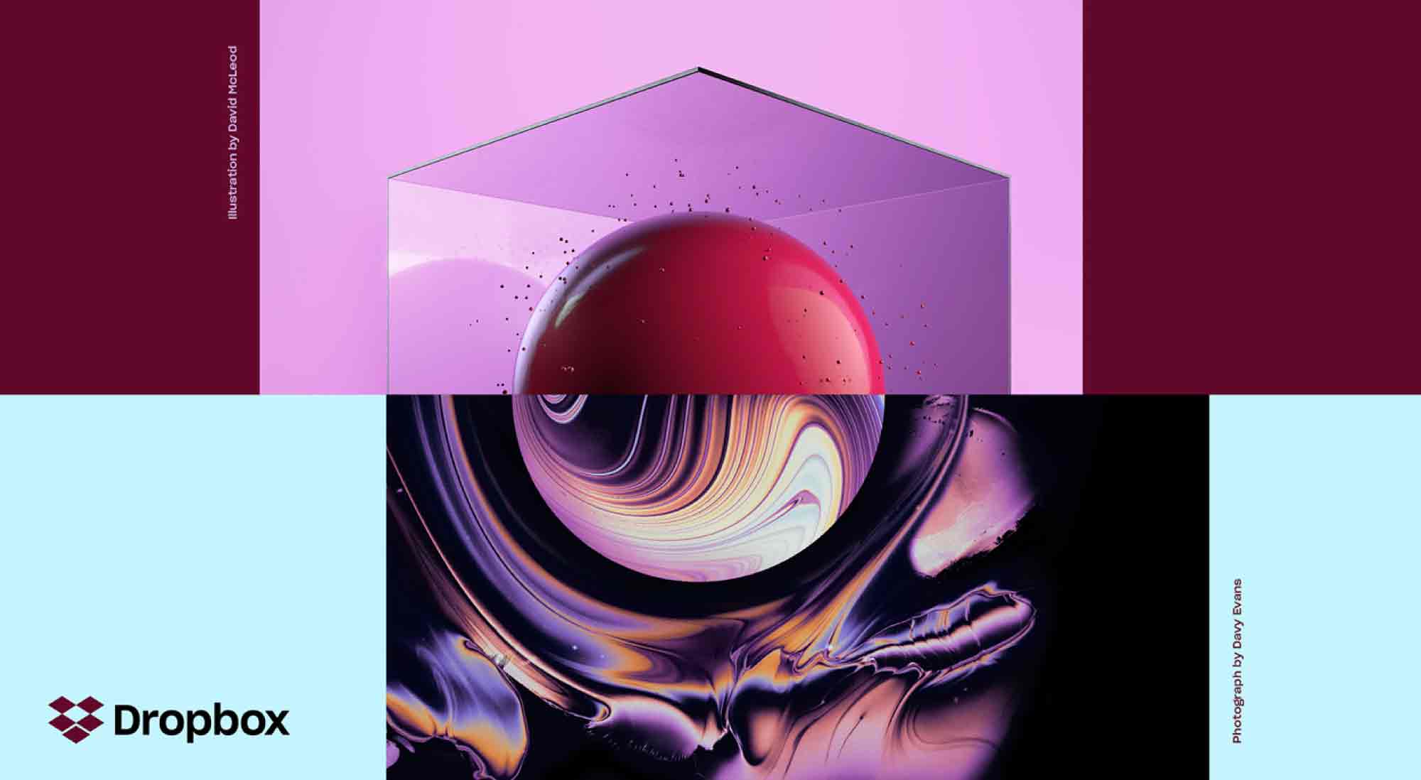
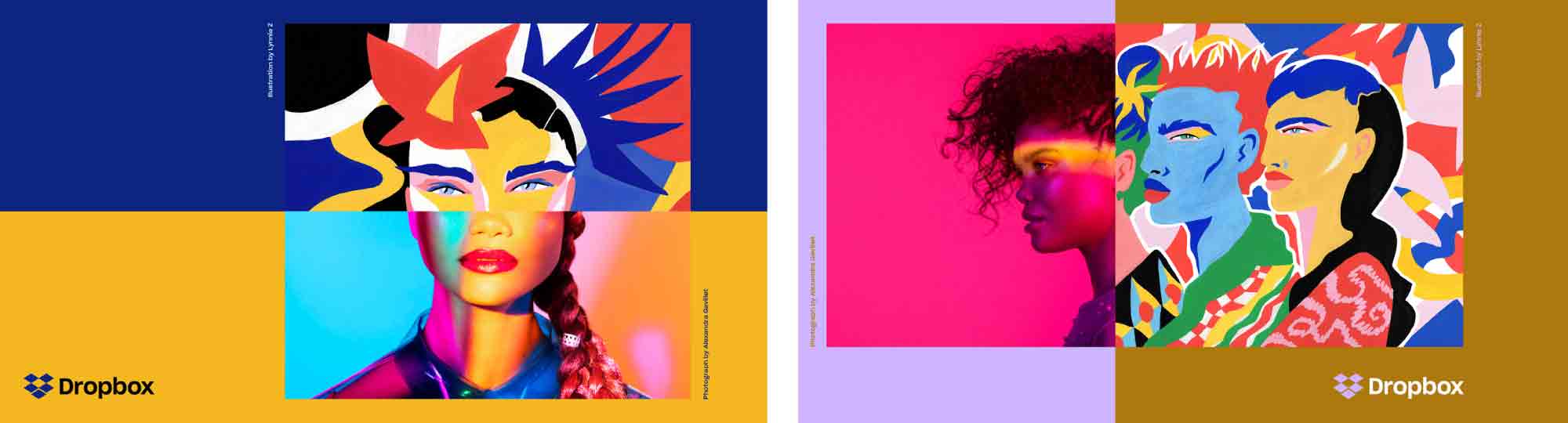
Dropbox is shaking its image as a place where stuff is stored and is attempting to transform into a community where creative energy and ideas are exchanged. Its new identity touts the work of users such as musicians, designers, and coders, and it mimics the look of on-screen, in-progress artistic work, boldly mashing up visuals.
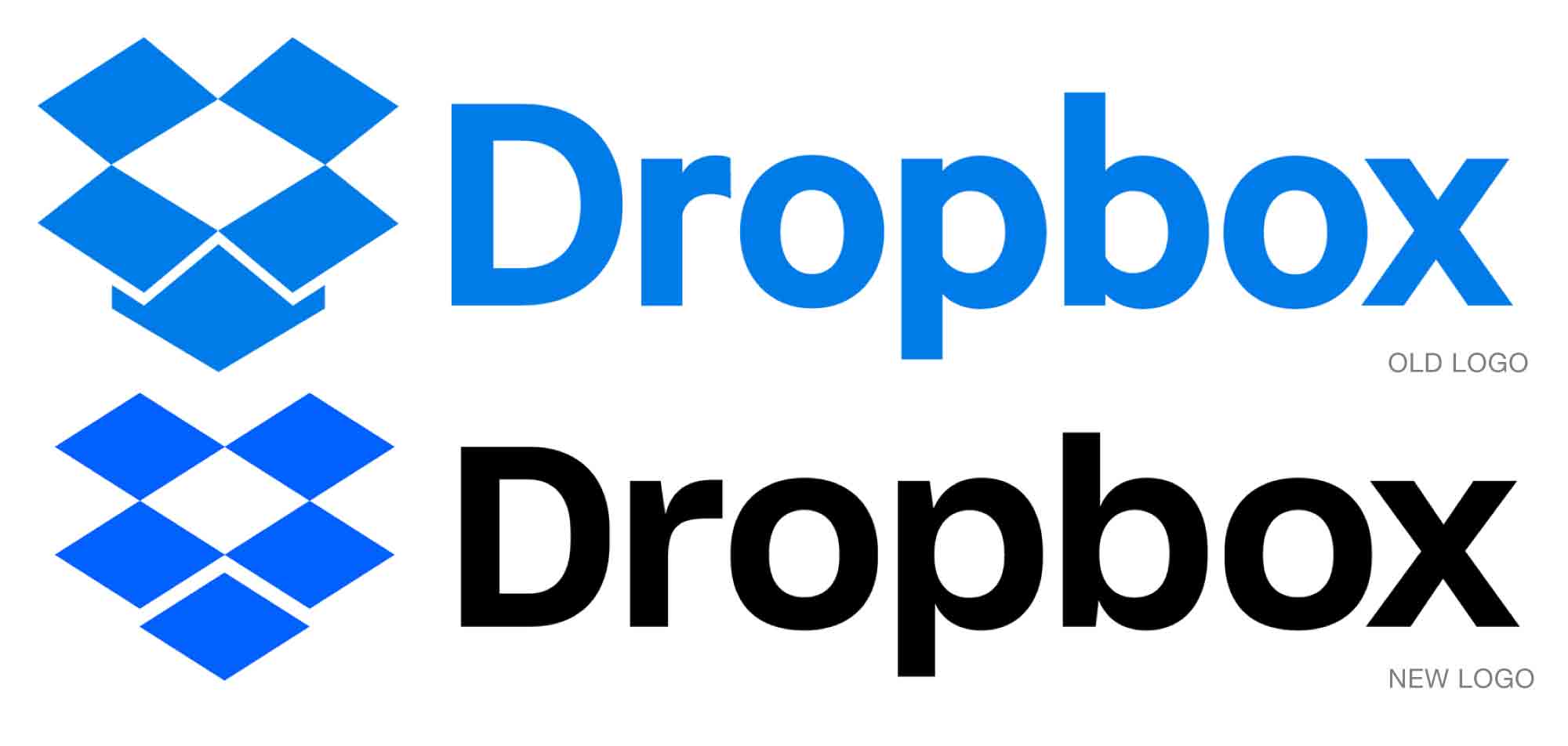
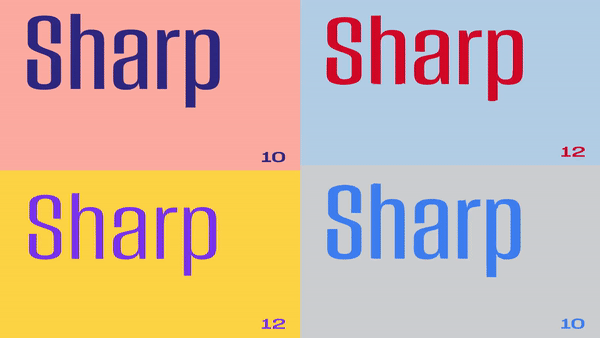
The brand’s identity has remained largely unchanged for 10 years, other than a type refresh in 2015. The new plan, created in-house with the help of design studio Collins, has abandoned the company’s original and very simple blue-and-white look, which was meant to suggest extreme ease of use. Where previously there was lots of white space there is now plenty of motion, color, graphics, and type. A new typeface, Sharp Grotesk (created by Sharp Type), gives the company 259 flavors with which to play.
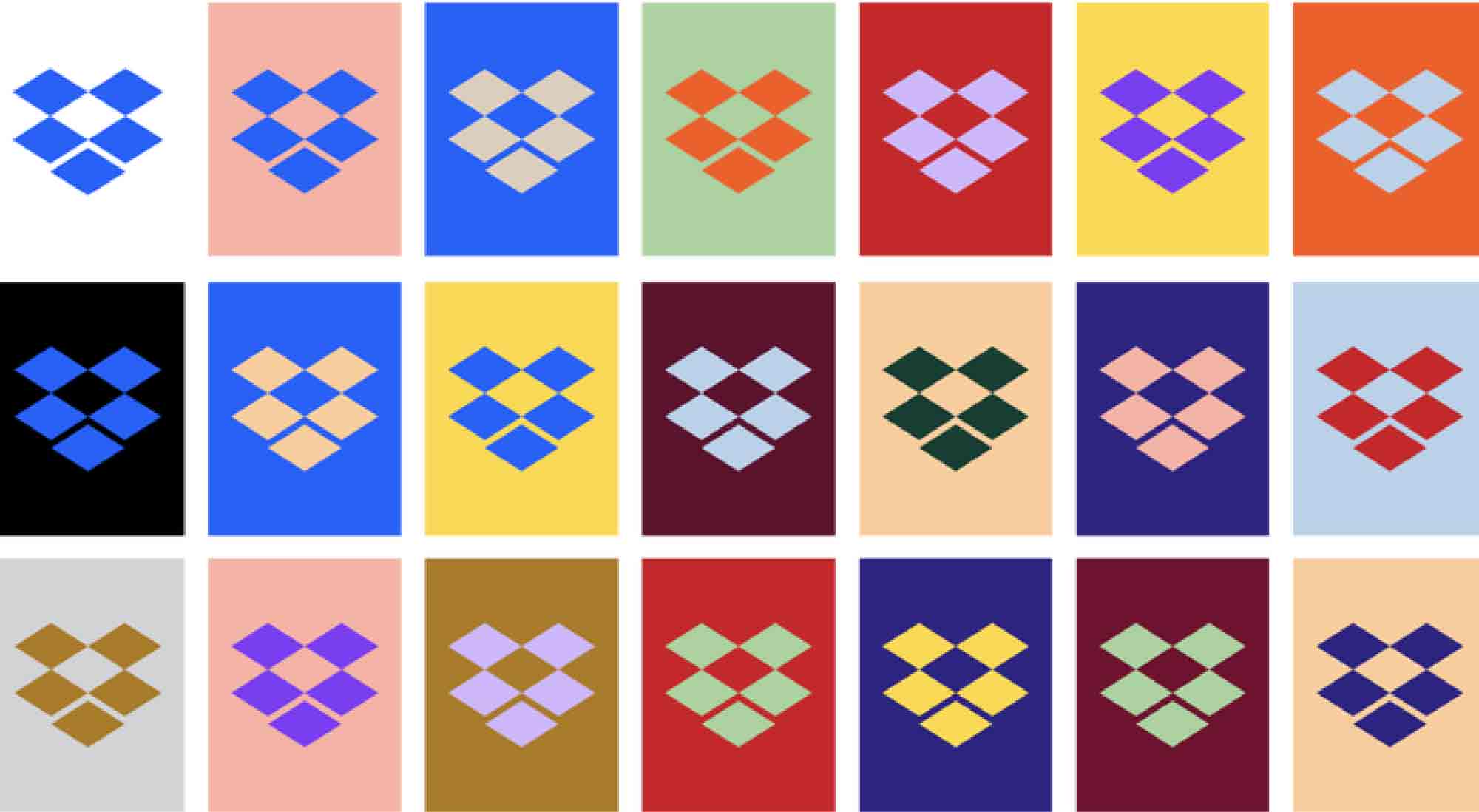
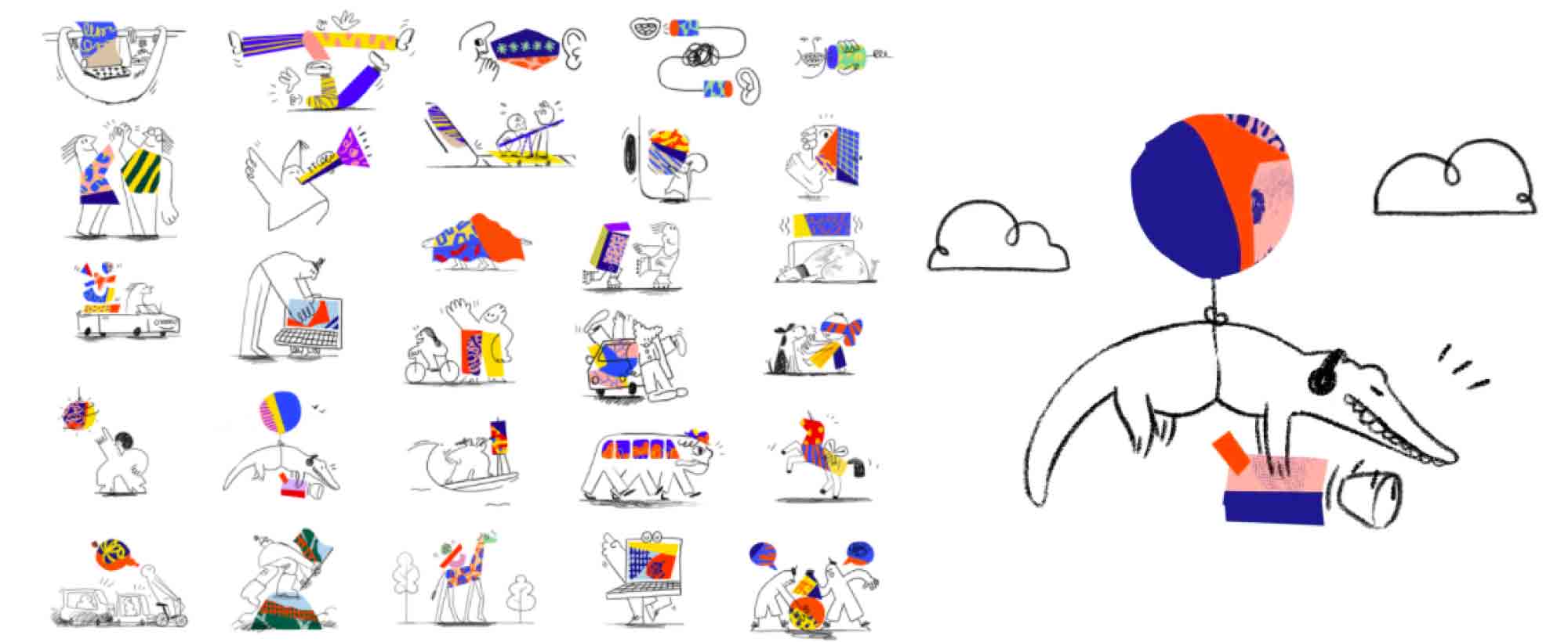
The dimensional blue-and-white design of the parent mark has been played out in the icons that represent the company’s 14-plus products. It’s a straightforward plan that can easily accommodate new acquisitions and products. Playing a big part in unifying so many products is a new bespoke typeface, Charlie Sans, named after the small character in the original logo.
The new five-diamond logo collapses the original mark, which actually looked like a box. The revamped design is more elegant/geometric, it does better suggest the coming together of resources, and it works well in tiny applications. But separated from the word “Dropbox,” it could become so abstract as to be meaningless.
A quick dip into the Dropbox product shows that little has changed on its user screens—although pencil-like line drawings do still appear in different interfaces—so presumably the blossoming of color and art revealed in the new look will be used largely in marketing. It will be interesting to see the ramped-up identity unfold: while the notion of mash-ups and “unfinishedness” does suggest the very heart of creativity and collaboration with all its messy, manic, artless artfulness, the approach may not well serve an identity, which at its heart needs at least some stability.
Read more here.