
Founded in 1980 as a single storefront, Whole Foods Market now has 430 stores and plenty of foody disciples. Its communications needs have changed substantially: it required a new system that let it share in a more flexible way its core values of caring where food comes from and how it is grown.

Whole Foods asked Office to create a refreshed communication system that worked within and outside of the company. In addition to developing a new color palette, typography plan, photography style, and tone of voice guidelines, Office designers also updated the logo. The leaf on the first O now looks more like a leaf, and serifs have been added to the E and F. The D has been tucked in a bit tighter, and the word MARKET is now in a sans serif face and has lost its container bar. Also, the entire lock-up is now contained in a circle, a shape that is often repeated in the new system.

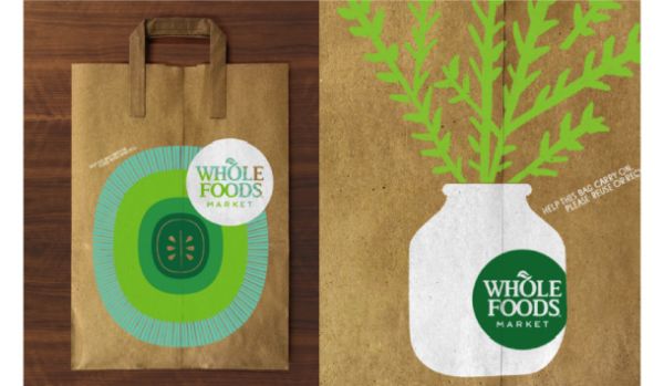
When you walk into a Whole Foods store, you can feel its independent spirit and personality, said Jason Schulte, founder and creative director of Office. We didn't want to lose that with a cookie-cutter approach. So we built that flexibility and room for creative expression into the system.
Read the entire case study here.