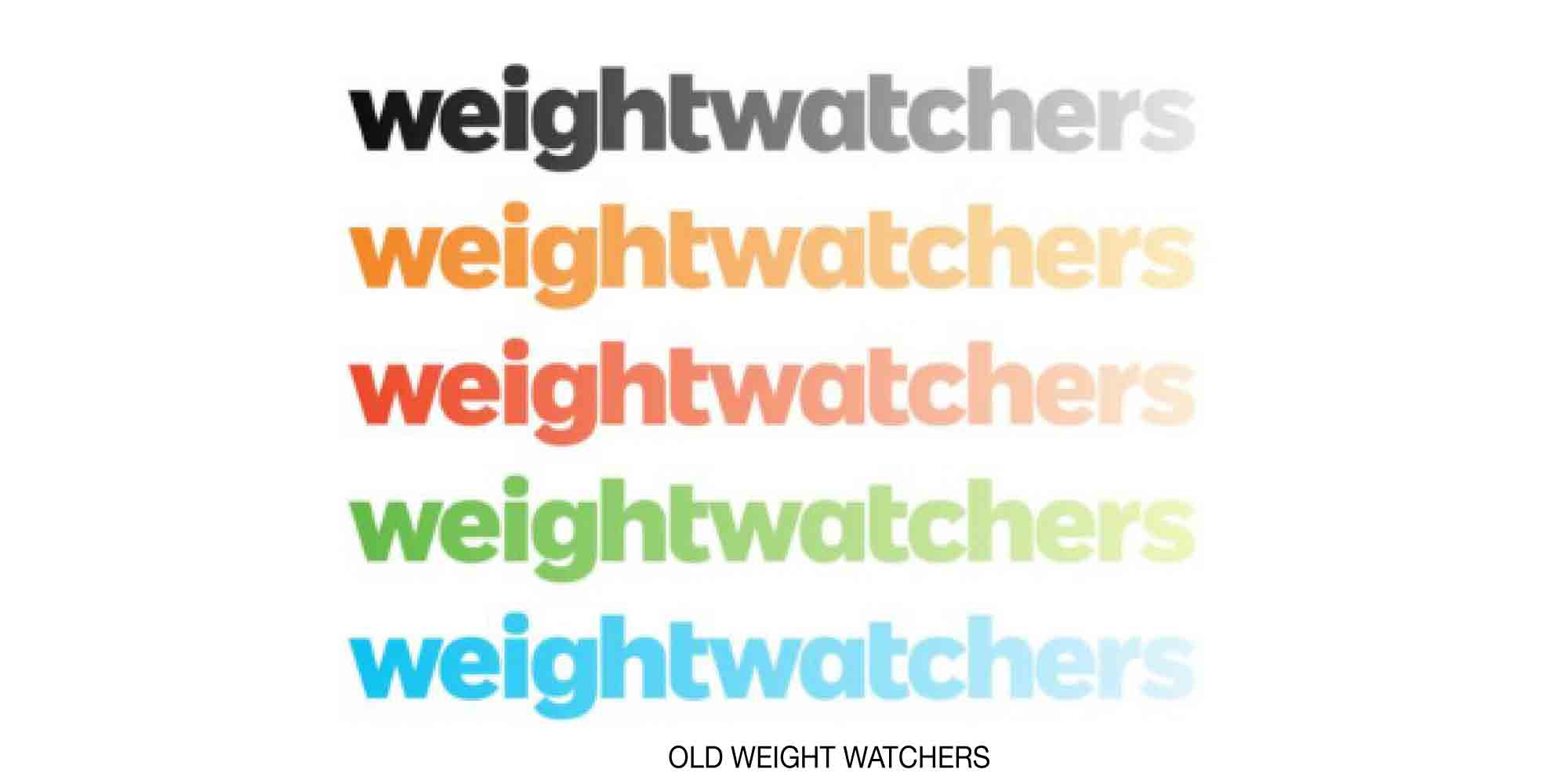
Weight Watchers has slimmed down to WW, reflecting a change in mission to focus on general health rather than just scale-watching. Its new tagline, Wellness That Works, brings to the forefront the essential benefit of its programs, all of which are meant to produce a better long-term lifestyle.
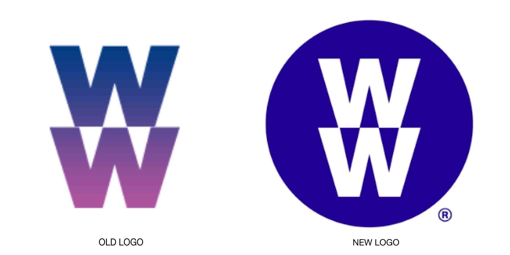
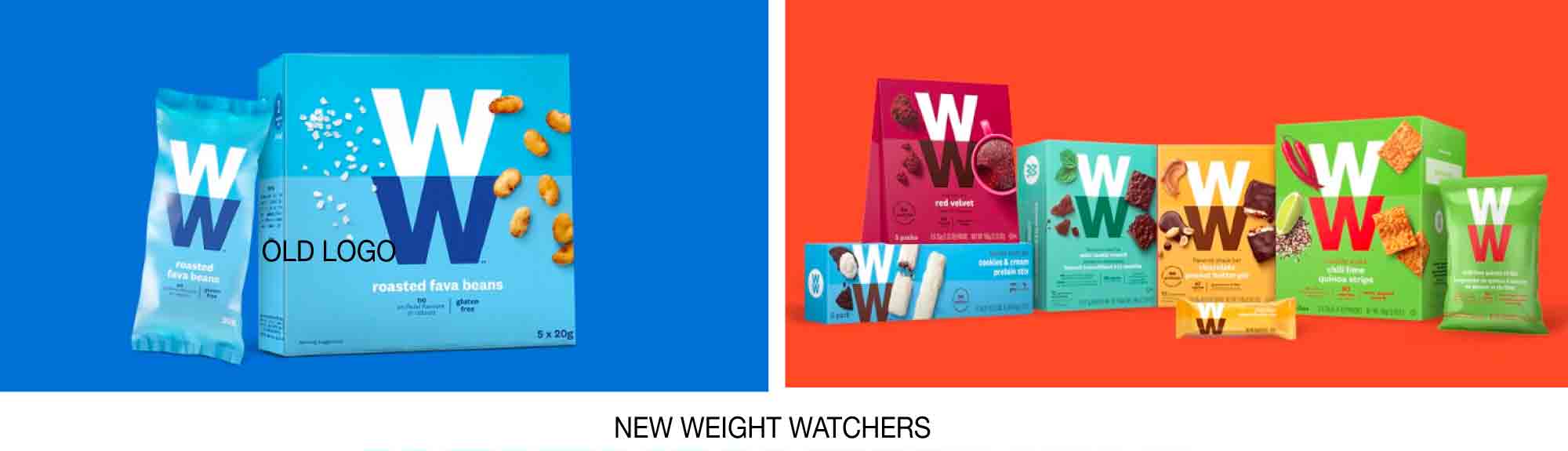
You might think that the name change would necessitate a new brand identity and logo. But that was actually already created back in 2012 by Pentagram: parts have been in use ever since. The newest iteration eliminates the original design’s gradients and places the mark in a circle, an element that is repeated throughout WW’s marketing. The bright color palette stresses health, simplicity, and excitement; it’s also a nod to the company’s promise to remove all artificial sweeteners, coloring, flavoring, and preservatives from WW-branded food. Photos used with the system clearly focus on health and happiness.
It all makes sense until you have to actually pronounce the name. WW feels clunky, and if the letters no longer stand for weight watching, they are clunky and arbitrary. The company is throwing forward a handful of possibilities in marketing: We Work. Wellness That Works. We Will. We wonder if one of those slogans will win out in time.

Read and see more details here.