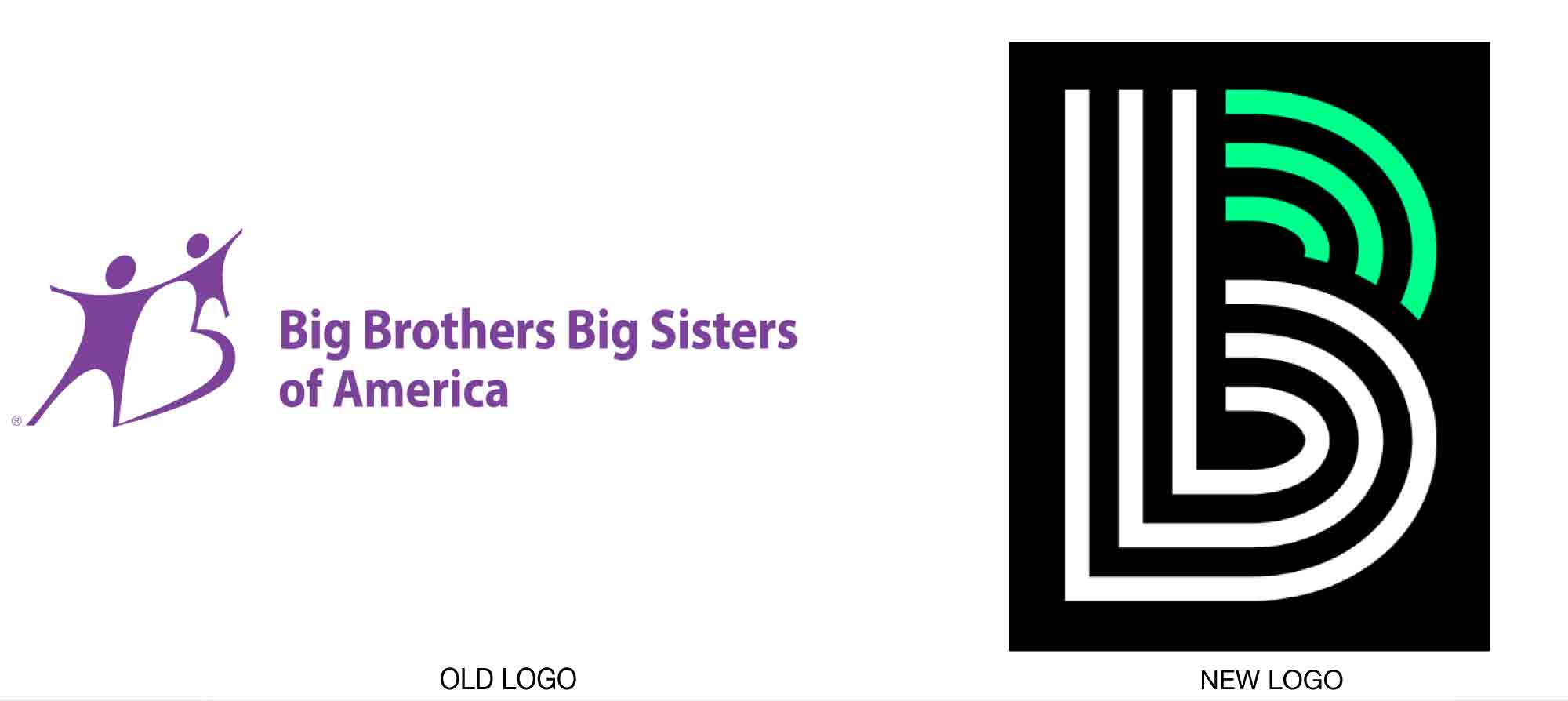
Big Brothers Big Sisters of America has a new brand identity, created by the marketing firm Barkley. Studies had shown that the existing purple-dominant, star people logo did not connect with young mentors. Without mentors, the entire mission of the BBBS falls apart.

The new logo graphically represents making stronger connections between “bigs,” or mentors, and the “littles,” or youth clients. A press release from Big Brother Big Sister explains more. “The new logo… is a symbol of the powerful relationships between Bigs and Littles. The little ‘b, ’ which symbolizes the Little, is the at the center of the mark, and the green lines that complete the capital ‘B’ symbolize the Big, who empowers the Little’s potential.”

Read more details on the rebrand here.