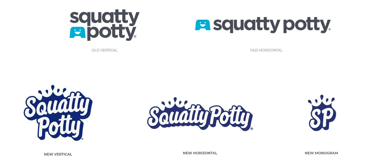
quatty Potty’s new brand identity tries to walk the line between fourth-grade poop jokes and trying to convey real health benefits. While its previous identity sort of hid the product’s actual purpose behind the scrim of a dignified design, the new system whole-heartedly embraces the entire experience of doing one’s dooty.
A release from the company’s website explains the splashy design. “The brand mission has been updated to clearly convey that Squatty Potty is practical, proven, and fun.... [T]he new logo evokes a feeling of inspiration and the customized font speaks to the upgraded playful position of the brand. The water droplets give a nod to the brand's home in bathroom products and the splash upwards is designed to convey the company's continued movement and expansion beyond stools.”
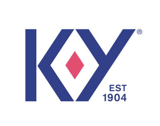
• One of the most surprising thing about the new K-Y logo is that it includes a stodgy and decidedly not sexy “EST 1904” tagline: Historic credence is not usually considered to be all that romantic. Not surprising at all is that the Design Bridge team that created the updated logo clarified the relationship between the center diamond and its “frame” in the original design. It is anything but subtle.
From a Design Bridge press release about the project: “We’ve unleashed a distinctive brand asset that was always there, it just never had any strength or purpose. By making it intentional, we’ve loaded it with meaning and brought a sensuality and confidence to the brand that was lacking before. An enormous step for a brand that was previously at best asexual, at worst clinical.”
https://www.designbridge.com/latest/