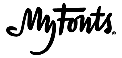
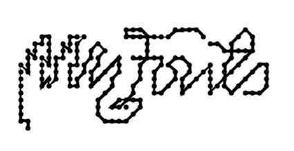
The new MyFonts logo, created by Underware
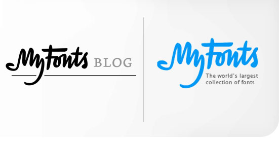
When MyFonts launched in 1999, its organizers popped a placeholder wordmark and logo into the web site, intending to replace it with a professional design at some time in the future.
A decade and 60,000 fonts later, the new logo/wordmark has finally been revealed in beta at https://new.myfonts.com/, to great acclaim. The new logo design, created by an independent type foundry in the Netherlands, Underware, is a script-based concept with an embedded hand logo that clearly addresses the nature of the site's broadly based audience.
"We sell fonts to a wide range of people, from hobbyists making bake sale flyers to professional designers. The new site and the new logo needed to appeal to professional designers without alienating our casual users. The site and logo needed to be serious, but not cold or scary," explains Nick Sherman, designer for MyFonts.
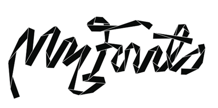
The new mark could have used an existing typeface or perhaps a rotating selection of typefaces, but after some experimentation, the team still wanted a more conceptual solution. They opted for an approach that was subtle enough to let the product shine through, yet it had enough personality to present MyFonts as a unique contender in the marketplace.
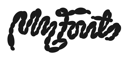
Underware designers Akiem Helmling, Bas Jacobs and Sami Kortem�ki presented an enormous range of ideas: Some picked up notions from the old site, while others were completely off the chart. One memorable concept looked like it was built from sausages, Sherman recalls. The final solution uses custom brush script-style lettering. It builds on a graphic device that was used in some early experimental interface designs for the new site: a dingbat-style pointing finger.
"That's what eventually led to the hand. The solution is about more than just a bunch of fonts; it stresses individuality, ownership, and a creative kind of DIY ethic. That's what really sets us apart," he says.
Underware designers: Akiem Helmling, Bas Jacobs and Sami Kortem�ki
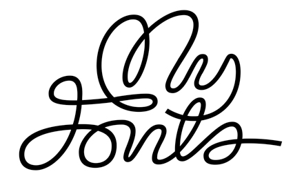
Underware created this MyFonts concept to be alive, elastic, and animated. Users could drag the lines, squeeze the logo, bounce, twist, and turn it.
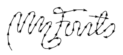
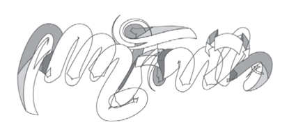
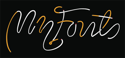
This concept is based on a monoline script grid. The hand element is always visible, but the line's nature is easily changed out no matter what the occasion or message.