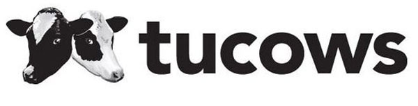
Tucows is a somewhat confusing amalgam of communication–related services, including domain name management and sales, personal domain and email name sales, mobile phone service, and internet service. But its name is also confusing: Tucows is short for The Ultimate Collection of Winsock Software. To help "explain" the abbreviation, its logo since the company's founding in 1993 has included a pair of cow heads. That might help a reader pronounce the name properly—two–cows—but it said nothing about what is actually a high–tech organization.
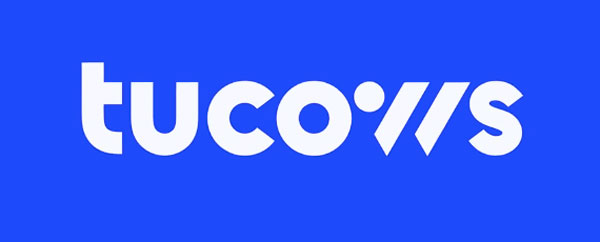
A new logo and development video appeared on the Tucows website recently. The video explains how the redesign evolved around the vision statement, "Making the Internet Better," but it doesn't say anything about how the standalone W–like logo/favicon was developed. It could be a stand–in for the cow concept, but it also resembles a "://" string, which does refer back to the vision statement and represents the company better. But the name Tucows does not start with the letter W, which muddies the water even more.