Since it was founded in 1960, what was then called the Leukaemia Research Fund—later renamed Bloodwise—has raised and invested more than £500 million to support the research and treatment of blood cancers. But its revenues were declining, perhaps in part because the name “Bloodwise” really did not communicate what the charity actually did.
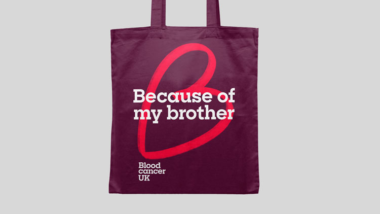
Pentagram has renamed the group as Blood Cancer UK and created an entirely new and more emotional identity based on the word “Because.”
![]()
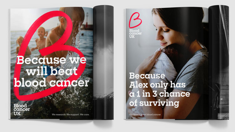
From a Pentagram release: “To [...] convey both the practical and the emotional elements, Pentagram’s team proposed the word ‘Because’ as a way of referring each activity and each individual back to the same cause. This became a central part of the tone of voice: Because we research, we care, we support. Because of Lisa, because of Norah, because of Richard.”
![]()
The charity’s new logo is a canted, hand-drawn capital B that resembles a red heart, again underlining the real human benefit of the charity.