General Mills has introduced a new logo, its sixth since 1928, when four milling companies joined forced to form the food conglomerate, which owns such brands as Pillsbury, Betty Crocker, Yoplait, Colombo, Totino’s, Old El Paso, and Häagen-Daz.

The now-familiar “big blue G” logo has been in use since 1960, the “G” also standing in for “goodness” in packaging and advertising. The first cursive G was created in 1963 by Lippincott & Marguilies.
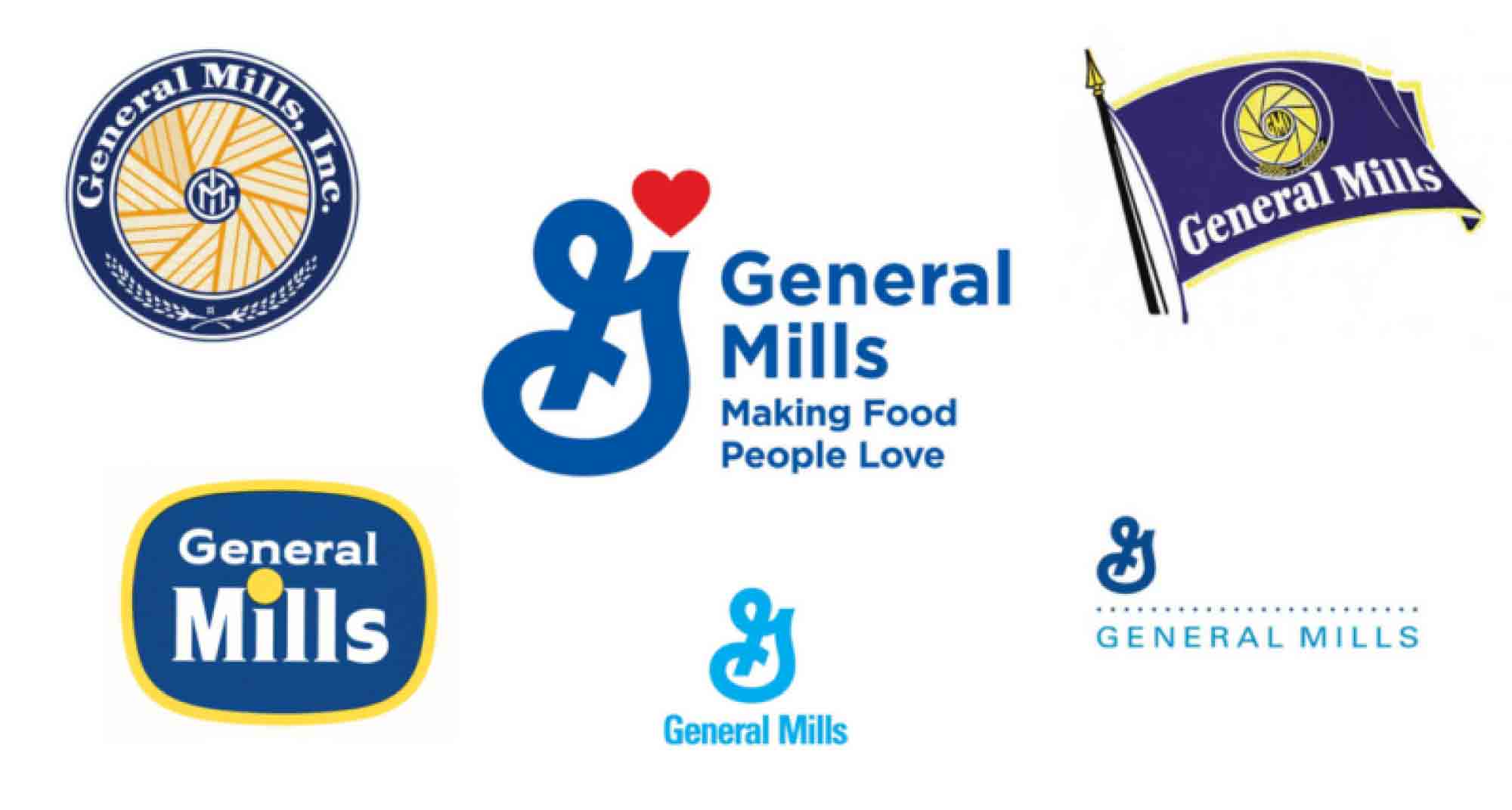
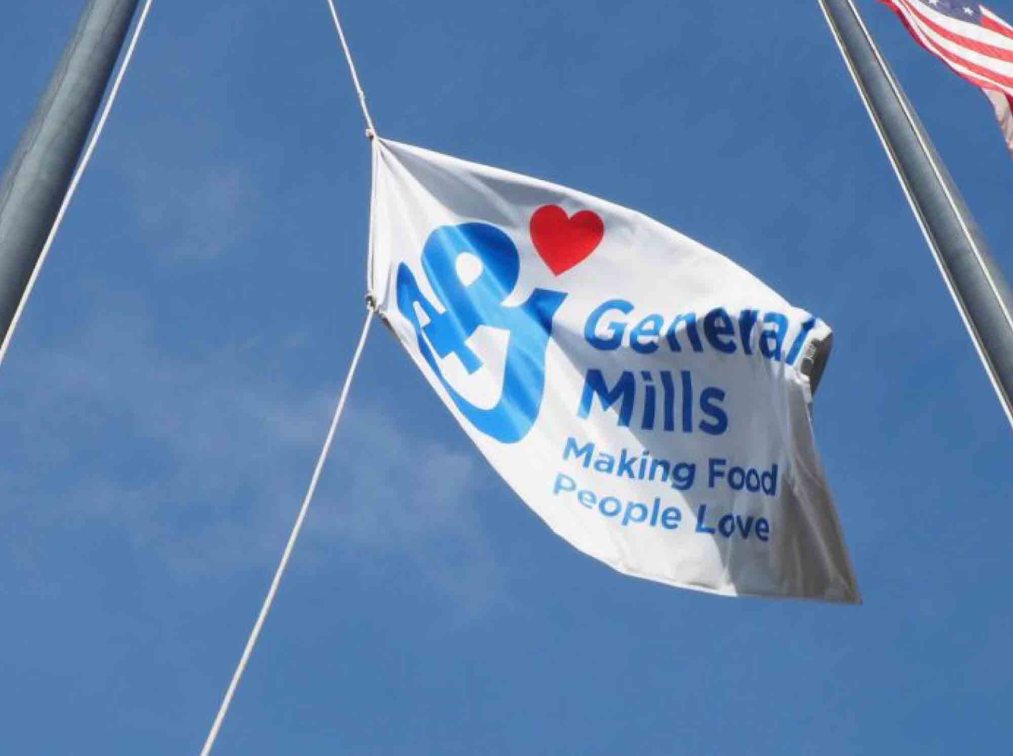
The addition of the red heart balances the canted G, and according to a General Mills spokesperson, “adds a splash of red to make our passion clear: Making Food People Love.” The new design has begun to pop up in social media and in offices worldwide, but is promised to be just the beginning of a larger worldwide rebranding in the next year.
Read and see more here.