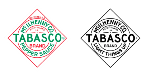
Tabasco is one of those brands that is ubiquitous enough to be almost invisible in a tabletop setting, especially considering the tiny stature of its original bottle. The design of its diamond-shaped label, first used on the founder’s 1868 bottles, has become its default identity. This has become somewhat of an issue as eight new varieties have been introduced since the early 1990s: green pepper, garlic pepper, habanero, chipotle, sweet and spicy, buffalo, sriracha, and scorpion. Adding to the ever-growing list of variables was the fact that labeling differed all over the world.
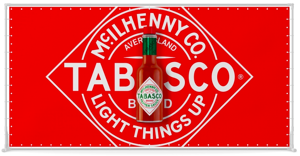
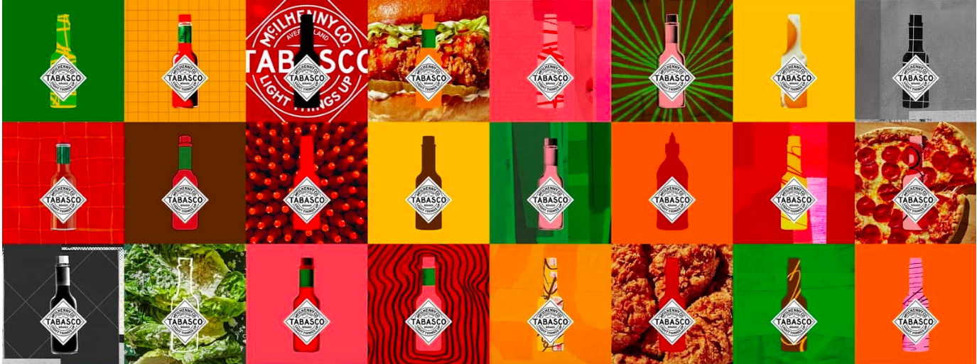
The McIllhenny Company, owner of the Tabasco brand, brought in the creative agency Mrs&Mr to coordinate its full packaging and identity system. Built on the tagline, “Light Things Up,” the new identity is full of hot color and patterning. It avoids clichéd images such as flames or peppers. The brand guardrails that guided the design included timeless, not trendy; potent, not brazen; original, not standard; and vibrant, not vulgar.
The designers also updated the familiar Tabasco diamond. Type has been tightened up, giving it a bolder presence. In some graphic applications, the diamond is shown in full—that is, in front of and not wrapped onto a bottle. Being able to see the entire shape and all its sharp points gives the design a stronger, more picante message.