Five major design consultancies—Brand Union, Lambie-Nairn, The Partners, Addison and Vbat—have pitched their names to formulate one brand called Superunion, in the hopes to create more opportunities for clients and projects.
This massive WPP merger, first announced in September of last year, will bring together motion graphics, branding, digital design and packaging. It will also bring its impressive count of clients and employees together, with 750 staff members in 23 offices, across 18 countries around the world.
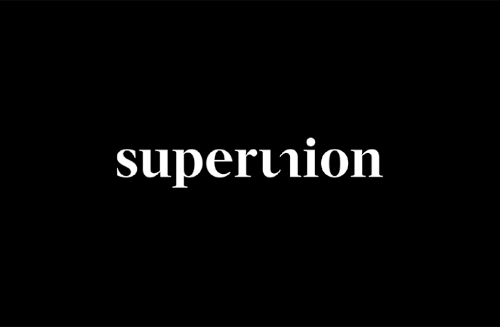
With this new mega-firm, comes new branding led by Superunion’s global chief creative officer, Greg Quinton, who ran The Partners creatively for 25 years.
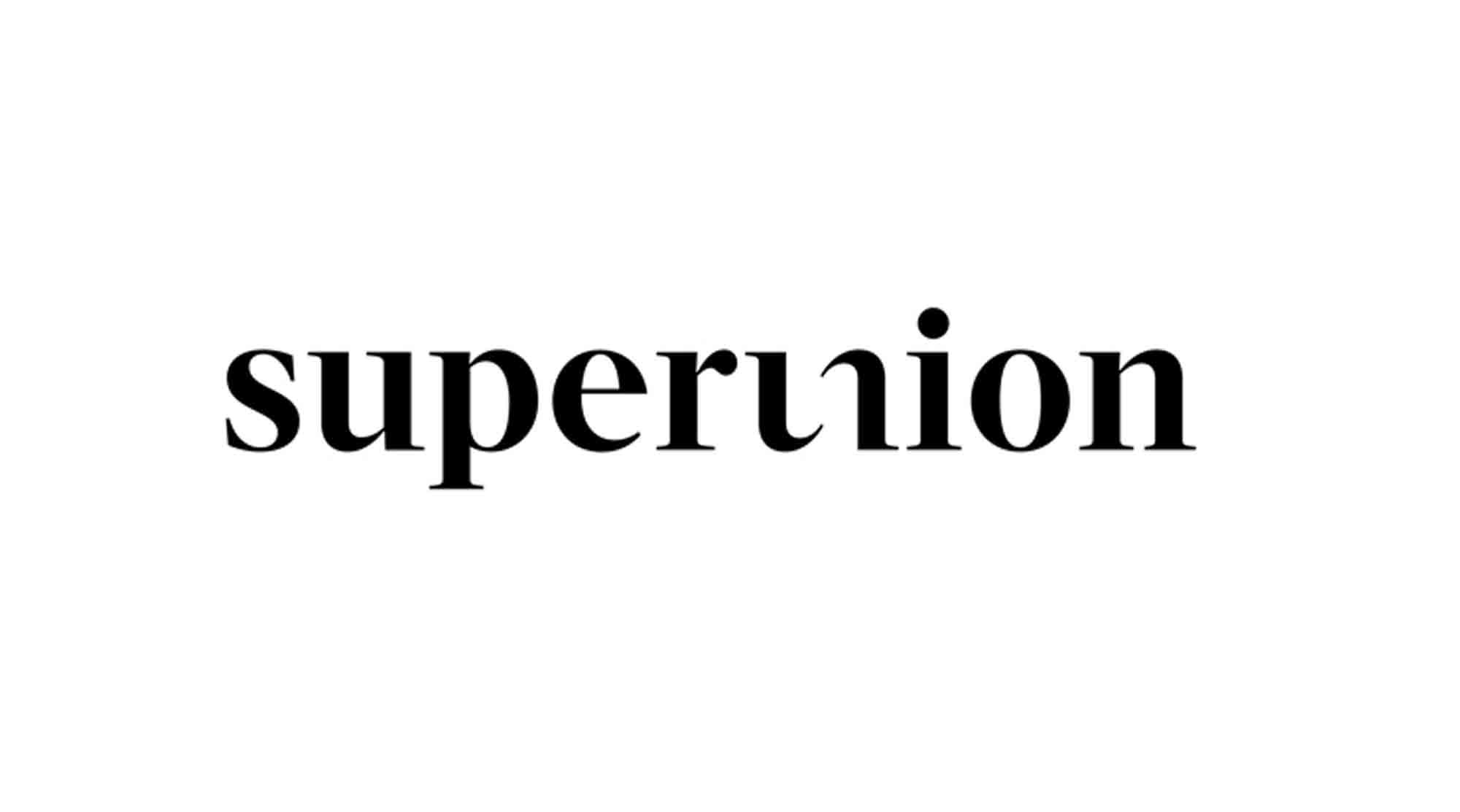
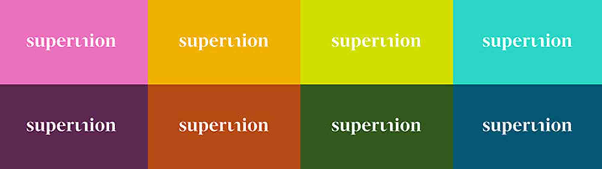
The new logo strives to communicate the idea of unity, says Quinton, featuring the brand name in lowercase, serif, bespoke typeface, which comes off as “approachable” and “human,” and the “u” and the “n” letters are cut in half, to appear as if they are a single character. This design is cleverly symbolic of the WPP merger itself, Quinton says, as it “brings two things together in an unexpected way to create one.”
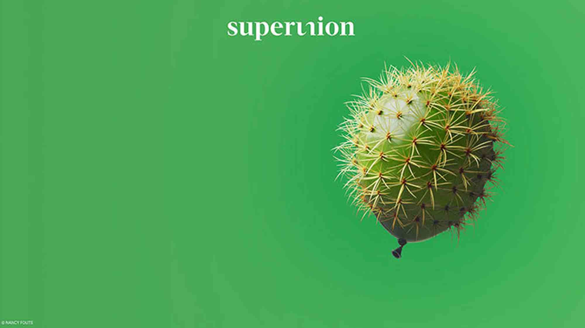
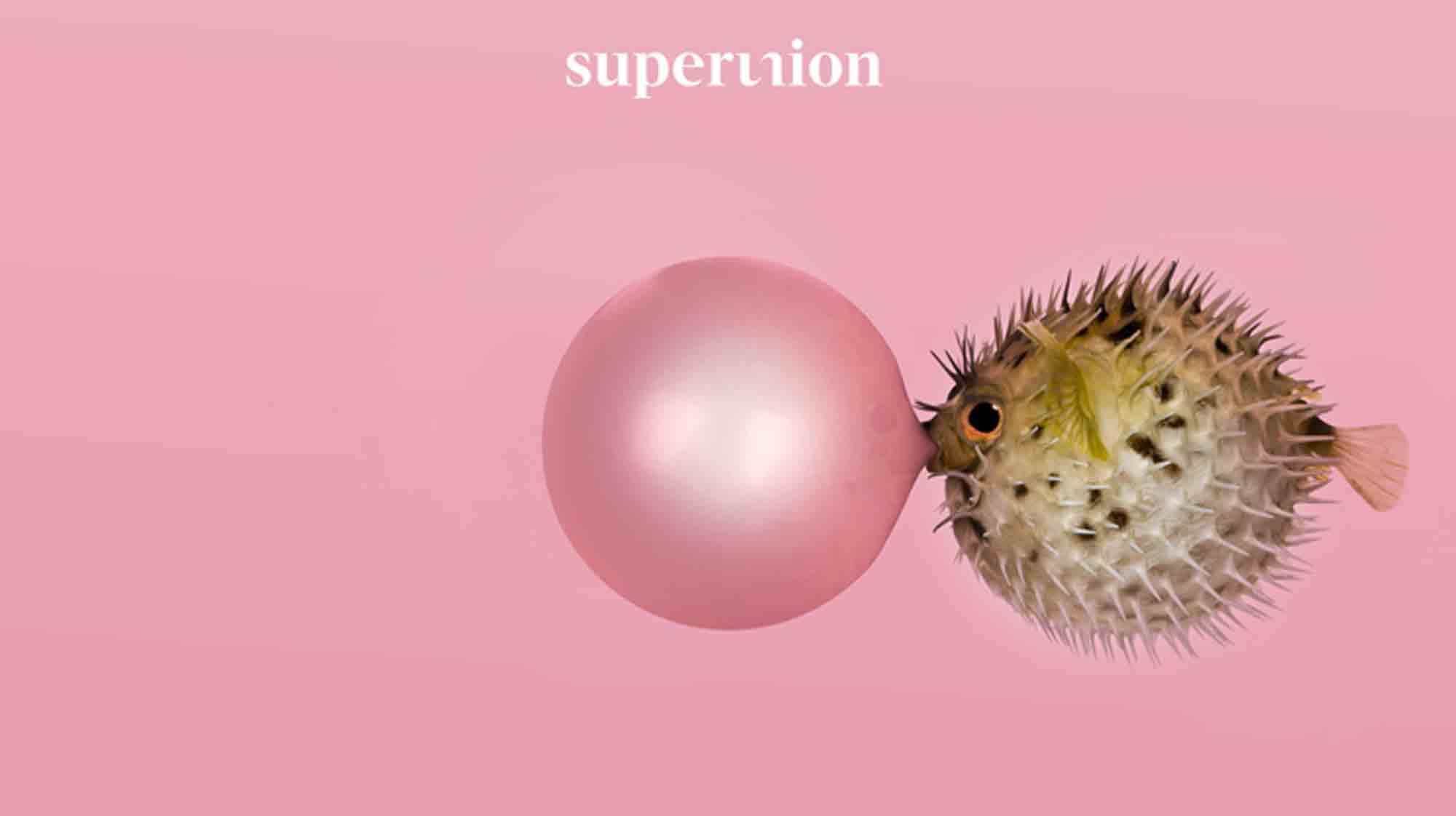
Imagery and photography for the new brand will also represent this theme, with similarly shaped objects that you wouldn’t normally pair together, that somehow work as they create a sense of flexibility and optimism.
To Quinton and his colleagues, this merger is a positive one. “We will be so much better being one, consolidated group, and so much more powerful,” he said. “What clients are looking for is the best of both worlds… creativity and the ability to scale… This is not an exercise in cost-cutting — it’s a process of building.”
See the new site here.