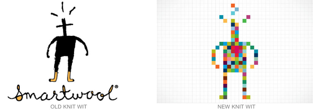
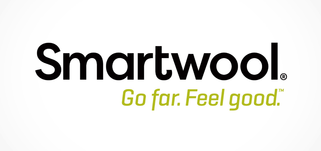
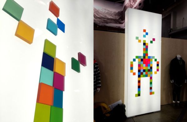
Design studio Solidarity of Unbridled Labour has updated Smartwool’s iconic “Knit Wit” character and brand identity, maintaining the friendly, iconic nature of the brand, but improving legibility and overcoming “production issues” (no doubt including reproducing the thin script found in the original identity in knitted fabrics).
From the Solidarity website: “The final logo concept is deeply rooted in Smartwool’s brand and heritage in the industry. They turned the shades-of-brown outdoor industry upside down with their joyous use of bright color. And the grid pattern is the knitting grid for sockstheir entry into, and dominance within, the outdoor industry.”
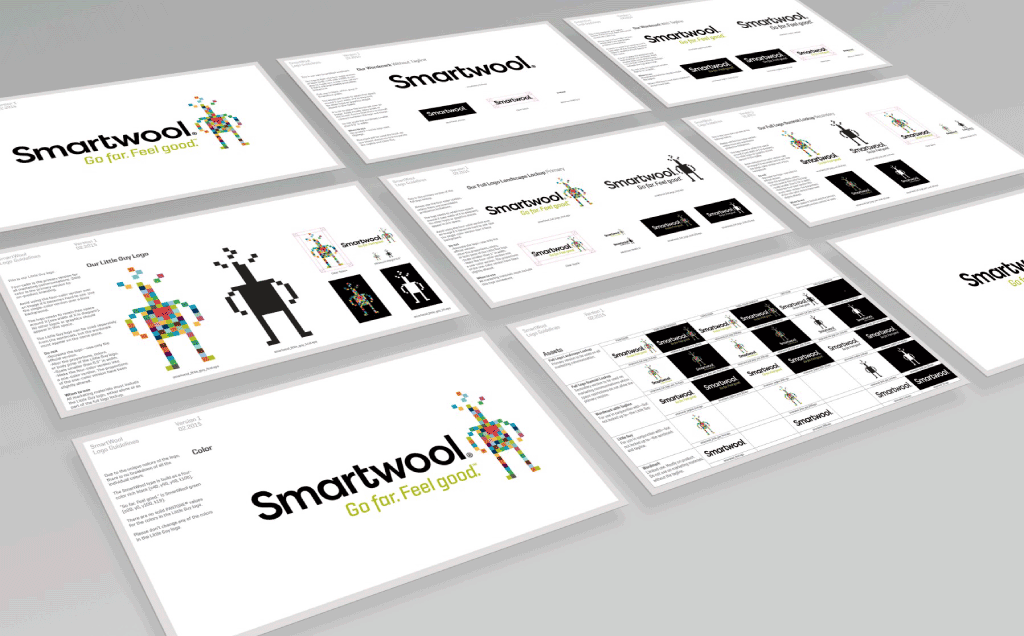
To see the redesign displayed, you can visit Smartwool’s website here.