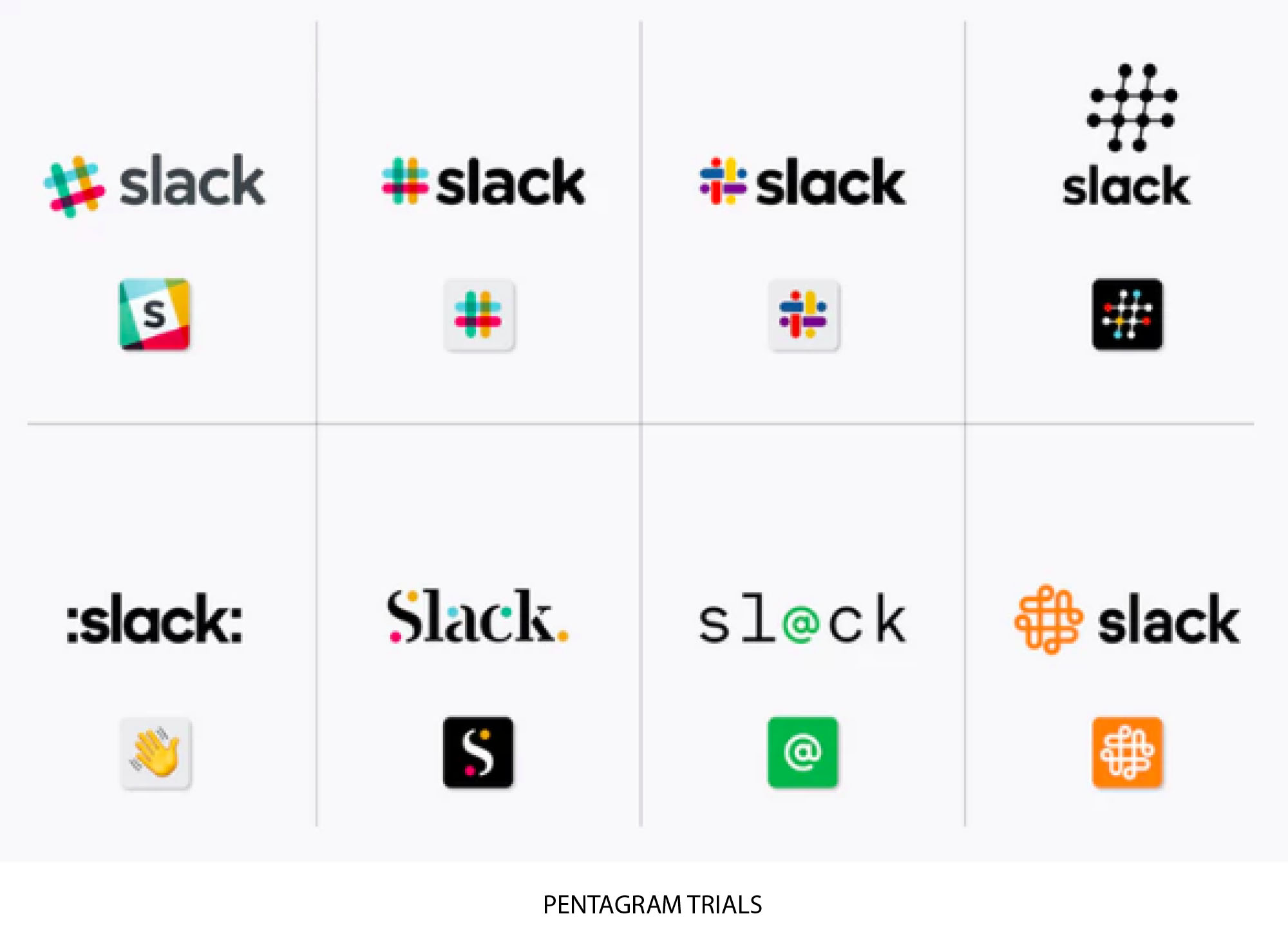
Pentagram’s has replaced Slack’s familiar octothrope (that’s “hashtag” to you and me) logo with a new design made from lozenges and droplets.
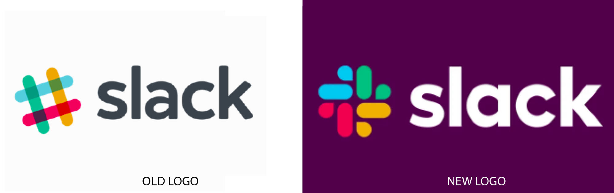
The designers kept the nature and some of the colors of the original design, but retooled the logo to get rid of reproduction challenges that infected the previous mark.
From Slack’s blog: “Our first logo was created before the company launched. It was distinctive and playful, and the octothorpe… resembled the same character that you see in front of channels in our product.
“It was also extremely easy to get wrong. It was 11 different colors—and if placed on any color other than white, or at the wrong angle (instead of the precisely prescribed 18º rotation), or with the colors tweaked wrong, it looked terrible. It pained us.”
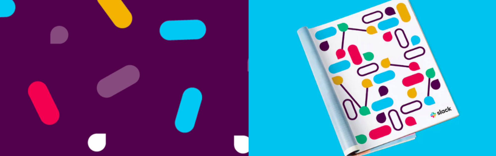
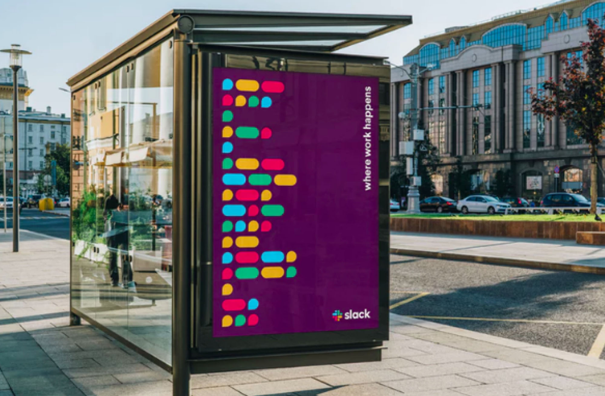
The new straight-up orientation ensures consistency. It uses just four colors in the logo itself; purple, black, and white are used as background colors. The droplets and lozenges can be farmed out into patterning, textures, and illustrations.
Learn more from the Slack blog at https://slackhq.com/say-hello-new-logo?cvosrc=spredfast.twitter.brand&cvo_creative=sf97658134&utm_source=twitter&utm_medium=spredfast&utm_content=sf97658134&utm_campaign=a_spredfast_twitter_all_en_follower_engagement_sf97658134_20190116&sf97658134=1.
Pentagram’s account is at https://www.pentagram.com/work/slack/story.