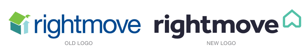
RightMove, a UK website that helps shoppers find new homes, has an updated identity, courtesy of The Team. The new design will be familiar to current customers as it contains a logo made from a house and an arrow, both components in the company’s original design.
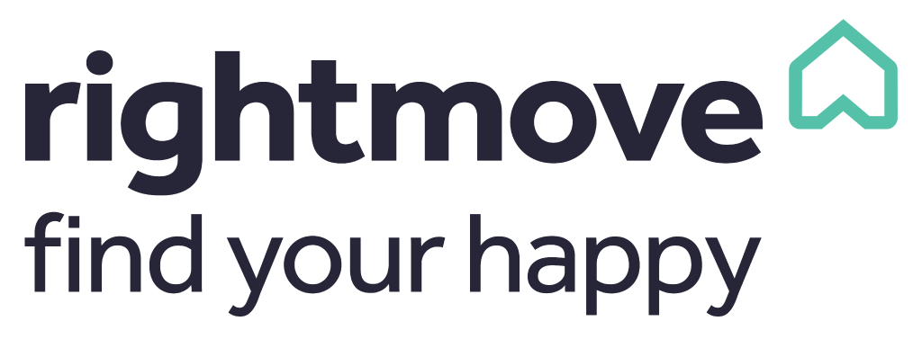
The new symbol can be reused as pictoral elements: as a house, arrow, badge or heart. The edges of the symbol have been rounded off and the color palette for the system has be warmed up, all intended to bring a more human feel to the brand.
Read more behind the new identity here.