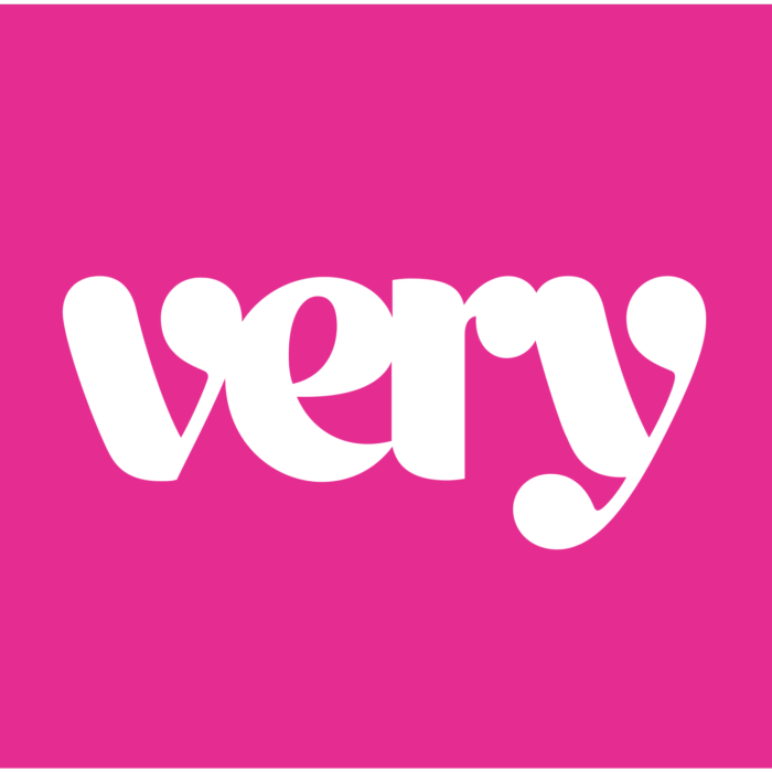
• Fashion retailer Very wanted to expand beyond its mostly female audience, but in creating a rebrand with the help of creative agency Someone, it also discovered that it needed a more legible online brand. With 82 percent of sales coming from mobile devices, it was clear a simpler, more readable wordmark was needed.
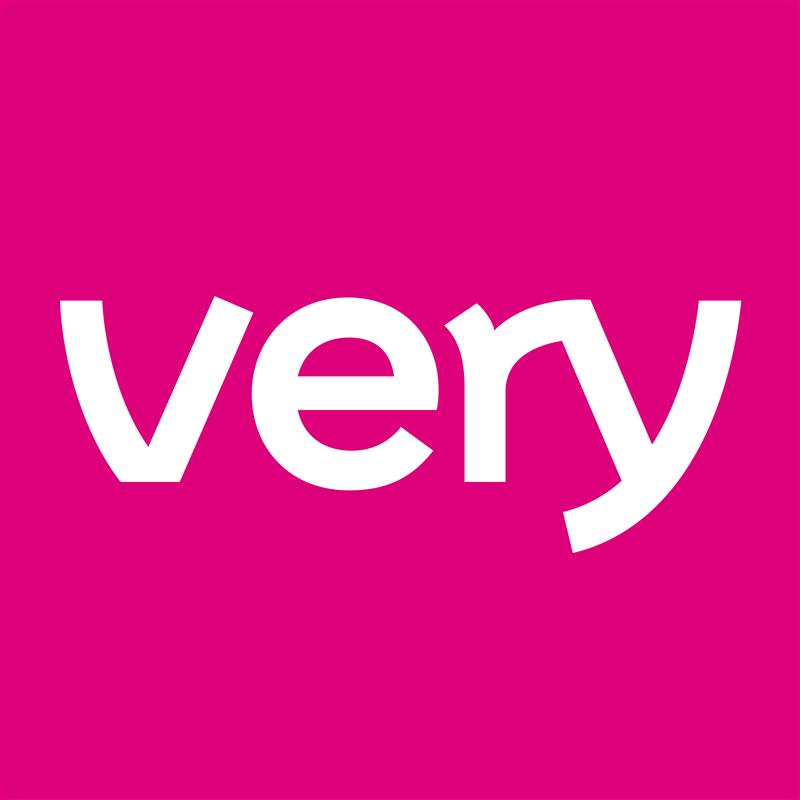
Someone worked with type foundry F37 to create a bespoke typeface, Very Sans, that still had plenty of personality but also had a stronger feel that was neither specifically male or female.

• Symbol is a brand of hi-fi furniture that embraces many eras, from 1960s and 1970s typography and colors to mid-century furniture design, in order to connect with today’s music lovers. Its collection includes vinyl storage and home listening solutions that are unique in the furniture world.
![]()
The Symbol wordmark is all 1970s, almost as if it were dry-transferred down from a particularly groovy page of Letraset lettering. Its logo is reminiscent of a turntable sitting at the center of an S.