![]()
Australian spend-management platform Divipay has rebranded as Weel with the help of Re (part of R&S Saatchi). Weel describes itself as “an all-in-one virtual business card and expense management platform that enables finance teams to better manage, control and streamline spending across their organization.”

The new identity is built on the theme of collective accountability, which leads to a more trusting and trustworthy community. The Weel logo is a dimensional, bright green wheel of fins whose color gradation suggests forward movement. The fin metaphor is appropriate for a “fintech” or financial technology company. The fins all meet at the center of the shape, reinforcing the goal of collective accountability. In the accompanying wordmark, the double “ee’s” in Weel mimic the wheel shape.
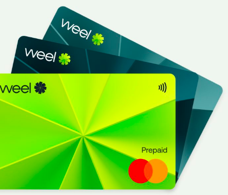
When cropped tightly so that the outside edges of the shape are no longer visible, the wheel turns into a completely different graphic. This version can be construed as rays emanating from a center point or even arrow points meeting in the middle. The bright green brand color creates an especially strong architecture when viewed at this zoomed-in perspective.