As excitement builds for the tenth installment of the bestselling LogoLounge book series, we wanted to give you a little taste of what's to come. Today, we offer you one of the 20 incredible case studies from the book! Behold, Case Study #13, where you'll read to discover the story behind Jay Fletcher's logo mark for Hen and the Goat. We hope you enjoy it!
Designer /// Jay Fletcher Client /// Hen and the Goat
Jfletcherdesign.comEven though Jay Fletcher is a one-man shop, he cranks out a lot of really great logos. In fact, he has 58 logos—the most of any other firm—featured in LogoLounge 10. The judges really responded to his work, and it’s easy to see why. An illustrator at heart, he creates meaningful imagery that goes right to the heart of the solution, though he never touches pen or pencil to paper. As he says, “I can draw basic ideas quicker with a computer than I can by hand, and if it works, I’m just that much closer to the solution.”

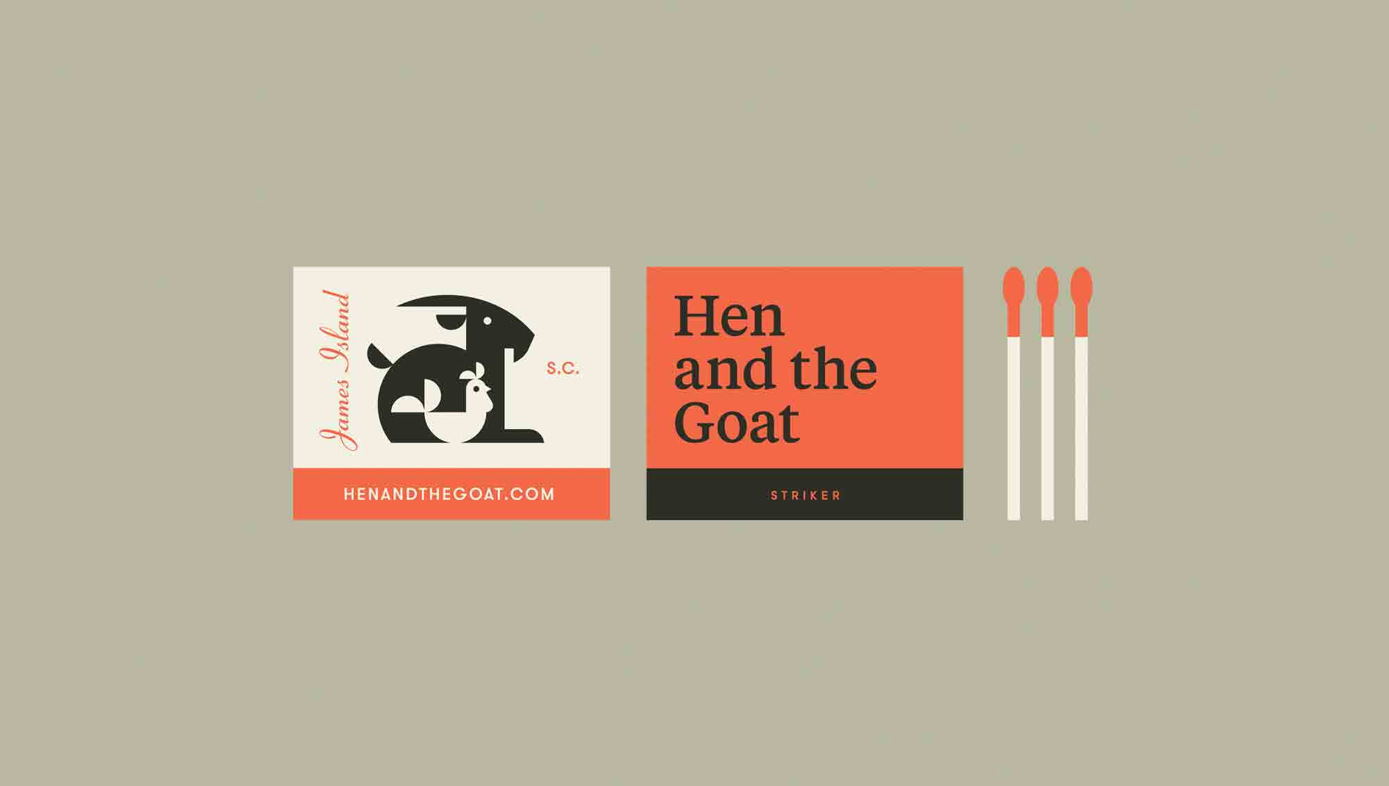
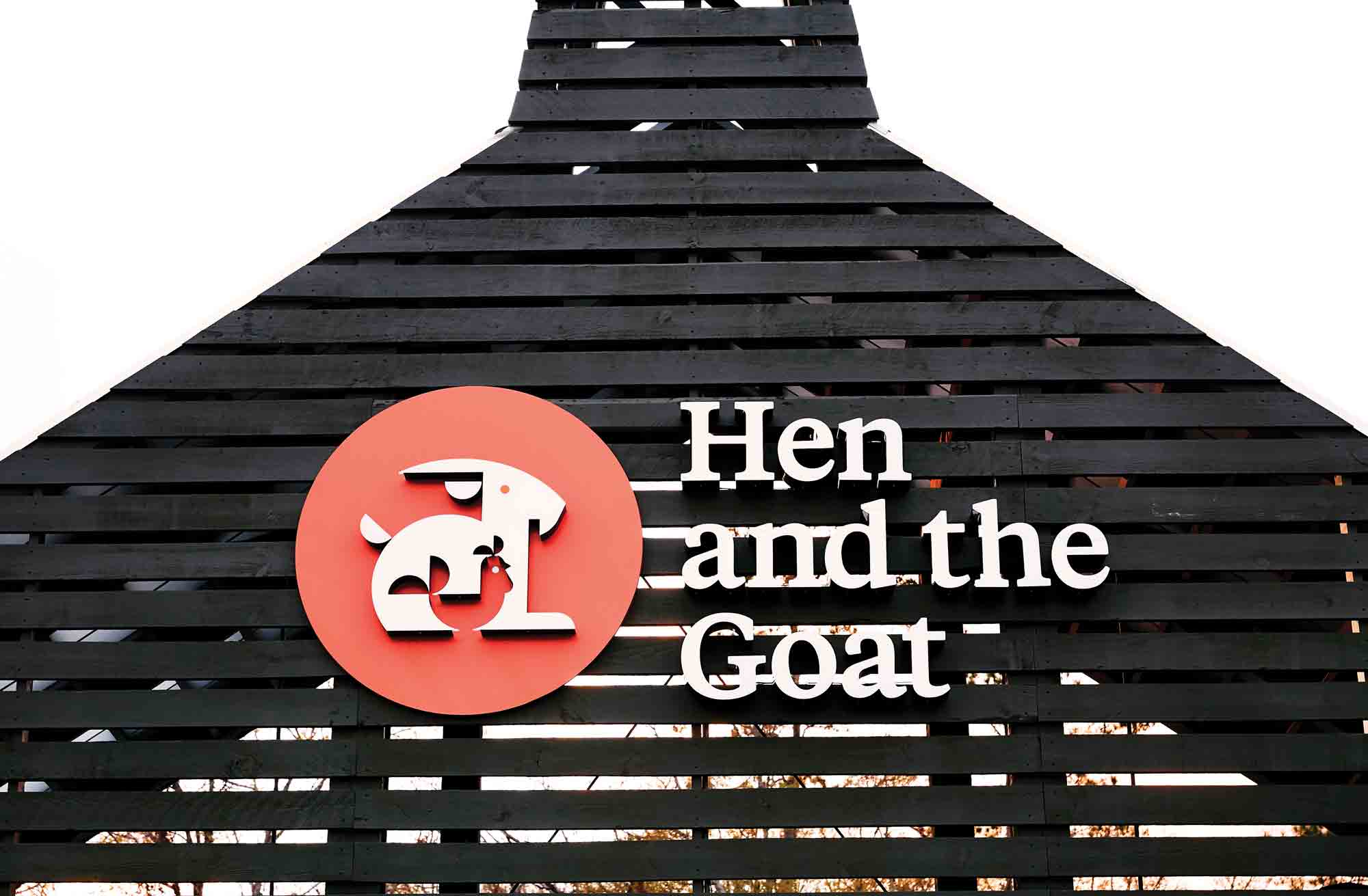
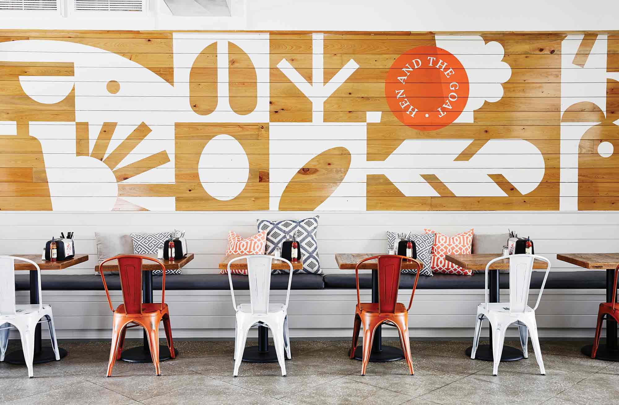
The logo mark for this new deli and cafe on James Island, just outside of Charleston, South Carolina, is simple and brilliant. Fletcher wasn’t given much in terms of a brief for the Hen and the Goat, other than the owner was kind of keen on including a hen and a goat in the official mark. “The space was going to include a lot of barnboard, Edison bulbs, and so on, so I recommended that rather than going too ‘distressed farmhouse chic’ with the design work, we instead create something cleaner, simpler, and graphic to go against the grain and create contrast,” he explains.
His experience also helps to guide the client in the direction that’s most appropriate for their business. “I tend to feel like you can plot clients and their design needs on a spectrum of timelessness. Especially with a logo project. Sometimes a logo should have as long a shelf life as possible, and other times the client would bene t from being a little trendier. Creating an identity for a restaurant tends to fall a bit more toward the ‘trendy’ side of things, in my opinion,” he notes. “I always want to give clients work that’ll stand the test of time, but it’s important that a new restaurant looks hip and ‘now,’ to help get people in the door. The first few months of a new restaurant’s lifespan are critical.”
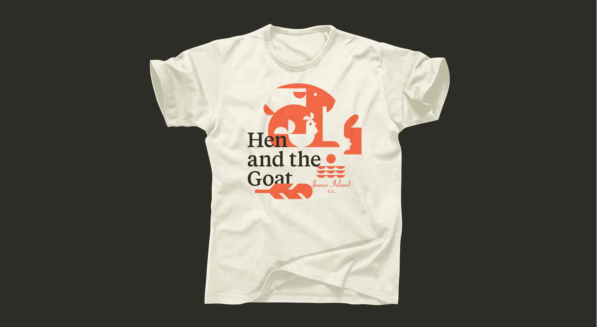
Fletcher explored a couple different directions initially, but quickly discarded them, opting for a lock-up of a hen inside the goat, which is what he presented to the client. It plays on negative space, and creates a compact mark with a punch. “Nestling the hen inside the goat makes them feel friendlier, like they’re buddies who go together,” Fletcher says. The additional elements complement the farm-friendly vibe, and work well as a backdrop in the restaurant’s interior. Adding to the appeal is the mid-century color palette that is warm and welcoming and timeless. “It dials it back a notch and makes the design work feel comfortable, like you’ve seen it before.”