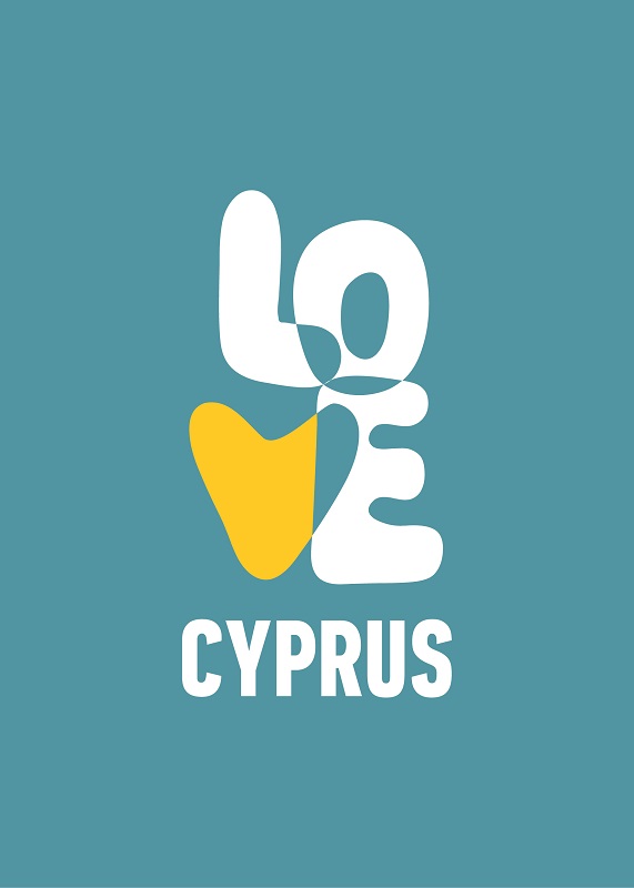
“Love Cyprus” is the catch-phrase of a new brand initiative for the Cyprus Deputy Tourism Ministry. The new logo has a relaxed, organic, ‘60s vibe. It can be used as a line-only version that allows any background to easily show through, or it can be filled with solid colors that represent sun, sky, water, and botanicals of the country.
https://news.gtp.gr/2021/07/27/cyprus-launches-new-tourism-brand-identity-and-logo/
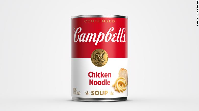
Campbell’s Soup’s very familiar red-and-white can will receive some modest changes that aim to modernize and freshen up the brand. Most noticeable are changes to the scripted brand name. The shadow behind the lettering has been removed, and the font has been modified. Fun fact: the original script as based on founder Joseph Campbell’s signature.
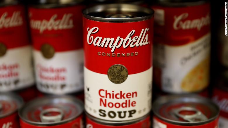
The C used in the signature is also repeated in the fleur-de-lis that sit on either side of the word SOUP (also in a new font). Varieties receiving the redesigned labels include tomato, cream of chicken, cream of mushroom and chicken noodle.
https://www.cnn.com/2021/07/27/business/campbells-soup-cans-redesign/index.html
![]()
In the early 2000s, some adult Lego fans felt socially isolated by their hobby—“Isn’t that for kids?”—as well as unrecognized by the company that produced the products they loved. Lego company officials did not embrace these groupies, who sent in unsolicited ideas and fan mail. Then, as the company approached bankruptcy, it started listening to its super-fans, realized the potential they offered the brand, and were able to turn its destiny around.
(You can learn more about the history of the Lego logo at https://blog.logomyway.com/lego-logo/.)
https://www.nationalgeographic.com/culture/article/adult-legos