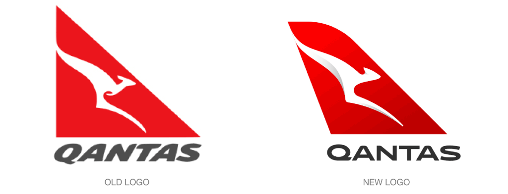
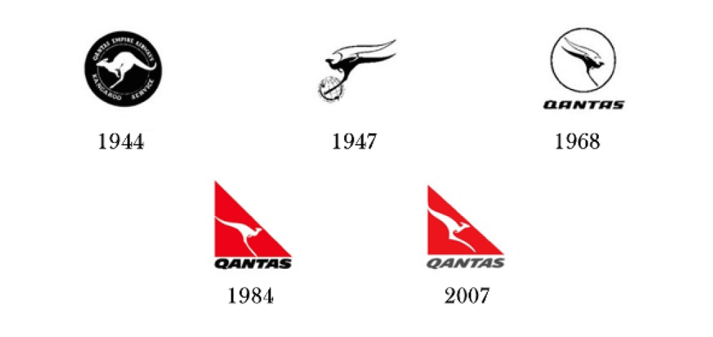
Qantas—which stands for Queensland and Northern Territory Aerial Services, in case you always wondered—has updated its logo yet again, this time with the help of the Australian design company Houston Group and inhouse design consultant Mark Newson.
The familiar red and white Qantas palette remains unchanged by the flying kangaroo has been simplified, streamlined, and shaded, the latter to give it a sense of depth. To the alarm of some fans, though, the creature’s front paws have been amputated in the design, taking the mark even further away from its value as a familiar sign of home for Australians, toward yet another zombie-like corporate shape.
The new wordmark has a cleaner look as well. Says Newson, “This new brand is more streamlined, and the shading behind the kangaroo gives a better sense of movement and depth. A silver band now extends from the tail to the rear of the fuselage, to give a more premium feel.”
Read more details about Qantas’ new logo here.