
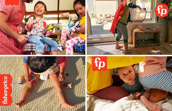
Everything you need to understand about Fisher-Price’s new identity can be viewed in an extraordinary animation on Pentagram’s website (link below). It’s a superb visual that explains how a well-established brand that generations associate with fun and play can be transformed into a brand that is even more authentically about fun and play.
![]()
As the Pentagram release phrases it, “Fisher-Price wanted to be less prescriptive about child development, and in the words of its new mission statement, ‘put the fun back into functional’ and the ‘play back into playtime.’ This dynamic point of view is neatly summed up in a new tagline, ‘Let’s be kids.’
“The refreshed identity centers on the bright red ‘awning,’ the iconic mark with scalloped edges that holds the company name. The updated logo simplifies the awning to three semicircles (from the previous logo’s four) and uses its clean, simple geometry as the basis for an expanded visual language. (Internally, the retooled awning also symbolizes the three founders of the company—Herman Fisher, Irving Price and Helen Schelle, as well as the intersection of parents plus kids.) The logotype has been redrawn in all lowercase, with letterforms that are slightly more refined than original but still quirky. The hyphen between the names is now a semicircle, echoing the scalloped edge as well as the smiles on the faces of the Little People.”
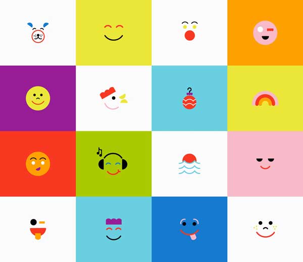
The awning shape, hyphen, semi-circle smile, and other shapes from the company’s new Let’s Be Glyphs font are used to form backgrounds, animations, icons, and more.