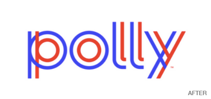
“DealerPolicy,” the extremely dry name of an embedded insurance service that allows car buyers to obtain auto insurance at the point of purchase, has rebranded as Polly, with the help of TBWA\Chiat\Day LA.
The new identity uses radiating lines to suggest the company’s brand statement, “Get it together,” but the lines also suggest the company’s desired benefit, which is to “be a force for good.” The lines can be construed as coming inward—bringing everything together or offering a protective shield—or as a force-field that is radiating outward.

In the logo, the lines serve a different service: they look like tire tracks. But beyond that, the two lines running parallel to each other imply that with Polly and the insurance it provides, there will always be someone by your side in your travels.
The new color scheme is centered on a bright purple with a vibrant accessory palette of blue, teal, pink, orange, green, and red. These intense hues change the mood of shopping for insurance, normally not a desirable experience.