
Pfizer has been around since 1849, but it has had surprisingly few changes to its brand identity since its inception—only three, in fact. Its first truly modern logo was created in 1987 by Charles Grossman. Grossman kept the tablet-shaped enclosure the company had adopted in 1940, but created a much more modern wordmark and selected the company’s trademark blue.
Today, on the heels of its new Covid-19 vaccine and accompanying press, Pfizer has a new brand identity that retain’s Grossman’s wordmark and brand color but removes the pill shape. Now a helix shape sits next to the company name.
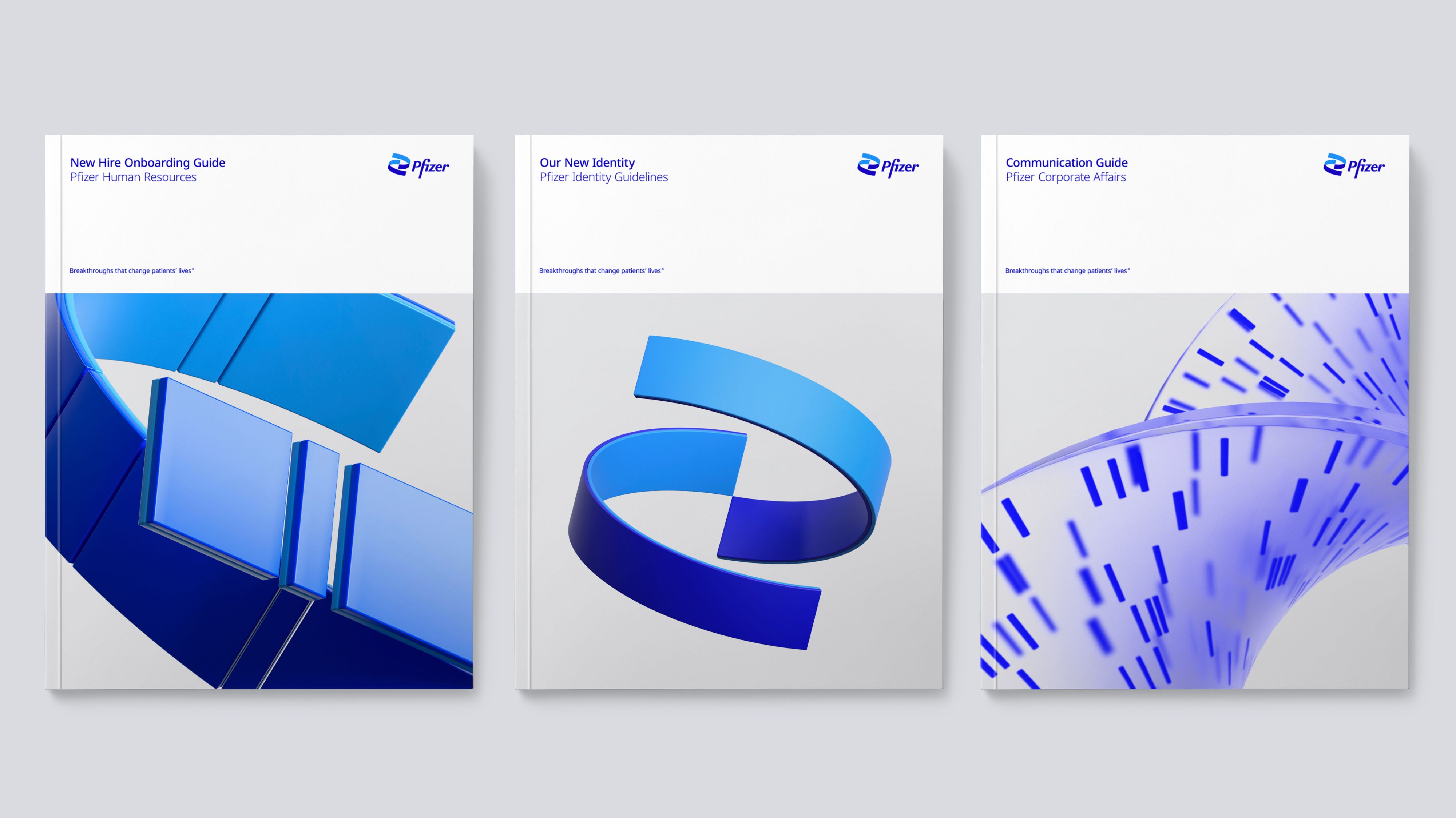
The change, which was in development before the Covid vaccine development began, was prompted by the company’s growth from a diversified medical company to a biopharma business focused on breakthrough science, according to a company spokesman. Design agency Team was the creative partner in the rebrand. Landor & Fitch also helped to plan brand strategy.