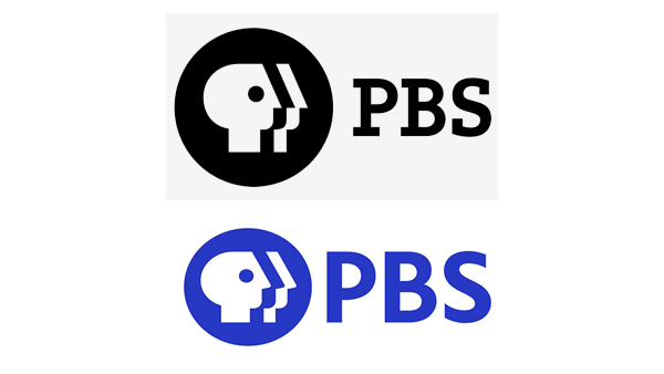
PBS is marking its 50th anniversary with an updated identity. It’s a design that has been tended by famous hands over the years, including creator Herb Lubalin, Tom Geismar, and now Lippincott. The 2019 update is subtle, but practical.
The Lippincott design uses a much bolder blue in the familiar shield/wordmark combo, but now a custom-typefaces has been added and the letters are larger: legibility at all sizes in all applications had been a challenge with the previous design. Herb Lubalin’s “everyman” profile has been softened, and the faces have been subtly reworked so they are looking in a more upward direction (although this is difficult to discern). The design has been flattened and its highlight removed, again a nod toward better legibility in all applications.
You can view the brand guidelines at https://www.pbs.org/brand/
https://www.fastcompany.com/90425497/pbs-unveils-a-new-brand-for-a-new-media-landscape